More often than not, our PowerPoint slides contain a chart or graph.
Sometimes you might come across charts where the data spans two different data ranges.
The chart will be confusing if you plot such data without adding a secondary value axis.
Because it will be hard to figure out the relation between the two data series.
It can also go so far as to be incorrect, depending on the chart type you choose.
This post will walk you through the process of adding a secondary value axis in PowerPoint charts.
So keep reading the post till the end.
Follow our easy step-by-step guide to add Grammarly to PowerPoint.
How To Add A Secondary Axis In PowerPoint Graph
PowerPoint charts are excellent tools for drawing graphs from data and visualizing the data. It helps people make the data meaningful and derive information from it.
If you are drawing a chart out of a big series of data, it is best to use Excel to draw the chart and then copy it into PowerPoint. 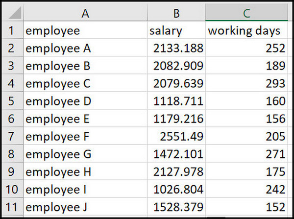
Once you have the chart in PowerPoint, you can edit the chart to fix the errors, change how the graph looks, etc. You can also add a secondary value axis to the chart.
Adding a secondary value axis is mandatory when you have two different data types along the vertical axis spanning two different data ranges. Plotting them one over the other will not work, and it can turn out to be incorrect.
You can, of course, draw two charts for the two data series. But it will be more work, and most importantly, it will be hard to relate the two charts.
So what you should do instead is add a secondary value axis. Then each data range will have its own axis. It will make the graph meaningful and more legible.
Here are the steps to add secondary value axis to charts in PowerPoint:
1. Choose the data to add to the secondary axis
At first, you need to select which data series will be added to the secondary value axis.
For example, you have the salary and working days on the vertical axis. The numeric values of the working days data are very small compared to the numeric values of the salary data.
So it will be hard to figure out how the working days’ data fluctuates since their height is much smaller than that of salary data.
Therefore, the obvious choice, in this case, is to select the working days’ data series to add to the secondary value axis. 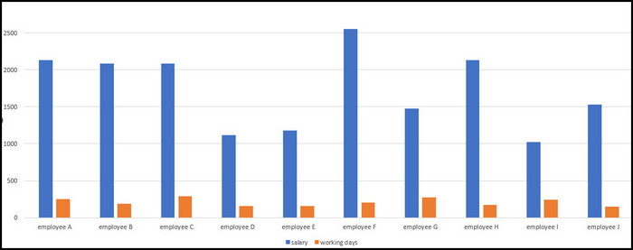
Once you have made a choice, it is time to add the data series to the secondary axis.
Also check our exclusive tutorial on how to merge shapes in PowerPoint.
2. Add the data series to the secondary value axis
In this step, you will select the data series and add it to the secondary value axis.
Here are the steps to add secondary axis:
- Open the presentation file in PowerPoint.
- Go to the slide containing the chart.
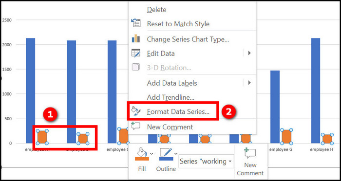
- Right-click on any plot of the data series, which will be added to the secondary axis. The context menu will appear.
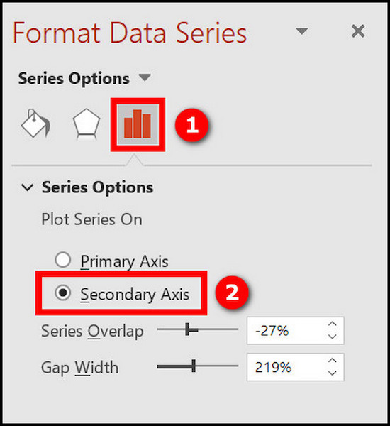
- Select Format Data Series at the bottom of the context menu. This will open the Format Data Series task pane on the right.
- Click on the Series Options icon (the third icon that looks like a bar graph) from the task pane.
- Click on the Series Options dropdown to expand it.
- Select the Secondary Axis radio button under the Plot Series On option.
You will see a secondary axis added to the chart along the vertical direction. The two axes along the vertical direction will show different tickmarks as they relate to different data ranges.
But in your case, it might be that one plot is overlapping the other. In such a case, you need to keep following some more steps. 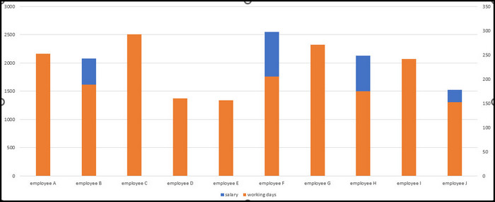
Follow our guide step-by-step to fix PowerPoint design ideas not working.
3. Change the chart type of any one data series
There is no definite rule to choose which data series to change the chart type of. This choice is entirely up to you, as it depends on the data range and its relation with the other data range.
In my example of salary and working days data, it will be better to make the salary data a bar chart and the working days data a 2D line chart.
Here are the steps to change the chart type:
- Select any plot of the data series that you want to change the chart type of.
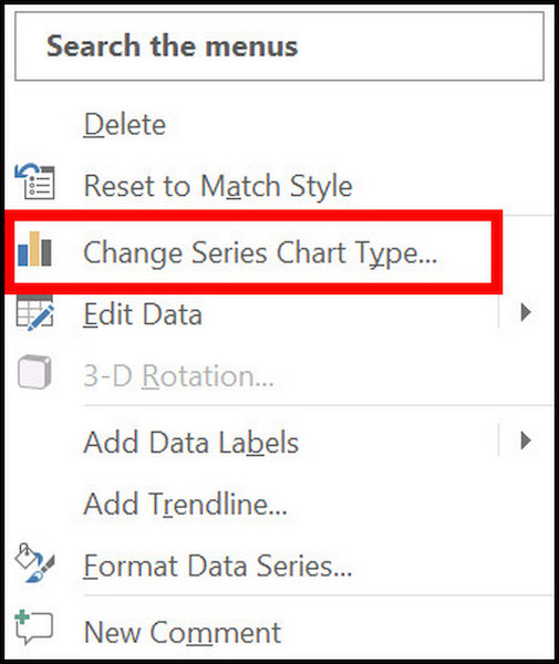
- Right-click on the data series to access the context menu.
- Select Change Series Chart Type from the context menu. The Change Chart Type dialog box opens.
- Select Combo from the left menu.
- Select the second icon from the top (Clustered Column – Line on the Secondary Axis). You can also choose a different chart type as you wish.
- Click on the OK button.
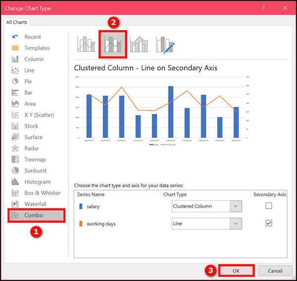
Now you will see the chart change to a different one. If you have chosen the “Clustered Column – Line on Secondary Axis” type, you will see the primary axis as a bar graph and the secondary axis as a line graph. 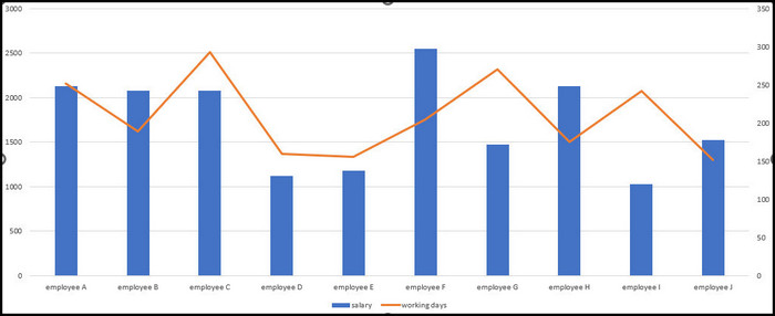
You can modify the chart further by adding markers to the line graph. It will help to make the chart more visually appealing.
Refer to the next section to learn how to add markers to the secondary value axis line graph.
Here’s a complete guide on how to use cameo in PowerPoint.
How To Add Markers To The Secondary Value Axis Graph
If you choose to represent the data series associated with the secondary value axis as a line graph, it is best to add markers. Markers will help to differentiate between the two graphs in the combo chart.
While adding the marker, you can choose the marker’s size, color and look, among other properties.
Here are the steps to add markers to the secondary axis graph:
- Open the presentation in PowerPoint.
- Go to the slide containing the chart.
- Right-click on the line graph where you want to add markers. The context menu will appear.
- Click on Format Data Series from the context menu. The Format Data Series task pane opens on the right.
- Click on the first icon at the top (the icon with the paint bucket).
- Click on Marker.
- Click on the Marker Options dropdown to expand it.
- Select the Built-in radio button.
- Click on the Type dropdown and select a marker type of your choice.
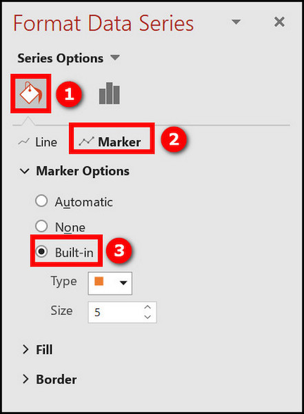
- Change the Size of the marker as needed.
- Expand the Fill option and choose a color for the marker. It is best to make the marker color a darker shade of the line color.
Now you will see the chart with the secondary value axis in all its glory. The two data series will be legible and meaningful.
Additionally, you can color the tickmarks of the two axes with their respective plot colors. It will be helpful to relate which axis represents which plot. 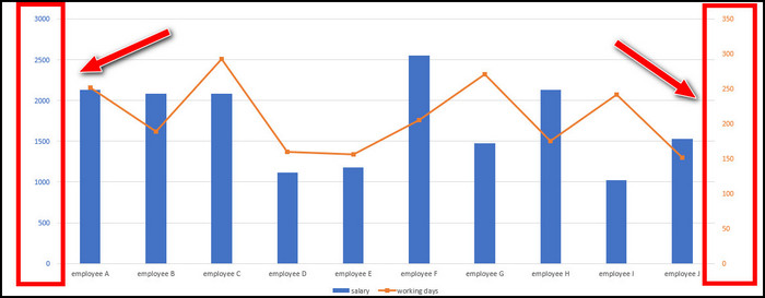
Now the chart will be quick to get a grip of and derive conclusions from.
Check out the easiest way to remove picture background in PowerPoint.
Final Thoughts
Adding a secondary value axis is a must if you have two different data ranges to plot on the same chart. The secondary axis will ensure the two data ranges are labeled correctly along the axes and are legible.
To add a secondary value axis to an existing chart in PowerPoint, you would first choose which data series to associate with the secondary axis.
Then the task is as simple as selecting Secondary Axis from the task pane and changing the chart to Combo type.
Finally, you can add markers to make the chart more appealing.