Histograms enhance the impact of your reports and presentations. They are practical data visualization tools that enable you to obtain insights and tell a story with your data.
If your organization has so much data that you do not know what to do with it, producing a histogram may be beneficial. Histograms enable the observation of trends in big data sets.
Are you unfamiliar with histograms? Don’t worry.
Keep Reading, As in this article I will explain what Histograms are and how to make them using different versions of MS Excel. Let’s get started!
What Types Of Data Are Needed To Create a Histogram in Excel?
Excel requires you to input two kinds of data to generate a histogram: the data you want to visualize and the bin numbers that reflect the intervals you wish to assess the frequency.
Hence, the data must be organized into two columns on the spreadsheet. 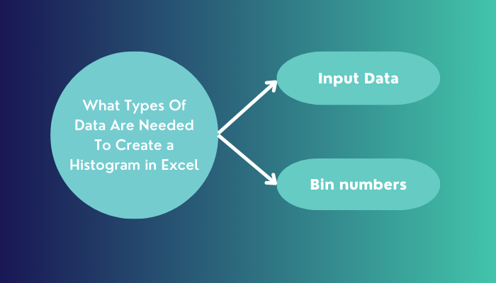
The following information has to be included in these columns:
1. Input Data
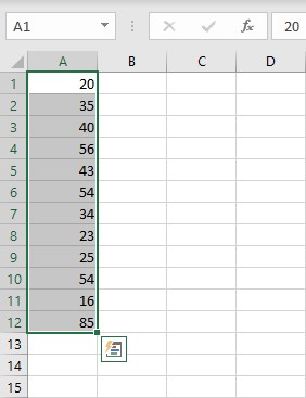
You want to evaluate this data by employing the Histogram tool. Suppose you want to determine how many students scored over 50 on a test and visualize the result using a histogram.
All students’ scores then must be arranged in a column, also known as the input data. The histogram chart will sort this data according to your set parameters.
2. Bin numbers
Bin numbers are the intervals you want the Histogram tool to utilize for measuring the input data when conducting any data analysis. Excel counts the number of data points in each bin whenever you use the Histogram tool.
Excel will generate a set of uniformly distributed bins between the minimum and maximum values of the input data if you do not include the bin range in your instructions.
A histogram table and a column chart representing the data in the histogram table are shown as the output of the histogram analysis. Depending on your preference, this output is displayed on a new worksheet or in a new workbook.
Here’s a complete guide on how to Highlight Duplicates In Excel.
How to Create a Histogram Chart in Excel
Excel provides several options for users who wish to generate a histogram for their data. Excel versions 2016 and later come with a built-in histogram chart option that you can utilize to create a histogram chart.
You can also construct a histogram in Excel 2013, 2010, or earlier versions using the Data Analysis ToolPak or the FREQUENCY function. Both of these options are available in Excel 2016 too.
Here are the steps to create a histogram chart from a given data:
1. Create Histogram Via the In-Built Histogram Chart Option
Suppose you are using Excel version 2016 or a later version. In that case, the Insert Chart menu item provides a straightforward method for quickly creating a histogram. Because of its dynamic qualities, this feature will immediately reflect any modifications you make to the chart.
To get going, just carry out the following procedures:
- Choose the Data set that you developed for creating a histogram.
- Navigate to the Insert tab > Go to the Charts section.
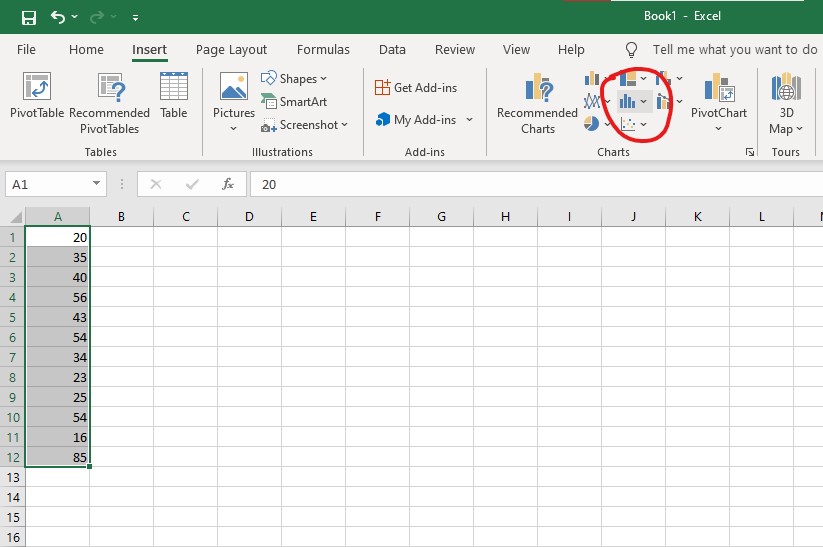
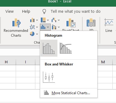
- Select the Insert statistic chart option > Click on Histogram.
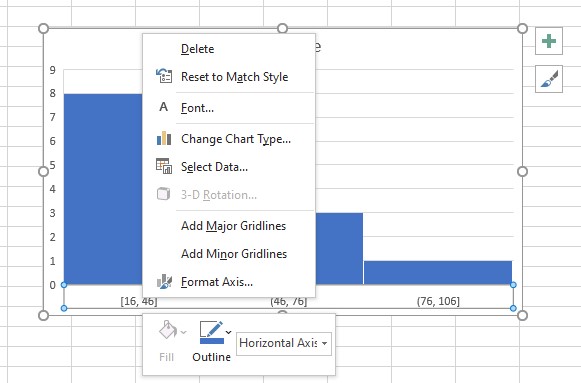
A histogram chart would appear on your screen, with automatically defined bins. Despite this, you are not yet finished. You’ll want to personalize the bins so that it’s easier to examine your collected data.
To accomplish this, do as follows:
Select the Horizontal Axis by right-clicking on it > Click on Format Axis. A popup containing a few different options should open up on the right-hand side of the Excel sheet.
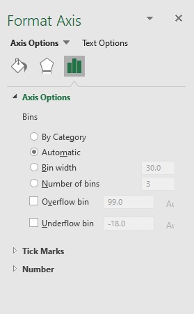
These options include:
- By Category: This helps organize the text into categories.
- Automatic: When you select this option, the number of bins that will be included will be determined for you automatically.
- Bin width: You can specify the range of a bin so that only that range of data is included in that specific bin.
- Number of bins: Here, you specify the number of bins you want to perform a specific analysis of, and the data is automatically distributed into each bin.
There is also a possibility that you will see the alternatives for Overflow Bin and Underflow Bin.
Quickly visit the links to find out how to freeze a row on Excel easily.
2. Use the Analysis ToolPak Method
To create a histogram with the data analysis tool add-in, select the tab labeled Data. You should see the Data Analysis dialog box in the top right-hand corner of the screen. If you don’t, then you should keep reading below.
Suppose you’re using Excel for Microsoft 365, Excel 2021, Excel 2021 for Mac, Excel 2019, Excel 2016, Excel 2013, Excel 2010, and Excel 2007. In that case, you’ll need to enable the Data Analysis Toolpak add-in.
To accomplish this, go as follows using Windows:
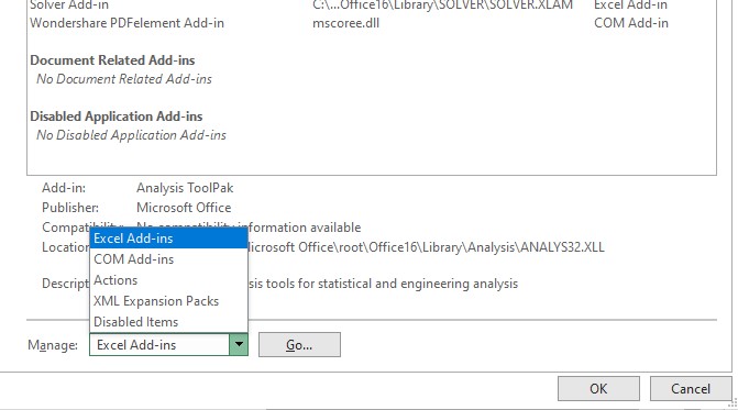
- Navigate to the Add-ins menu by selecting the File tab > Click on more.
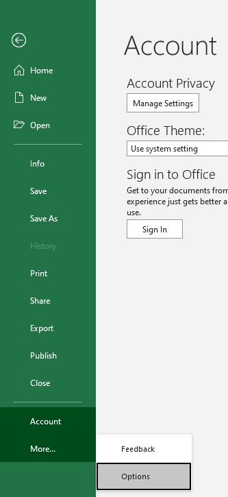
- Select Options > Click on Add-ins.
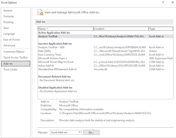
- Click the Manage box > Select Excel Add-ins > Click on the Go button.
- Select the checkbox corresponding to the Analysis Toolpak after arriving at the Add-ins box > Click on the OK (You may need to utilize the Browse function to identify it if it does not already appear.)
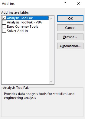
- Click on the Yes button to install the add-in.
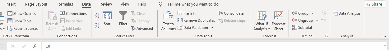
As soon as you navigate to the Data tab and locate the tool for data analysis, you will be able to create a histogram.
Let’s create a histogram representing wait times for cars getting clearance at a toll station as an example to help with this procedure. The wait times are measured in seconds.
Let’s assume that our wait times are entered into cells A2 through A13. We will need to establish our bins. Bins are how you will organize your data into intervals, as was explained.
In this particular illustration, we decided to use tenths of a unit. When creating your own histogram, make sure that the bars do not overlap and that you list the values from lowest to highest.
Here are the steps to create a histogram chart using the data analysis tool pack:
- Click on the Data tab > Select the Data analysis option.
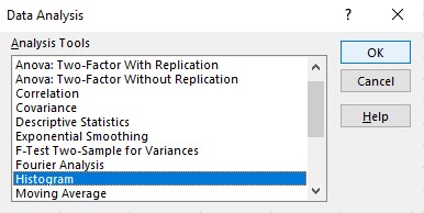
- Select the Histogram tab within the window > Click on the OK button.
- Enter the Input Range (A2:A13) and the Bin Range (B2:B11).
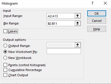
- Select Output Range from the drop-down menu > Navigate to the cell in your spreadsheet where you want the histogram to appear.
- Instruct Excel to produce the chart by checking the box labeled Chart Output.
- Hit the OK button.
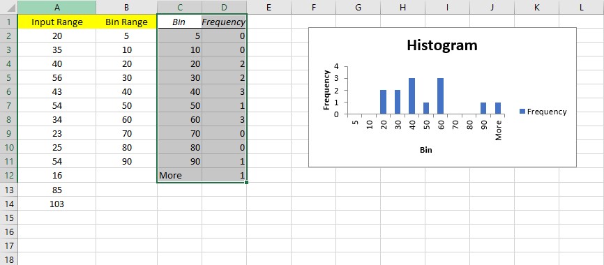
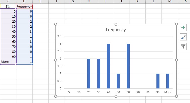
You should now see a histogram in addition to a table with the bins and frequencies. Please note that any values higher than the final bin will be tagged with the word More.
If you’re following my example, our wait time value was 103 seconds, which was longer than the wait time for our largest bin, which was 90 seconds. Therefore, the value that I assigned to More is 1.
Additionally, suppose you wish to update any of the values in your histogram. In that case, you will need to make those changes manually in the table and not in the original data. If you need to adjust the initial data, you will also need to generate a new histogram.
3. Use the FREQUENCY Function
Using the FREQUENCY function to make a frequency distribution table is another way to make a histogram that updates over time. This will summarize how many times each value appears in a particular range.
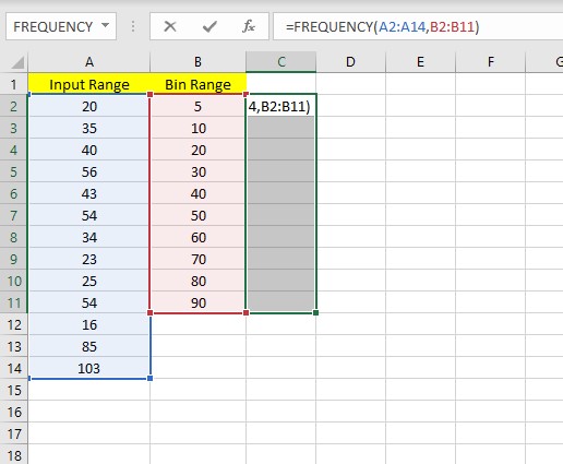
How you do this depends on which version of Excel you are using. FREQUENCY(data array, bins array) is the correct way to write the function while you plot a histogram chart using this function.
If you’re using a version of Excel that came out before Excel 365, do these things:
- Select the cells where you want your output range to be shown.
- Use the formula =FREQUENCY (A2:A14,B2:B11).
- Press the keyboard shortcut CTRL+Shift+Enter to ensure the formula is written as an array formula.
If you want to use Excel 365, do these things:
- Choose where you want your output range to begin. In our example, it’s C2.
- Use the formula =FREQUENCY (A2:A14,B2:B11).
- Press Enter.
In our example, the extra number in the frequency column stands for any values above the highest bin value. In this case, it takes up 103 seconds, which is more than our biggest bin, which holds 90 seconds.
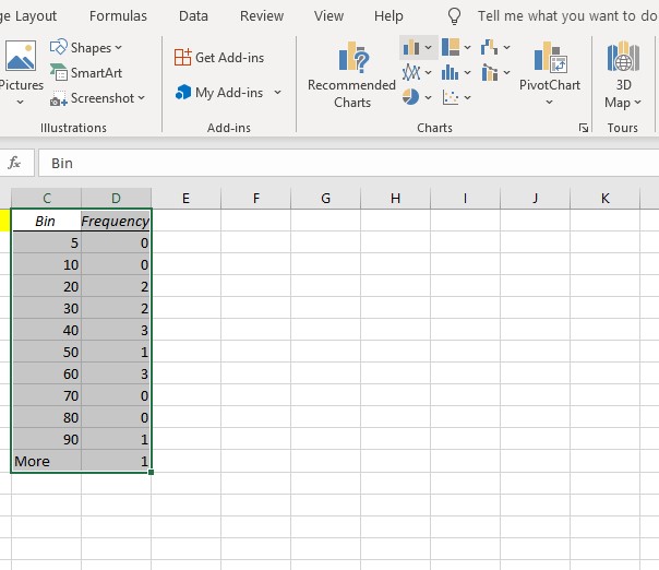
Now you can use the frequency list and bins to make a chart. Just mark those two columns, go to the Insert tab, and click Insert Column or Bar Chart (2D column).
Follow our ultimate guide if you want to know how to post Bank Statement in Excel to Quickbooks.
Conclusion
In this article, you have learned about Histograms in MS Excel. I hope you have made a histogram chart and adjusted the value and range of the bin while going through the procedures described here.
With the way the bins are designated, the built-in histogram approach will likely require the most time to become accustomed to. Depending on the method chosen to generate the histogram, some formatting and customization options may be more or less flexible.