When you create a bar graph on Microsoft Excel, you may have one of the bars being shown at a higher level because of a very large value than all the other bars in the graph. This makes the other bars look tiny compared to the taller one and it becomes harder to compare them with each other.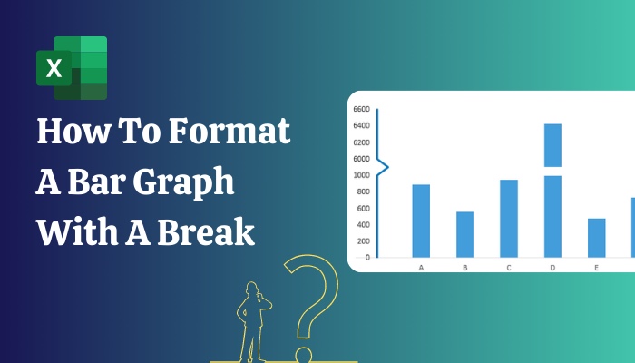
If you are in a similar situation, then this guide is for you. Because here we will teach you how to add a break on your bar graph in the easiest way so that the bars look closer to each other.
So stick to the end to learn how to edit a bar graph with break in Microsoft Excel.
What Is A Bar Graph Break In Microsoft Excel?
In simpler words, it means to split and take away any part from the middle of the axis and joining the lower and the upper parts together.
So, breaking the axis on bar graph brings the higher and lower values closer.
The axis may have consecutive values but at a break, since the value is discontinued, the next value is a higher one.
The break on the axis of a bar graph is usually visualized by an empty space, dotted line or wavy line between the non-consecutive values and the visualizations also appear on the respective bars in the graph.
So, by now, you must have realized why you should add break in the axis of your bar graph if your values deviate from each other by a lot.
If you are still curious, the reasons why you should do this are briefly explained in the next section so that you can give them a look to understand them. Then, learn about the process of how to add the break on your bar graph on the latter section.
Also read how to freeze panes in Excel easily.
Why Should You Add Break In Bar Graph?
Editing your bar graph in Microsoft Excel becomes a necessity when you have highly deviating data in your graph. This makes some of the bars way higher than the others and that is why, to bring them closer for better functionality of the graph, a break is added on the axis.
You can benefit much by adding a break in your bar graph when it is needed.
- Adding break makes your data seem more relevant to viewers.
- It brings the bars closer to each other, making it easier to compare them.
- Not having a break reduces the functionality of a bar graph. There is no point to it if you cannot compare the data.
- Unnecessary empty spaces on your graph is removed.
- It preserves the aesthetics of the bar graph.
These are enough cause to break the axis of your bar graph when you need to and the way of doing it is explained in very simple words on the following section.
So, go through it and learn to add break to the axis of your graph.
How To Add Break To Bar Graph In Microsoft Excel
In Excel, formatting the axis of a bar graph with a break is a bit intricate since there is no tool that allows you to directly do this. So, you’ll have to edit it in your own way using already existing tools. There are a few different ways to approach this. The easiest one is discussed here.
This process is probably the simplest and also the quickest way to approach your issue of other bars being way shorter than the very tall one in a graph.
Follow these steps to know how to format a bar graph with a break in Excel:
1. Plan on Where to Put Your Break
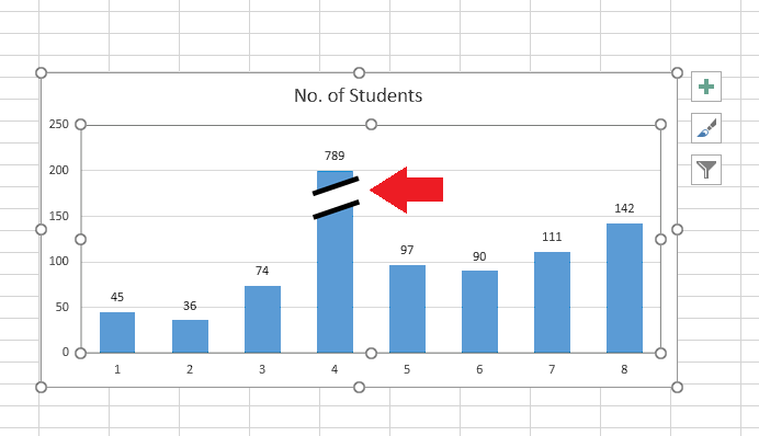
If you see that most of your bars on the graph are very short due to one or more bars being too tall, you have to decide on where you want to break the axis.
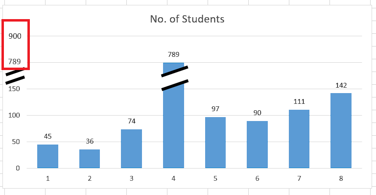
You should pick a point for break that is closer to the top of the tallest shorter bars.
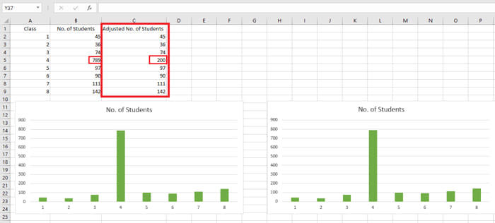
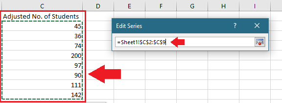
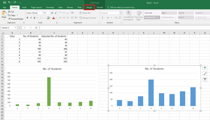
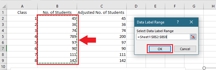
For example, on this graph, the highest value is 789 on the 4th class. The level closest to the top of the short bars is 200. So, I can convert 789 to 200 in this graph, which will result in other bars to become taller. 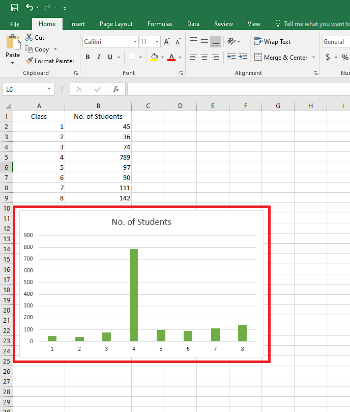
Quickly visit the links to find out how to freeze a row on Excel easily.
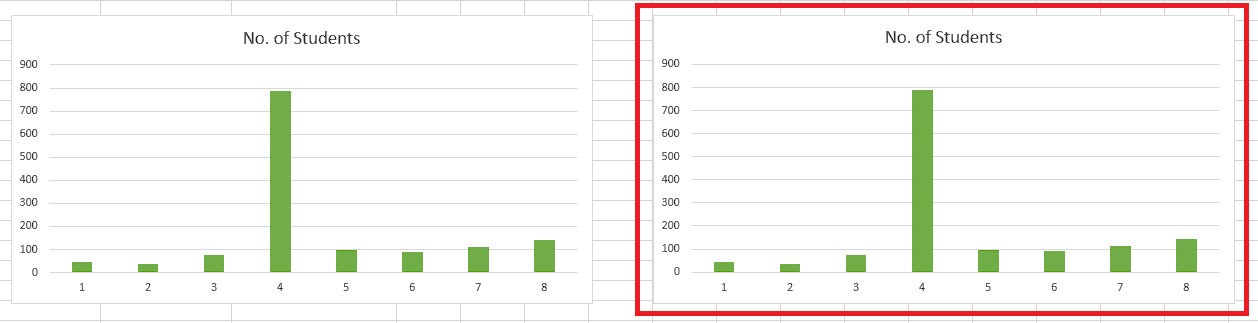
2. Duplicate and Edit the Graph
After you have planned out your break, you will create a duplicate graph and put in some edits that will change the height of your bars.
Here’s how you can duplicate and edit your graph:
- Click on your graph.
- Press Ctrl + C.
- Paste the graph beside the original one using Ctrl + V.
- Create an adjusted version of your original chart, changing the highest value to your planned one.
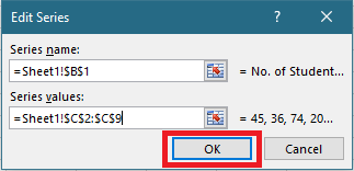
- Right-click on any bar of the newly created graph.
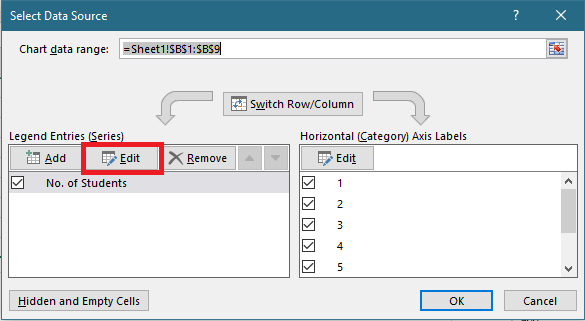
- Click on Select Data.
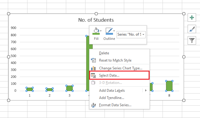
- Select Edit under Legend Entries (Series).
- Clear Series Values.
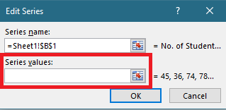
- Select the adjusted chart portion into Series Values.
- Click on OK.
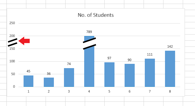
You will now see that the difference in height of the bars have been reduced. You still have more edits to do.
3. Enter Data Labels on Your Bars
Now that you have your new graph, you have to edit how it looks. Follow the process of changing it appearance:
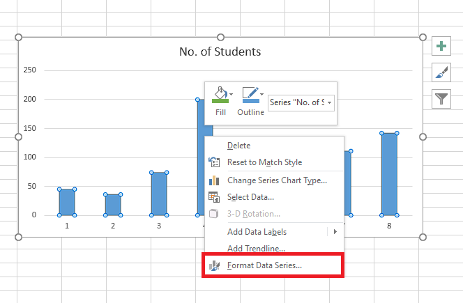
- Right-click on any bar of the new graph and select Format Data Series.
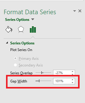
- Reduce value of Gap Width to increase bar width.
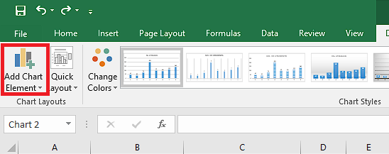
- Click on your new graph.
- Go to Design tab under Chart Tools.
- Select Add Chart Element.
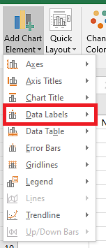
- Choose Data Labels.
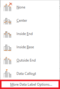
- Click on More Data Label Options.
- Check Value From Cells option.
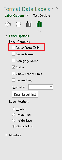
- Copy the original chart portion and click on OK.
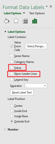
- Uncheck Value and Show Leader Lines options from Format Data Labels pane.
Your original values are now entered as labels onto your new chart. Now to form the break on the tall bar.
Follow our ultimate guide if you want to know how to post Bank Statement in Excel to Quickbooks.
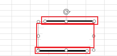
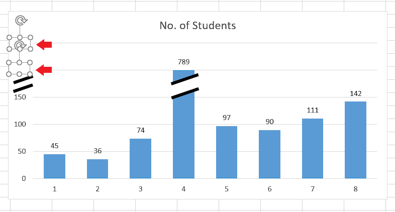
4. Create Visualization Shape for the Break
Next, you need to create a shape to actually show your break on the bar. This is how you can make shape for break:
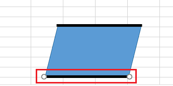
- Go into Insert tab and choose the Parallelogram under Shape.
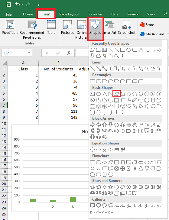
- Draw it on the sheet.
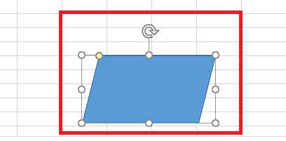
- Choose Line from Shape again.
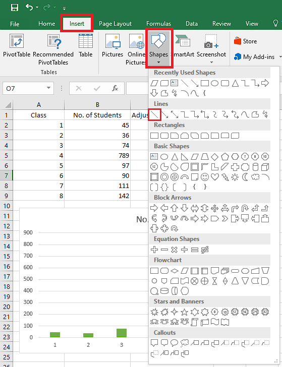
- Draw it along the upper part of the Parallelogram.
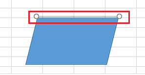
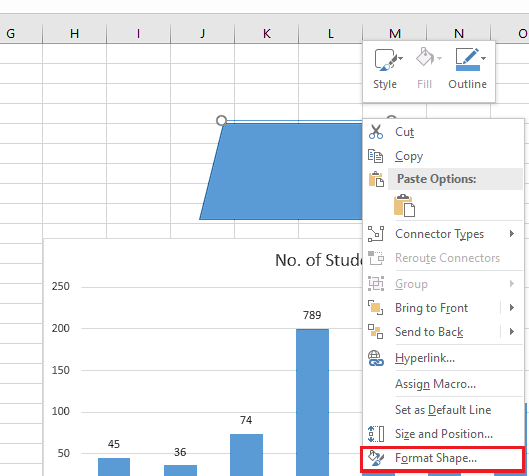
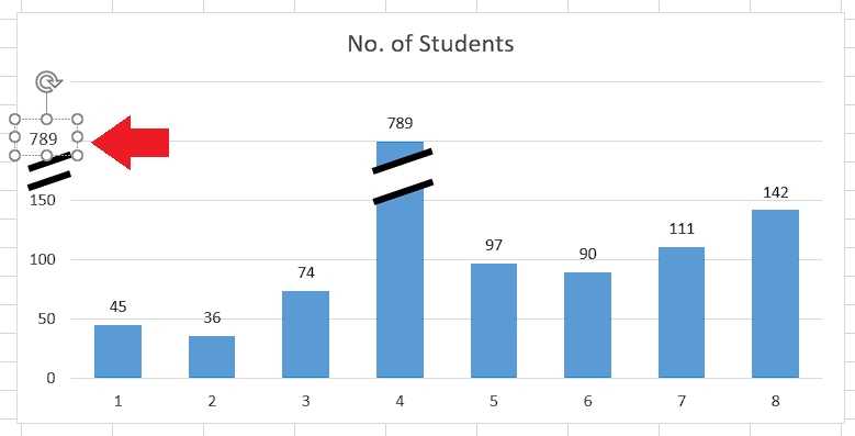
- Right-click on the Line and select Format Shape.
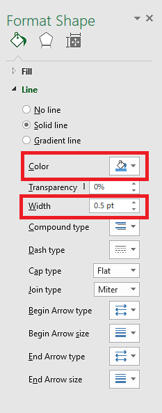
- Change the Width and Color according to your preference.
- Use Ctrl + C and Ctrl + V to copy and paste the line along the bottom part too.
- Click on the Parallelogram and go to Format under Drawing Tools.
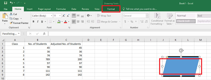
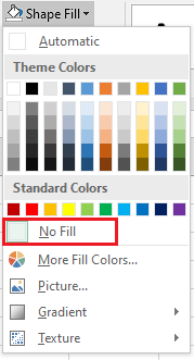
- Go to Shape Fill.
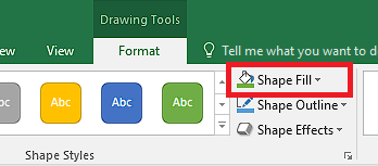
- Choose the white color.
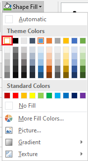
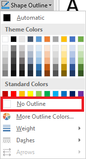
- Go to Shape Outline.
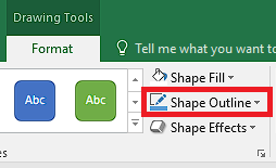
- Select No Outline.
- Use Ctrl button to select all your shapes together.
- Right-click on your shapes and select Group option.
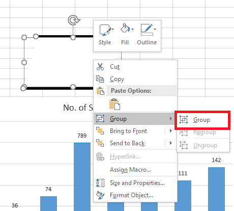
- Resize, rotate and reposition your shape onto the tall bar.
- Copy and paste the shape onto the axis too.
Your break will now on your bar and also your axis. All that is left is to break the axis by creating new label.
Also read how to shade every other row in Excel.
5. Break the Axis
You now have to add a label on the axis to match the value of your tall bar. Go through this process to add new label on your graph’s axis:
- Add more Rectangle shapes from Insert tab with white fill to block out the labels after the break.
- Choose Text Box in Insert tab.

- Type the value of the topmost bar and move the Text Box in respective positon of the label.
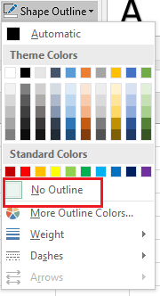
- Select No Fill from Shape Fill.
- Choose No Outline from Shape Outline.
- Similarly fill the rest of the labels.
After you have gone through all the steps in this guide, you will now have successfully created a break on the axis of your bar graph. You can now replace the old graph with the new one. 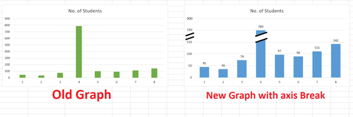
Find out how to randomize a list in Excel.
Conclusion
Although there isn’t a direct tool for creating a break on the axis of your bar graph in Microsoft Excel, you can get it done without any effort using the formatting tools that are present in this resourceful spreadsheet app.
The process in this guide is the easiest way to format your bar graph with a break in Excel. So go through it step-by-step to add a break on your graph’s axis.