Imagine your employer wants you to make a Power BI report where the reader can view both overall and individual sales based on different time frames. For that, you can make separate data models for each aspect or employ different filters manually.
Or, instead of those manual labors, you could just use slicers, which is basically an advanced and intuitive visual filter. But how?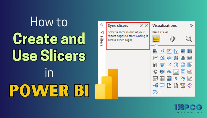
On that note, let’s dive into this article and discuss how you can create and use slicers in Power BI.
What are Slicers in Power BI?
In Power BI, slicers are basically interactive visual filters that allow users to filter values displayed on the report page. It is not as complicated as DAX filters but not as simple as typical filters either. The option/icon to add these slicers is located in the Visualizations section.
By using such filters, users can select the type of values they’d like to view in the report visualization page.
For example, suppose we added a slicer with two different years as data range. Whenever you click on any of the years, the report page will show the specific values from a specific time frame.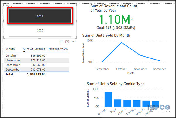
Now, you might be wondering how a slicer works in Power BI.
Well, under the hood, when you click on a field from the slicer filter, it scans the columns in your data set and displays the unique values corresponding to/specified by the said filter.
In short, it narrows down the portion of data that is displayed on the report page from the semantic model based on the selected data range.
Benefits of Using Slicers in Power BI
Since the slicers are primarily visual filters, the benefits of using one in Power BI live and die with the dashboard. Furthermore, the usefulness of such a feature varies based on your use case.
Nonetheless, this type of filter has its own benefits, as it tremendously helps in making a dynamic report with better comprehension.
Here’s why slicers are important in Power BI reports:
- Helps the presenter to display important or commonly used values in the report canvas.
- Easily hide the unnecessary column/data and only show the currently needed values.
- Turn a basic report page into a dynamic one suitable for focused viewing.
- Allows users to check the currently filtered state directly from the dashboard without having to go through the drop-down filter list.
These benefits should also give you an idea of why you should use slicers in Power BI.
Not to mention, the slicer syncing feature in Power BI is a neat way to quickly sync up all the report pages with the filters created on a single page, effectively removing the manual workload. But more on that later.
Right now, let’s get into our main topic.
How to Create and Use Slicers in Power BI
The process of setting up a slicer in your report is both easy and tricky at the same time. The slicer-adding part is easy, as it’s quite similar to adding a visual. But the Power BI data modeling part is a bit tricky.
Below, I have thoroughly addressed all the crucial aspects that need to be followed to add a flawlessly working slicer.
Here’s how to add and use slicers in Power BI:
Step 1: Create a High-Level Report Page and Data Tables
Before adding a slicer, the first thing you need to do is import data sets and make a report page with intuitive visuals. While doing so, ensure that the table columns contain proper values correlated to the slicing filter you want to implement.
For example, if you want to create a date slicer(we’ll discuss the different types of slicer later on), you have to make sure that the Date column in your data set includes every single date within the time frame.
To elaborate further, let’s take a sales report as a sample. 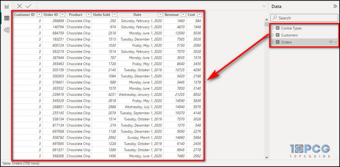
Here, we have three tables containing everything related to the sales of different types of cookies. Not to mention, all the tables have co-related values and columns, along with established relationships between them.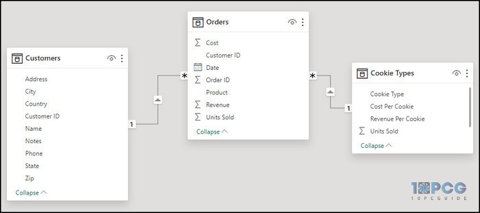
From those data sets, we’ve created a few dashboard visuals, like the sum of revenue, the sum of units sold, etc. We’ve also positioned them properly within the dashboard and left a space to add a slicer field. 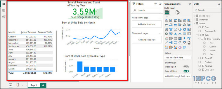
To learn how we generated these visual report cards, check out our extended tutorial on the Power BI dashboard.
Step 2: Add a Slicer
After you’ve done setting up your report page, you can start creating slicers in the canvas. Here’s how:
- Click on the Report view icon from the left side pane.
- Select the Build Visuals option from the Visualization section.
- Click on the Slicer icon and position the slicer field on the dashboard according to your preference. FYI, don’t select the Slicer(new) icon; that’s a different one.
- Drag and drop the desired column into the Field. You can add multiple columns in the Field based on your needs.
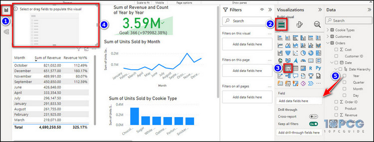
This column will be used as the filter, and the slicing will be done based on that data.
Is it a bit complicated? Well, let me explain.
In our sample report, Power BI has automatically created a Date hierarchy from our corresponding column. If we expand the Date > Date hierarchy from the Data section, we’ll find the Year value as a newly created measure/column.
If we drag and drop Year into the slicer’s Field value, we’ll get the available years in the slicer, which are 2019 and 2020. 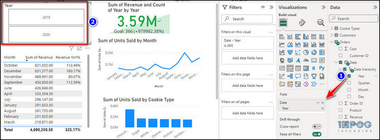
When we click on either of the years from the dashboard, the entire report page will be instantly modified to show the report/values for that particular year.
As we click on 2019, the sum of revenue, the sum of units sold, and all the other corresponding fields show data for 2019 only, which means we have successfully added a slicer.
How to Format Slicers in Power BI
After creating the aforementioned filter, you need to know how to change the slicer style in Power BI. By doing so, you can make the slicer more dynamic and user-friendly, which would increase the wow factor of your entire report.
To change the Power BI slicer design, you need to format it from the Format your visuals option in the Visualization section.
Let’s continue with our newly added slicer from the sample report and see how to format it:
- Click on the slicer field from the dashboard/report.
- Select Format Visual from the Visualization pane.
- Click on Visuals > Slicer settings > Options.
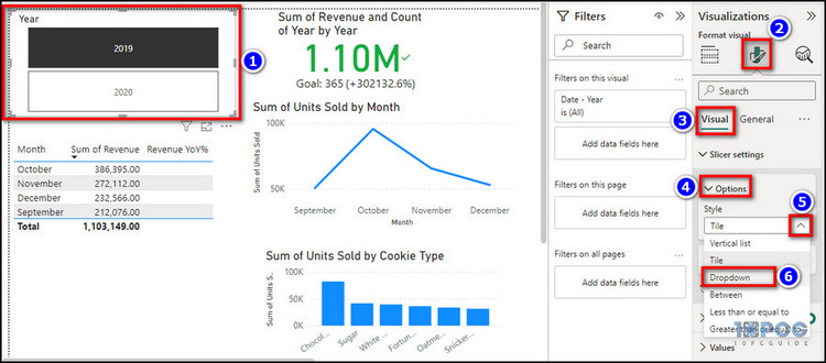
Let’s say we want to turn our tile-styled slicer into a drop-down one. To do that, expand the drop-down for Style and choose Dropdown. 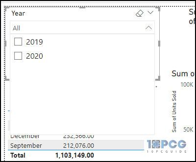
Voila! The slicer’s style in the dashboard will change into an expandable/collapsable menu.
You can further format the slicer by determining whether it’s a single-select or a multi-select option from the Selection section. You can also change the font size and other related slicer settings from the Values section.
Additionally, the General tab within the Format visual section offers a few valuable options to further customize the slicer field, like Properties, Effects, Alt text, etc.
These options are pretty self-explanatory, and how you’ll change those values entirely depends on your use case. Mostly, only changing the Style and leaving other options to their default settings should be enough.
That’s how you create a dynamic slicer in Power BI.
Types of Slicers in Power BI
Similar to different filters, there are a few types of slicers available in Power BI. Besides, each of the types has its own unique functions.
Here are different types of Power BI slicers with examples:
1. Drop-down Slicer
A drop-down slicer allows users to select a single filtering value from an expandable/collapsable list. Furthermore, the drop-down menu can be customized and have an arrow or plus/minus icon for opening/closing.
For example, here, we have a data set containing the cookie sales for 2019 and 2020. When we apply a drop-down slicer with the Date[Year] value, we’ll get a collapsable bar containing those two years.
2. Date Range Slicer
The date range slicer is mainly a filtering slider that gets added when a user selects a date column as the slicer value. This type of slicer uses the Between style from the slicer formatting.
To further elaborate, when we drag the Date column from the Data section into the slicer field, we can see a slider appear in the dashboard with two buttons at the end. The left button has the oldest, and the right button has the newest date value, like 1 to 30. 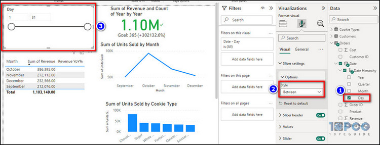
We can easily move either of those buttons throughout the slider to set a range and get the desired value in the dashboard.
For example, if we set the left slider to 1 and the right slider to 10, we will get the reports of the first 10 days of each month, and the values within each dashboard card will be adjusted accordingly.
3. Numeric Range Slicer
Just like the previously mentioned date range slicer, you can use the Between slicer style to get a slider for a specific data range. This slider also includes one higher and one lower-end button.
Dragging each button to different slider positions can set a numeric range, which will be used for visualization. Doing so allows you to inspect a specific range of values based on your preference.
Not to mention, all the visuals from the dashboard will change accordingly based on the numeric range you’ve specified in the slicer.
For demonstration, let’s drag and drop the product cost column into the slicer value field. After that, we can see a slicer field within the dashboard containing a slider with two ends. 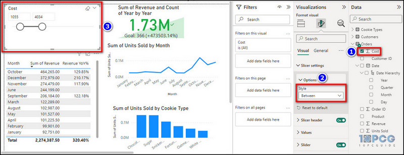
If we set the lower bound to 1055 and the upper bound to 4034, we will only see the corresponding reports for products with a price tag between 1055 and 4034 dollars.
Moreover, if you’re wondering why these cookies are so expensive, these are Apple cookies. Just kidding!
4. Hierarchy Slicer
A hierarchical slicer type is a must when you have to select subcategories within a parent category to filter out the visuals as per your preference. This type of slicer is the way to go when you want to create a slicer using multiple columns of a table.
After adding multiple fields to the slicer value, the slicer will bring up a chevron or an arrow for expanding. Clicking on the said arrow would make it act like a drop-down menu and display the filter items.
Let’s see an example for a better understanding of this filter type.
For the filter value, we will drag and drop the Year and Month columns from the Data section into the slicer’s value.
After doing so, we can see a new slicer field containing 2019 and 2020, each with an adjacent drop-down arrow. The two years are actually the top-level item for filtering. If we expand 2020, we’ll find 12 months of the year and small square boxes next to them.
Say we select the square box for January and see what happens. 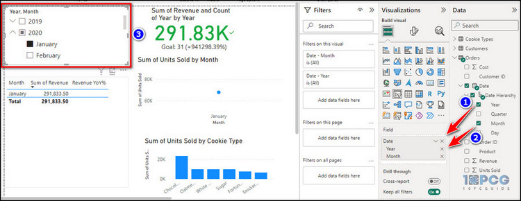
Predictably, the visuals within the report page have been modified automatically, and the dashboard cards only show the sales values that occurred in January 2020.
5. Sync-based Slicer
As we’ve created all these four types of slicers on a single report page, what can we do to apply them throughout other pages?
That’s where the slicer syncing comes into play. Enabling this feature will sync all the visuals from the report to make them act according to the applied slicer regardless of the page.
To use the slicer sync option:
- Go to the View tab and click on the Sync slicers option.
- Select the pages where you want to apply the slicer from the Sync slicers pane.
- Click on the refresh icon or expand the Advanced options and make the changes accordingly.
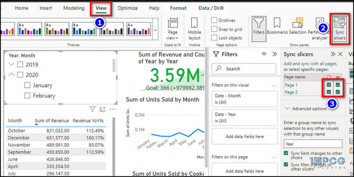
After you’re done, you’ll see all the visuals from other pages were modified according to the slicer added to the original page report.
For demonstration, I’ve added a Page 2 to my Power BI report, along with necessary data modeling & visualizations. Adding the page to the Sync slicers pane conveniently changed all the displayed values for the Page 2 based on the slicer from Page 1.
Additionally, all the slicer fields added to the dashboard are completely resizable and repositionable, regardless of the slicer type.
Limitations of Slicers in Power BI
Although the slicing filters are quite intuitive when it comes to visualizing a report, they have their own limitations. Similar to drill-through or DAX functions in Power BI, the aforementioned visual filter only works in certain scenarios.
Here are some of the limitations of Power BI slicers:
- Drill-through is not supported in slicers.
- Slicers have no support for input fields.
- Slicer filters can’t be pinned to the dashboard.
- No support for visual-level filters.
- Time zone information needs to be converted by Power Query before you can use it in a slicer.
- No support for calculated measures.
- Only row-level filtering is supported by numeric range slicers.
- Unable to deal with aggregated values.
- Certain filters created with the Power BI desktop app can’t be used in the Power BI service—for example, the numeric range slicers.
That being said, these slice-and-dice filters are still quite useful when it comes to making a cool and dynamic summary page.
Last Bit
Whether you want to make a Power BI report for business or corporate reasons, implementing a slicer into the dashboard can turn a simple summary page into a lively one. So, if you want to impress your boss and colleagues, this guide is definitely your best bet.
That’s all there was to say! Feel free to check our website to learn more about Power BI or any other Microsoft service.
Have a great day!