The first thing you see after opening a Power BI datasheet is the dashboard. It’s a big white window that is waiting patiently for the magic of an artist.
You can play with the data as you wish and give it an insightful touch. The dashboard is the perfect place to visualize the information and show one’s creativity.
It is available on Power BI desktop, mobile, and web versions. And here, I’ll show how you can create a dashboard from scratch on every available platform.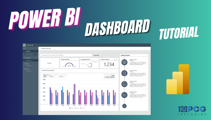
So, let’s begin.
What is Microsoft Power BI Dashboard?
Microsoft Power BI Dashboard is the collective version of reports. It is a single page that visualizes multiple information on your datasheets.
Power BI Dashboard is created to provide a quick and easy overview of the essential data in one window. They are used to track key performance indicators (KPIs), monitor trends, and identify the necessary changes.
Things to Do Before Creating A Dashboard on Power BI
Creating the dashboard starts with importing the data and modeling relationships. It works based on the provided data. Generally, it’s imported from external sources, such as Excel worksheets.
But, it doesn’t always find relationships between the data or detect the data type. As a result, it may become hard to create a Power BI dashboard.
Therefore, you must prepare the data for making a dashboard by formatting and modeling the data after a successful import.
Here are the steps to import and model the data for the Power BI Dashboard:
Importing Data
To make a Power BI dashboard, you must begin by importing the data file. Microsoft Power BI supports various types of data, and they are:
- Excel Workbook
- Text
- CSV
- Power BI datasets
- SQL
- Dataflow
- Dataverse
Excel Workbook, Text, CSV, and Power BI datasets are the most popular methods. The following procedure will show the way to import data in Power BI.
Here is the way to import data in Microsoft Power BI:
- Open Power BI desktop or web version.
- Press on Get data from the ribbon.
- Select a data source and click on Connect.
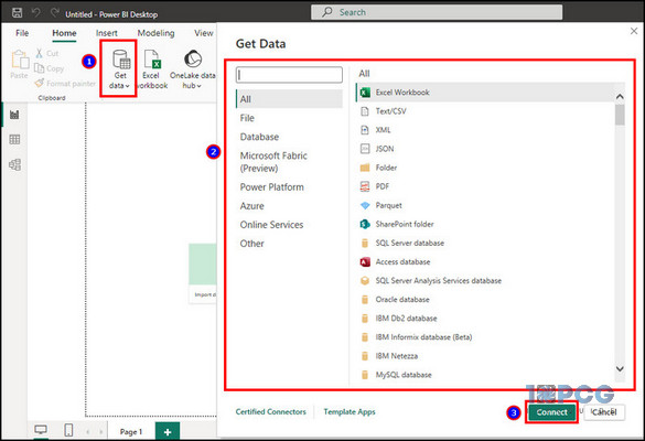
- Press on the file and Open.
- Choose the Data and click on Load.
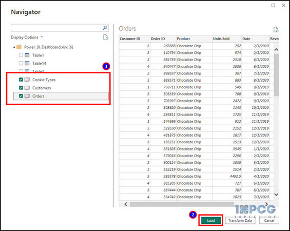
You can select the Transform Data option if you need to change anything in the datasheet.
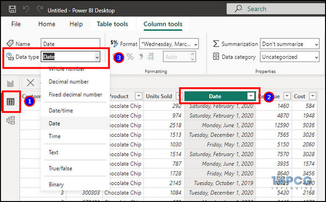
Formatting Data
The Table view from the left pane allows you to format the data type of the tables. It works similarly to the Transform Data option.
For example, you can change from text to date to correct the data formatting.
Follow the process below to format the data:
- Press on the Table view from the left pane.
- Click on the column.
- Press on the Data type from the ribbon.
- Choose the correct data format.
After setting the accurate format, you should check the Model view tab to finalize the datasheet for visualization.
Modelling Data
The Model view tab is used for data modeling in Power BI. You can create relationships between tables from here.
Power BI automatically creates the connection when the automatic relationships are enabled from the settings.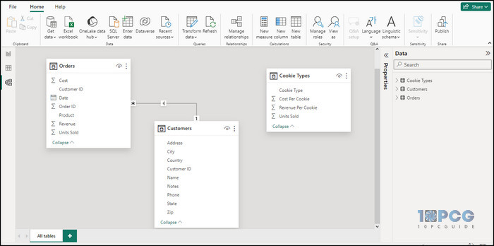
You can also manually define new relationships from the Model view to connect the complex data efficiently.
Visualizing Data in Microsoft Power BI Dashboard
Visualization is the main part of creating a Microsoft Power BI dashboard. It will transform your selected data and visual method into an insightful window.
There are various visualization methods, such as line chart, bar chart, pie chart, slicer, table, map, card, etc. You can also include custom and complex calculations in the data visuals.
Every visual method has a different use and purpose. The following passage will describe the importance, how to add, and the best use cases.
Here are the visualization methods to create a Power BI dashboard:
Add Bar or Column Chart
Bar charts are effective for comparing different categories of data and highlighting the relative magnitudes between them.
In my test datasheet, I’ve taken data from Cookies Type and Units Sold and visualized the raw data using a bar chart. I’ve used the Stacked column chart. But Stacked bar chart, Clustered column chart, and Clustered bar chart will also do the work.
Here are the steps to add a bar or column chart in the Power BI dashboard:
- Select the data from the right pane.
- Choose a bar or column chart from the Visualization tab.
- Resize the bar or column chart tab.
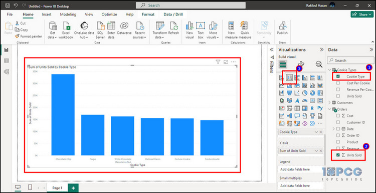
It automatically identifies the X and Y axes for the chart and writes the horizontal and vertical legends.
Insert Line Chart
Line charts are useful for tracking trends and changes over time. It showcases patterns and fluctuations of the data.
Take a close look at my datasheet. I’ve selected the Month and Units Sold to calculate the Sum of units sold by Month using a line chart.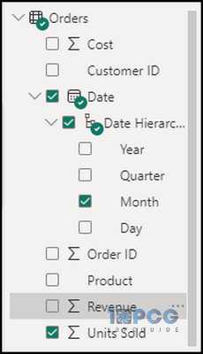
Follow the procedure below to insert a line chart in Power BI:
- Choose the data from the right pane.
- Select Line chart from Visualization.
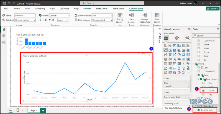
It’s better to choose the preferred chart type after selecting the data. This way, Power BI will put the X and Y axes into the correct pattern.
Include Pie Chart
The pie chart demonstrates the relative contribution of different categories and shows the percentage of a whole.
For example, I want to demonstrate the revenue percentage by cookies. Therefore, I’ve selected the Cookies Type and Revenue data to get the desired outcome.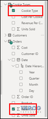
Read the following steps to add a pie chart to the Power BI dashboard:
- Select the information from the Data.
- Choose a Pie chart from Visualization.
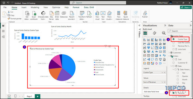
It will automatically create the pie chart and show the percentage of revenue along with the amount by each cookie.
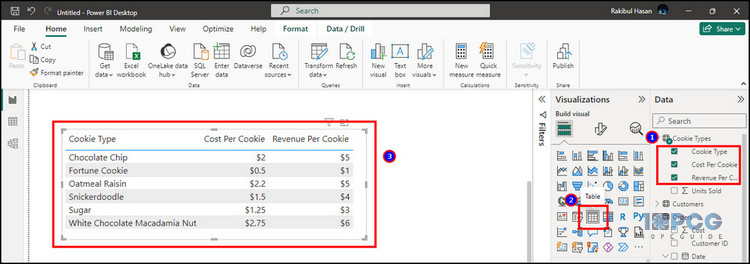
Add Table
The table provides information from the selected data and shows them in columns and rows. Some data provides better visualization in the table.
Such as production cost and revenue for each cookie in my test datasheet. I can clearly see the expense and earnings for every cookie from the table by selecting Cooke Type, Cost Per Cookie, and Revenue Per Cookie.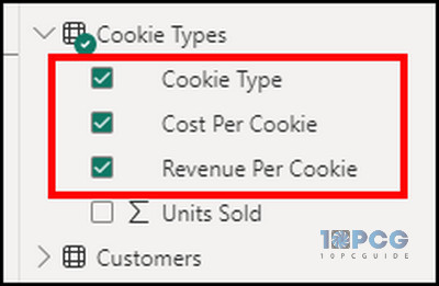
Here is the way to add a table in the Power BI dashboard:
- Check the box beside the data to select the information.
- Click on Table from the Visualization tab.
Include Scatter Chart
Scatter plots are useful for exploring relationships between two variables. It reveals the correlations and patterns in data distribution.
To show you an example, I’ve included the total revenue and units sold data by cookie type to show their relation in a scatter plot.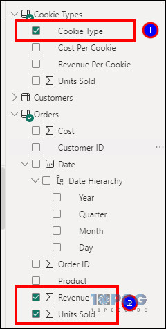
Read the process below to use scatter plot in the Power BI dashboard:
- Check the box beside cookies type, revenue, and units sold.
- Choose Scatter chart from Visualization.
It will show you dots in a chart where the X and Y axes contain the Sum of Revenue and Units Sold, respectively.
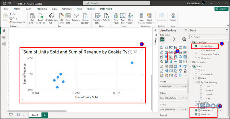
Insert Map Chart
The Map chart provides geographically distributed information from the data. It requires address, city, or country information to locate the area.
In my test data, I’ve customers from five different cities across the United States. I can place their address on an interactive map to show their precious location. All I need to do is select the customer name and the city.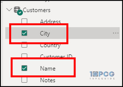
Follow the procedure below to include a map chart in the Power BI dashboard:
- Select the name and the proper address from the data.
- Choose Map from the Visualization tab.
- Zoom in to show the information.
The more accurate your address is, the better location it will provide. The map chart is very helpful for understanding the distance and geographic situation.
Include KPI Chart
KPI or Key Point Indicator highlights the dashboard’s most extraordinary data or target value.
I have a revenue target each year, and I’ve featured it in my test dashboard by selecting the Year and Revenue data.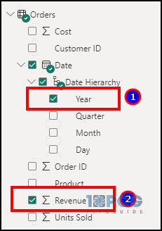
Follow the process below to add a KPI chart in the Power BI dashboard:
- Select Year and Revenue from the right pane.
- Choose KPI from the Visualization pane.
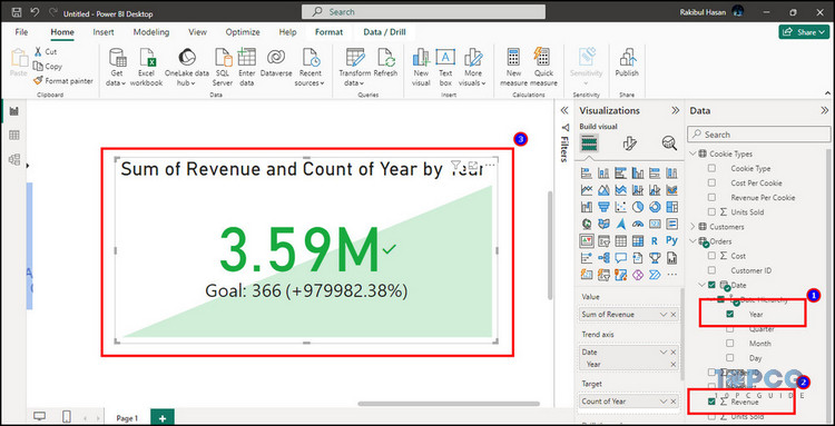
The KPI can be different for each company. Some may choose Total sale, and others may prefer units sold.
Insert Quick Measure Calculation
The Quick Measure Calculation is an efficient way to create measures without writing the Power BI DAX formula.
I can include Year-to-date total, Month-to-date total, or Year-over-year change very quickly by adding a quick measure. I’ll include the Revenue YoY% in my test table.
Here is the way to include Quick Measure Calculation in the Power BI dashboard:
- Select Month and Revenue from Data.
- Press on Quick measure from the ribbon.
- Click on Year-over-year change from the calculation.
- Select Revenue in the Base value.
- Choose Date in the Date value.
- Click on Add.
- Select Revenue YoY% from the right pane.
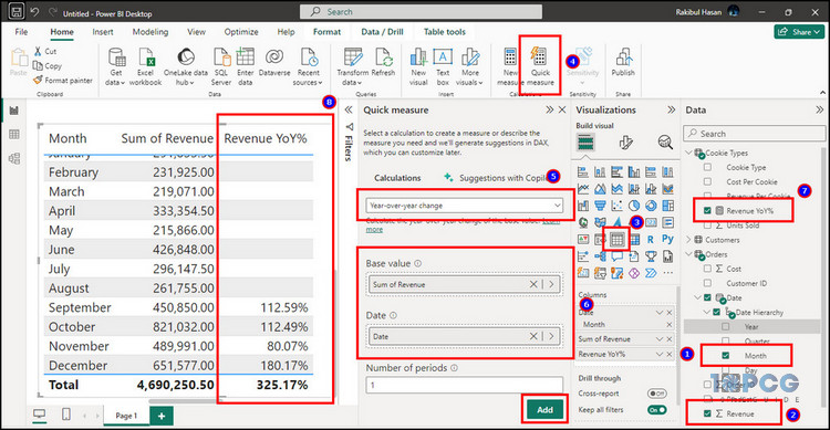
The newly added Revenue YoY% data will be added to the table.
Add Q&A
Q&A is a great way to find the answer from your data efficiently. It’s especially helpful when working with a complex dataset.
If you ask a related question or information about the data, it will deliver the exact answer in your Q&A window.
For example, I want to see the total revenue in 2020. All I need to do is just type the question in the Q&A box.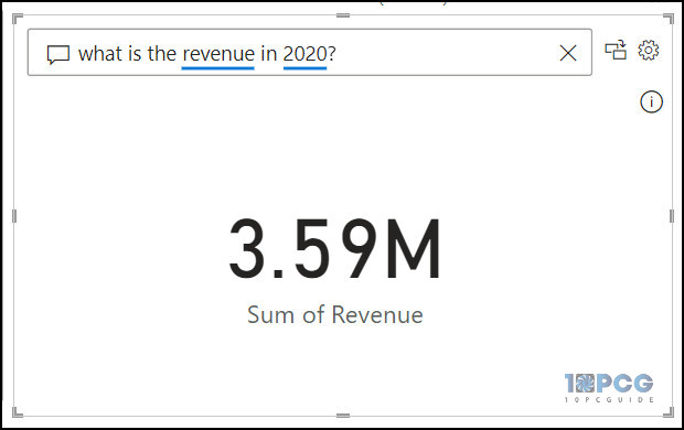
Now, let’s make it a bit more difficult. I want to see the total revenue for chocolate chips in 2020. After writing the question, taa-daa! The answer is here!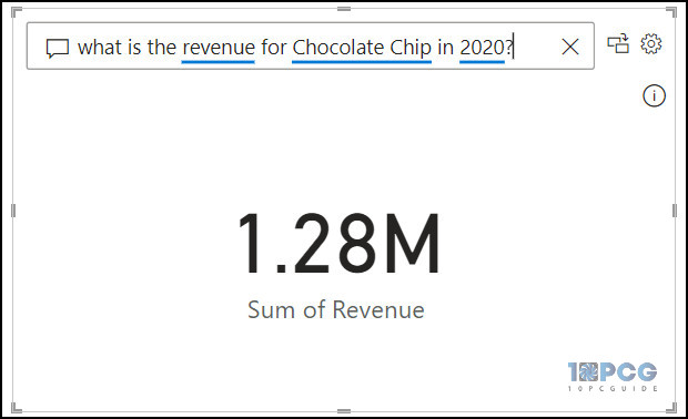
Read the process below to add a Q&A option in the Power BI dashboard:
- Click on Insert from the top ribbon.
- Select Q&A and place them on your dashboard.
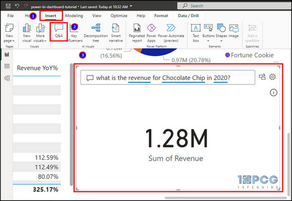
You can type any question about the data, and the artificial intelligence will work immediately to provide results. However, a red mark will appear under the text if you ask questions outside the data.
Insert Slicer
The Slicer is a visualization method that interactively filters data displayed on a Power BI dashboard.
Let’s say I want to check the Sum of Units Sold in 2020. In that case, I’ll choose the Year from the data and include a Slicer filter.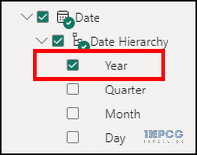
Follow the process below to add a Slicer in the Power BI dashboard:
- Select Year from Data.
- Choose Slicer from the Visualization tab.
- Click on the year to filter the dashboard data.
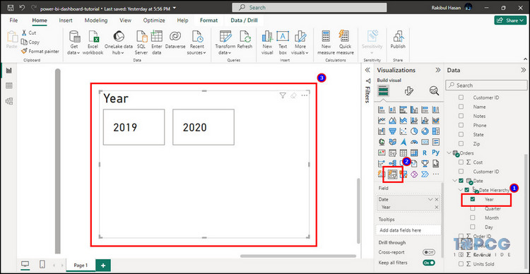
When I click on 2020, the dashboard will deliver the data only for the selected year.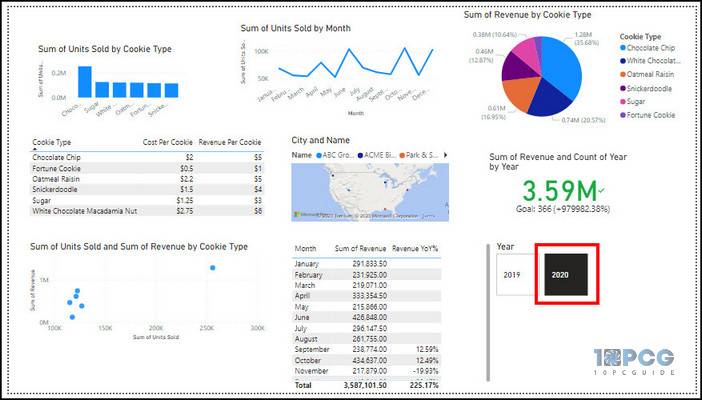
Now, take a look at the results for 2019 to find the changes.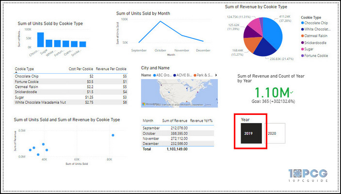
Similarly, you can add the slicer filter for name, month, city, etc.
All the above visualization methods let you freely choose your preferred design and insert it in the dashboard. After including all the above visualizing options in my test dashboard, here’s how it looks.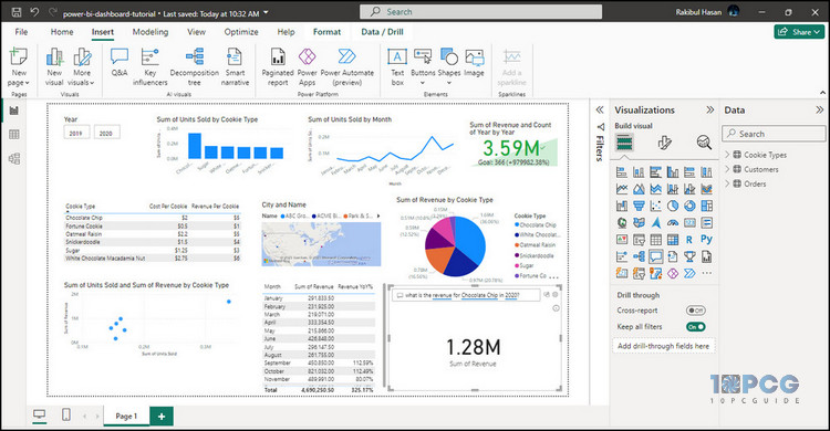
We did manage to include the information correctly. But it’s not the end of the dashboard tutorial. I will show you all the advanced methods to customize the dashboard and improve the appearance.
How to Customize Microsoft Power BI Dashboard
Microsoft Power BI dashboard is easily customizable to give a professional appearance. You can change the visuals to adjust the size, font, and color. It allows you to update the tile settings, pin the report to the dashboard, and change the theme to enhance the visualization.
The customization totally depends on your choice. You can keep it as it was or improve the size and colors to make it look better.
Here, I’ll show you how to do a Power BI dashboard design. So, you can follow the procedures to alter as you wish.
Here are the ways to customize the Microsoft Power BI dashboard:
Change Visuals
The visual settings come under the Format visual option in Visualization. It allows you to change the selected reports’ font, color, size, etc.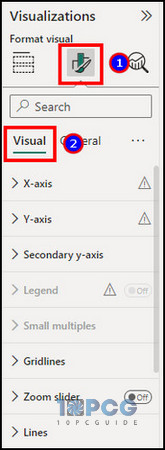
Here are all the settings you can get from Visuals:
| Option Name | Description |
|---|---|
| X-axis | Changes font, color, and height of horizontal text. |
| Y-axis | Alters font, color, and height of vertical text. |
| Secondary Y-axis | Modifies secondary Y-axis range. |
| Legend | Changes position, font, color, and title settings. |
| Small multiples | Alters small multiple settings. |
| Grid lines | Modifies style, color, and width of the grid line. |
| Zoom slider | Enables zoom slider for Y-axis, Slider labels, and Slider tooltips. |
| Columns | Changes column color and spacing. |
| Data labels | Includes data labels on graphs and charts. |
| Plot area background | Changes backgrounds of the report. |
For example, the visual options for tables will be entirely different from a column chart.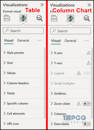
Add Title
In the General settings under the Format visual, you will find the option to change the Title and Subtitle, including their divider and spacing settings.
These options are known as Tile settings in the Microsoft Power BI web version.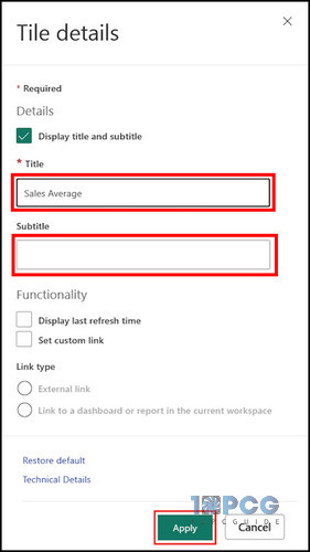
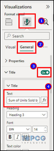
Power BI automatically sets a title for a report based on the available data. You can change and give them a more professional name.
Follow the steps below to add a title for the Power BI dashboard report:
- Click on a report.
- Navigate to Format visual > General from the Visualization tab.
- Enable and expand Title.
- Type the Title name.
- Customize the font and color.
Similarly, you can add a Subtitle under the title to provide additional information about the dashboard report.
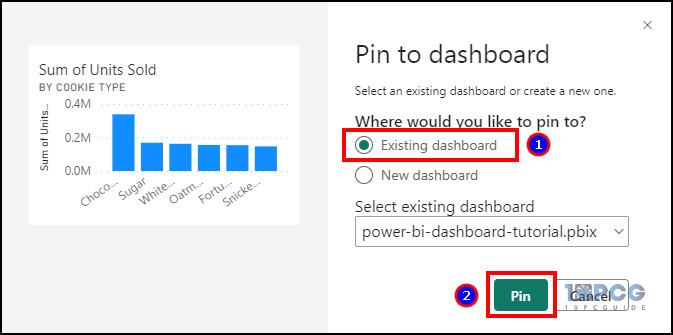
Pin to Dashboard
Like a report or seems very important? Then simply pin it on the dashboard!
The Pin to Dashboard feature is exclusively available for the Microsoft Power BI web version. You can pin a selected report by following the process below.
Here are the steps to pin a report on the Power BI dashboard:
- Go to the Power BI web version.
- Click on the report.
- Press the Pin button.
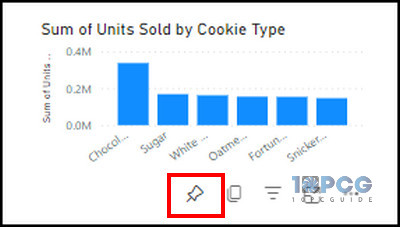
- Select Existing dashboard and click on Pin.
Change Theme
Theme is an efficient but excellent way to enhance the appearance of your dashboard. It changes the color of the elements under the report that can easily be distinguished from others.
Follow the procedure below to change the theme of the Power BI dashboard:
- Go to View from the Power BI ribbon.
- Expand the Theme option.
- Choose a preferred theme.
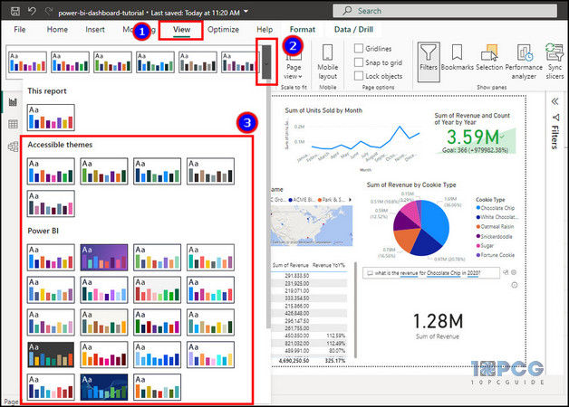
Themes will change the reports and the dashboard’s font, color, and background.
How to Create Mobile Layout for Power BI Dashboard
Power BI is available for both PC and mobile. The default layout works for Power BI desktop and web versions. But for the mobile screen, you must customize and rearrange the layout.
Here are the steps to create a mobile layout for the Power BI dashboard:
- Press on the Mobile layout button from the bottom.
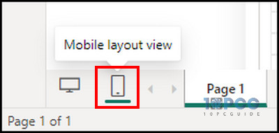
- Drag the reports from Page visuals and drop them inside the mobile view.
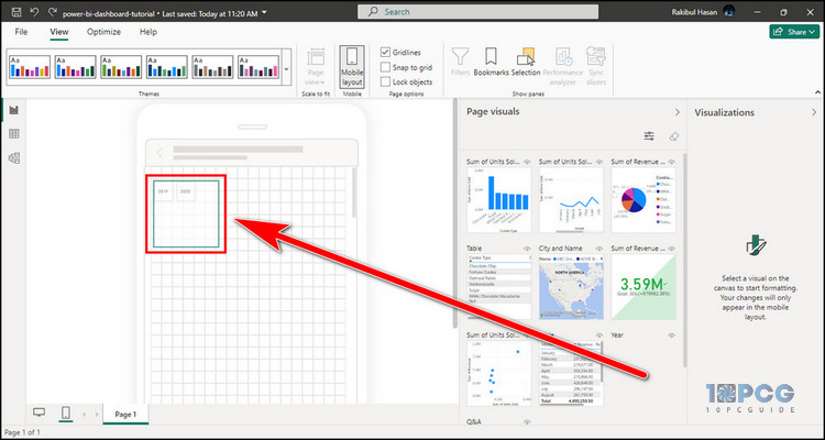
- Rearrange their position and size to fit the screen.
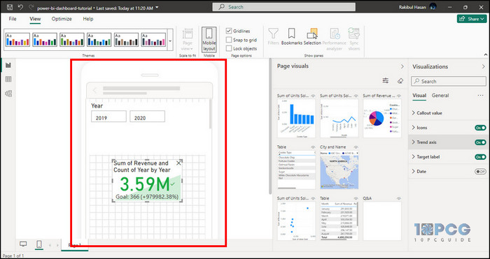
Now, when you open the project using a mobile application, the dashboard will appear as a mobile layout.
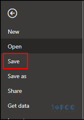
After completing the Power BI dashboard, it’s now time to save in your local storage and share it with others.
If you don’t save the project, the dashboard you’ve made will disappear after closing the application. Consider reading the following procedure to learn the way.
Here is the procedure to save the Power BI dashboard:
- Press on File from the top ribbon.
- Click on Save.
- Choose the location and enter the name.
However, if you want to share it with others or within your organization, it’s better to store it in OneDrive and share the link with everyone.
Follow the process below to share the Power BI dashboard:
- Click on File and press Save As.
- Select OneDrive.
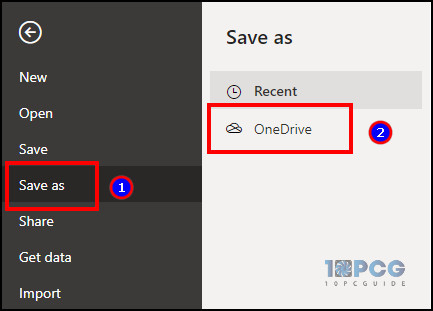
- Press on Save.
- Go to File and click on Share.
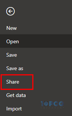
- Press on the Copy link and share with others.
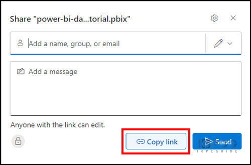
Now, the person with the OneDrive link can download and see the Power BI dashboard.
Download the Power BI Dashboard Template
I’ve included all the above methods in my test Power BI dashboard. You can download the Power BI dashboard template for free and try all the reports.
Download the Power BI Dashboard Template »Power BI Dashboard Examples
I’ve added some unique and creative Power BI dashboards as an example. You can check the example and use the above methods to create a similar project.
Here are the examples of Power BI dashboard:
Store Sales Overview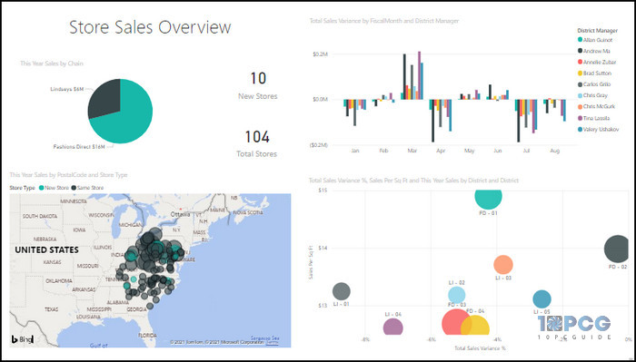
Sales and Marketing Sample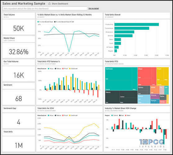
Market Share Dashboard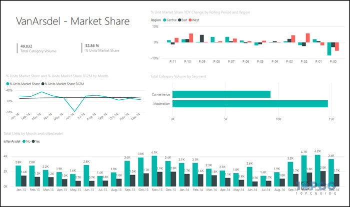
Trend Analysis Dashboard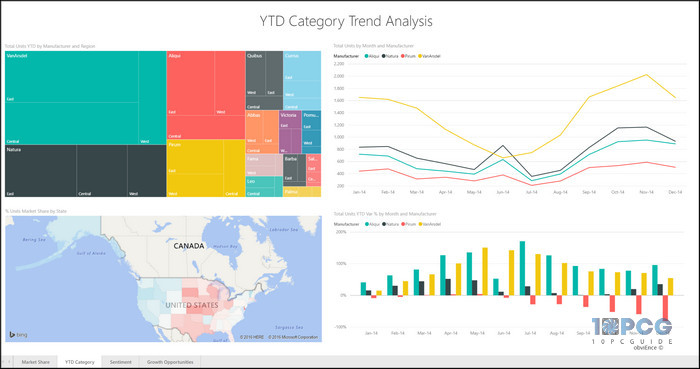
Sentiment Analysis Dashboard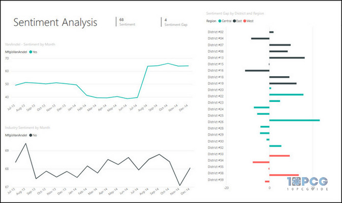
Growth Opportunities Dashboard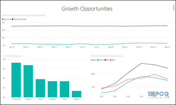
Ending Note
The dashboard is a must for every Power BI project. It gives a perfect visualization and quickly filters the data that is necessary for you.
You can follow the above tutorial and example to build an amazing and productive Power BI dashboard.
I hope you’ve found the article helpful and informative in creating a Power BI dashboard. Cheers!