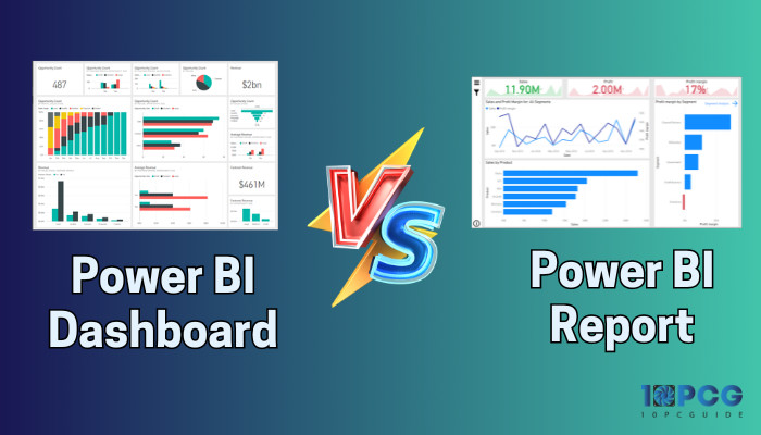
In Power BI, dashboards and reports are two key items, and many users don’t know the comparisons between them. As a power user, if you know the differences between them, you can use those in the best way.
Here, I will quickly go through the Power BI dashboard and report, as well as their differences.
Without further ado, let’s jump in.
Is There a Difference Between Dashboard and Report in Power BI?
The Power BI report and dashboard terms are frequently used interchangeably. However, they have different functionality and objectives. So, yes, they are different.
When you create content in the Power BI desktop app, it is called a report, whereas pinned visual collections from one or multiple reports in the Power BI service are known as the dashboard.
The Power BI dashboard is like a one-stop shop overview to display the summarized key metrics and data trends from various reports. It aims to get a glimpse of the most relevant information to monitor & track progress quickly without digging into several reports.
It is a perfect canvas to present a high-level dataset summary with visual representation and helps to make decisions based on the key performance indicators.
On the other hand, reports in Power BI provide in-depth analysis and insights by presenting detailed data.
It is highly customizable and allows users to explore data and understand the information more deeply. Reports are helpful to users who need comprehensive information to make decisions.
What is a Power BI Dashboard?
You will see the dashboard only in the Power BI service, as it is unavailable in the desktop app. It is a single-page canvas that displays a consolidated view of data to gain insight and track performance with a brief look.
Purpose: The KPIs (Key Performance Indicators) are visual elements displayed on the dashboard with charts, graphs, and gauges to grasp a business’s overall performance quickly.
A well-designed dashboard with up-to-date information lets users monitor business information through interactive tiles. In addition, it drives you to the original reports when clicking on a tile in the dashboard.
Key Features: The important Power BI dashboard features are:
- Flexible Tiles to Organize: You can move and organize the tiles in the dashboard so it is more intuitive to the person who will interact with it.
- Alerts: If there are changes on the dashboard, you can get notifications to the dashboard or email when the changes are above or below the limits you set.
- Single Canvas: Display critical information from multiple data sources.
- Allow Customization: Let you edit the title & subtitle, and functionality.
Examples: For example, take a look at the following dashboard that displays a comprehensive view of employees across all branches of the organization.
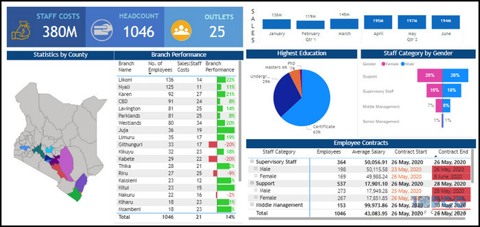
This overview section has Staff Costs, Headcounts, and Outlets on the upper left side. Employ contracts tile displays an overview of the employee number, their salary, and contract period filtered by gender to narrow the results.
It is easy for human resources in any organization to navigate and extract the information from here.
What is a Report in Power BI?
Power BI reports are detailed pages if you require in-depth analysis and let you dive deep into data. Compared to the dashboards, the reports have interactive features like filtering, drill-through, highlighting, etc.
Purpose: Reports let users make custom measures, complex calculations, calculated columns, etc, for more meaningful visualizations to display.
A report can have multiple pages, so the designer can use various visual elements to improve the report, which will eventually be used in the dashboard.
With data modeling in Power BI, users can make charts to include them in a report. With dynamic reports, dashboards also get updated when the data changes.
Key features: The important Power BI report features are:
- Data Filter: Power BI report supports data filtering to showcase the crucial data only. You can create a used slicer in Power BI to optimize the data from the Filters pane.
- Upload to Web: The reports in Power BI are web publish supported. So, you can publish it on social media or blog posts.
- Showcase Detailed Data: It provides in-depth dataset fields and tables.
- Support Various Formats: Reports allow extracting data in CSV, XLXS, PDF formats, etc.
Examples: The following image is a sample report example showing customer behavior as well as the segmentation of customers into key clusters.
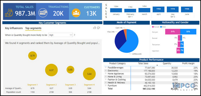
From the report, one can interpret how the customers made their payments, as well as their nationality and gender. Moreover, the report also shows which specific product category has the highest total sales and profit margin.
Difference Between Power BI Dashboards and Reports
The two key differences between the Power BI dashboards and reports are the information level and interactivity.
Due to the one-page limitations, the dashboard provides only critical information squeezed out from a large data set, whereas reports can provide vast information with multiple pages.
Additionally, you can narrow down data in a report with slicers and filters, but dashboards lack the interactivity here.
Here is a table showing the differences between Power BI Dashboards vs Reports:
| Comparison Parameter | Power BI Dashboards | Power BI Reports |
|---|---|---|
| Availability | Only available in the Power BI service. | Available in both the Power BI desktop app and service. |
| Purpose | To get an overall consolidated view of business performance. | To explore data and analysis comprehensively. |
| Information Kind | Provide only limited crucial information to end-users. | Provide a detailed breakdown of each report category. |
| Pages | Single page. | Multiple pages. |
| Filters & Slicers Option | Not available. | Available to filter, highlight, and slice data. |
| Alerts | You can configure an alert to get notifications if there are changes in dashboards. | Not available. |
| Template | It is not available and requires you to create a dashboard from scratch. | It has a set template to kick-start your report creation process. |
| Visuals | Dashboards are visual-centric, like graphs, charts, gauges, etc. | Focused on creating summary pages. |
| Q&A Feature | Available to get quick answers about business. | Only available if the report creator added a Q&A visual to the report. |
| Exporting Formats | Allow to export in .csv format. | Several export options, such as .xls, .pbix, .pdf, etc. |
| Data Set View | Incapable to see source data. | Able to see raw data. |
Advantages and Disadvantages of Power BI Dashboard and Report
You may wonder which is better after knowing the differences between the dashboard and report in Power BI. To simplify it, I’m showing the pros and cons of the two below.
Here are the advantages and disadvantages of the Power BI dashboard and report:
Dashboard
- »Offer a consolidated view.
- »Provide Important metrics on a single page.
- »Doesn’t support filters and slicers.
- »No templates.
Report
- »Support sliders and filters.
- »Can see source data.
- »No alert support.
- »No Q&A feature by default.
When to Choose a Power BI Dashboard or Report?
Power BI reports and dashboards complement each other. The dashboard offers hand-picked crucial information to make quick decisions, while reports are a more structured and detailed approach to data analysis.
Here are the factors you should consider when choosing Power BI Dashboard or Report:
- App type: If you use only the desktop app, you have to stick with the reports only.
- Purpose: To provide detailed data for a better understanding, you must prepare data.
- Target Audience: If you make the content for the CEO or higher authority with experience, they won’t need to dig up the entire data history in the report. Instead, they only need a dashboard with essential summaries.
So, depending on the requirements, you should choose the one that fits you.
Final Thought
Despite the Power BI dashboards and reports providing us with business information to make decisions, the two have some differences. But putting the comparison aside, you should use both to create a more meaningful visualization.
However, as this article discusses, you can pick only one depending on the target viewer or requirements.
Have a nice day!