Did you ever want to add trendline to your chart in Excel? The primary purpose of graphs is to help visualize complicated numbers and understand the message clearly.
But if you have a large set of data series, and you generate a scatter or line chart, then the end result would be a bunch of dots that only leave you more confused. In this situation, you may want to add a trend line to show the data trend.

A trendline is a curved line or a line of best fit and you can add multiple trendlines for the same data values if you wish.
If you want to learn how to add trendline in excel, then this is exactly what you need. I’ve been using trendlines in my Excel datasheet for many years. If you’re thinking of adding them, you’re in the right place.
So, let’s begin.
Download the Excel Workbook
Download the excel workbook below to learn the steps covered in this article and to practice the methods.
Some more guide on how to group rows in Microsoft Excel.
How to Add a Trendline in Excel?
You can insert a trendline in Excel chart after you select the chart type by checking the box beside the Trend line. It helps to visualize the increase and decrease line and makes your chart more interactive. You can also change the type of trendline using the format trendline pane.
Here are the steps to add a trendline in MS Excel:
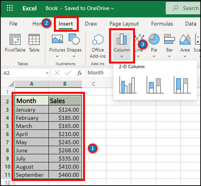
- Launch the Excel application on your Windows.
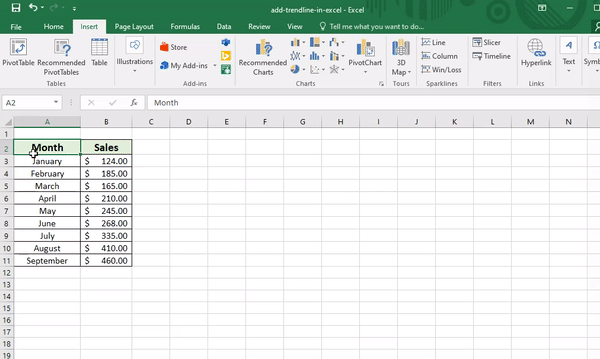
- Open the Excel datasheet.
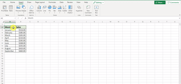
- Select the data. Note that you should select no more than one data series at a time.
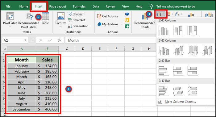
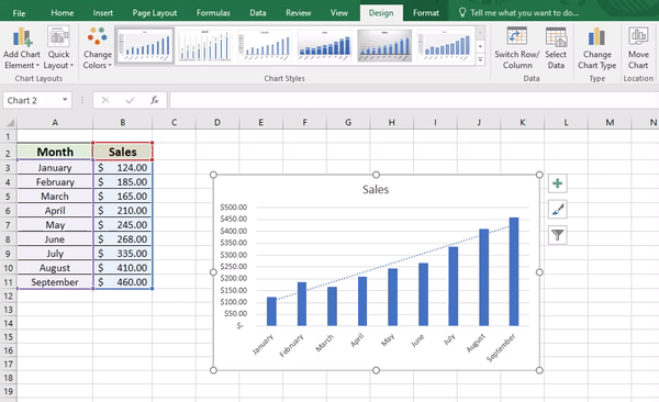
- Go to the Insert tab from the top ribbon.
- Select a chart.
- Click anywhere on the chart.
- Press on the Chart Element ( + ) button.
- Check the box beside Trendline.
Checking the option will add the trendline you want to your selected chart.
Do you want to use multiple data series in a single chart in Excel? The best way to do this is by adding a secondary axis to a chart so click on the link to speed up your workflow efficiency.
If you want to change the type of the trendline, consider reading the following passage.
How to Choose Different Trendline Types in MS Excel?
The trendline format is set as Linear as default. But, there are multiple types of trendline to choose from the settings. Read the following instructions carefully to choose a different trendline.
Here are the ways to choose different trendlines in MS Excel:
- Press on the trendline.
- Right-click on it.
- Click on Format Trendline.
- Choose the radio button beside the type of trendline.
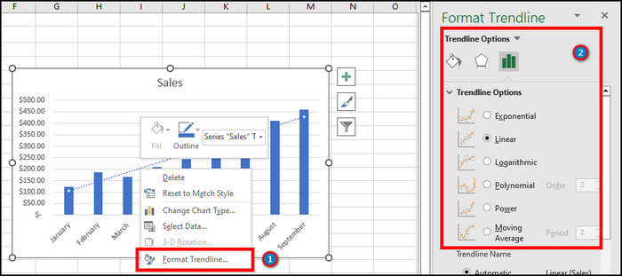
You can select between Exponential, Linear, Logarithmic, Polynomial, Power and Moving Average.
Also, you can double-click on the trendline to find the option. It can become confusing to choose a trendline type. You’ll find the details of the trendline below.
Here are the types of trendlines in Excel:
Exponential
Exponential trendlines type visualizes the data that increases or decreases at a significantly higher rate. It only works for the positive value.
Linear
The linear trendline is best for the data sets where the increase and decrease rates are steady. The R-Squared value measures how the linear regression model fits the data before generating the line that best fits the data.
Logarithmic
Using a logarithmic trendline is suitable where the data increases or decreases quickly at first and then becomes steady. It works both for positive and negative values. Excel uses a transformed regression model for this method.
Polynomial
Polynomial trendline works better in a datasheet where the value fluctuates more than one rise and fall. It works with both positive and negative values.
Power
Using the power trendline where the value increases at a specific rate is better. This trendline only works with positive value.
Moving Average
A moving average trendline shows a trend or pattern in the dataset by smoothing out fluctuations in the data.
You can also show the trendline equation to calculate the least squares fit for the different types of trendlines by checking the ‘Display Equation on Chart’ or ‘Display R-Squared Value On Chart’.
Having trouble getting Excel to run smoothly on your PC? This can happen for several reasons, and if left untouched could cause worse problems in the future. I suggest quickly reading this short post to fix Excel freezing or slow.
If you want to improve the appearance or change the fillings and color, the following passage will help you to accomplish that.
How to Format A Trendline in Microsoft Excel?
Formatting a trendline allows the user to change the line types and colors from the Fill & Line option. Additionally, you can modify the shadow and glow settings from the Effects.
The process helps to make the slope of a trendline attractive and makes it eye-catching in your datasheet. Follow the instructions carefully to learn about the ways to format trendlines in MS Excel.
Here is the process of formatting trendline in MS Excel:
- Double-click on the trendline.
- Go to Fill & Line from the Trendline Options.
- Choose Line types and colors from Fill & Line.
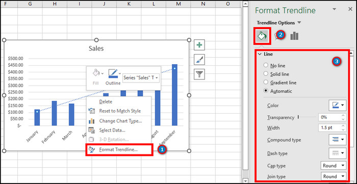
- Click on the Effects option to change the shadow and glow.
Additionally, you can go to the trendline option by using the Format Trendline option. You’ll find the steps below.
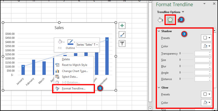
Here are the steps to format trendline in MS Excel:
- Click on the trendline.
- Right-click on it.
- Press on Format Trendline.
- Go to Fill & Line to change lines and colors.
- Change shadow and glow settings from the Effects.
If you are a Mac user, you will find the procedure to add best fit lines below.
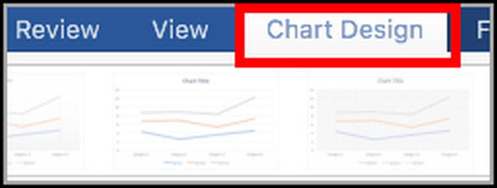
How to Add a Trendline in Microsoft Excel Chart for Mac?
The procedure on Mac is slightly different than on Windows because of the MS Excel interface. You will find the option to add trendline to a chart from the Add Chart Element option in Chart Design.
Before adding the trendline, you need to add a chart. Find the process to add a chart and trendline from the procedures below.
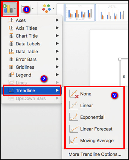
Here are the ways to add a trendline in MS Excel for Mac:
- Open MS Excel on Mac.
- Select the data range.
- Go to the Insert tab from the ribbon.
- Add a chart.
- Click anywhere on the chart.
- Go to Chart Design.
- Press on Add Chart Element.
- Hover on Trendline and select the trendline type.
If you use Excel on the Web, consider reading the instructions from the following passage.
Check out the easiest way on how to randomize a list in Excel.
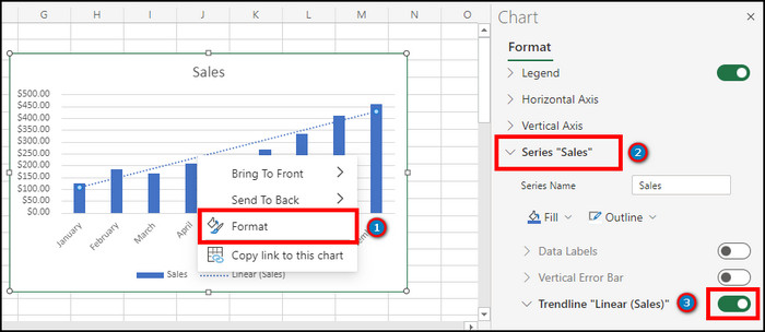
How to Add a Trend line in MS Excel on the Web?
Microsoft Excel on the Web is becoming more popular daily, and you can add trendlines using this too. You will find the option to do this from the Format option.
Here are the procedures to add a trend line in Excel on the Web:
- Visit Microsoft Excel on the Web.
- Open or create your datasheet.
- Select the data range.
- Go to Insert from the ribbon.
- Add a chart.
- Select anywhere on the chart.
- Go to Chart from the top ribbon.
- Click on the Format option.
- Expand Series from the right pane.
- Enable the trendline option.
- Select the trendline type from the drop-down menu in Trend Type.
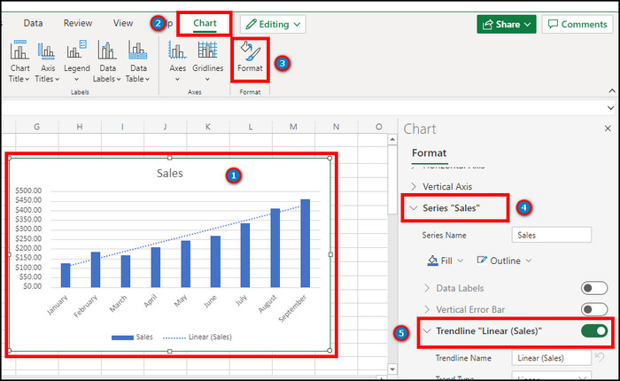
You can choose Linear, Exponential, Logarithmic, Moving Average, Polynomial, and Power from the list.
Follow our guide on how to shade every other row in Excel.
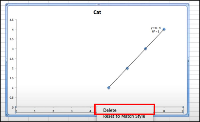
How to Delete Trendline in Excel?
As humans, it’s natural for us to make mistakes. You may want to delete a trendline from your spreadsheet if such a mistake has been made. Users can remove the trendline by pressing the Delete button. People don’t know the correct procedure to remove the trendline.
You’ll find the process to delete a trendline on MS Excel on Windows, Mac and Web from the instruction provided below.
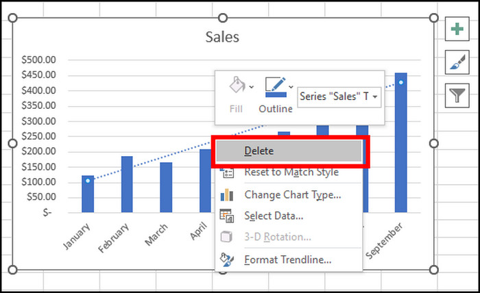
Here are the steps to delete or remove a trendline in Excel:
- Select the trendline.
- Right-click on it.
- Press on Delete to remove the trendline from the chart.
If you are an MS Excel on Mac user, find the process to remove a trendline below.
Here is the method to remove a trendline in MS Excel on Mac:
- Press on the trendline.
- Right-click on the trendline.
- Click on the Delete button to remove the trendline.
Here are the steps to delete trendline in MS Excel on the Web:
- Go to MS Excel on the Web.
- Open your spreadsheet.
- Click on the trendline.
- Right-click on it and select Format.
- Expand Series from the right pane.
- Disable the trendline option to delete or remove the trendline.
Frequently Asked Questions
What is a trendline in Excel?
The trendline is a linear least squares regression tool that provides data points connected with two or more things that aren’t linked apparently.
How do I activate my Trendline?
To activate the trendline, Click on the Chart > Chart Element > Check the box beside Trendline.
Final Thoughts
Trend lines in the Excel chart creates a better impression on the audience. Without it, the chart misses out on some spices.
In this article, I’ve outlined the use of trendlines in Excel, and I hope it’ll help to create a better impression on your worksheets.
Share your experience after using the trendline from the comment box down below.
Cheers!