There are so many tools to visualize your data. Among them, Microsoft Power BI, a business insight application, assists you in visualizing your datasets.
This helps you reveal the information with patterns, trends, and insights. Data visualization can help you communicate complex information more effectively, make better decisions, and discover new knowledge.
That said, today, I will cover all the basics of data visualization in Power BI, how to work with them, and what they offer.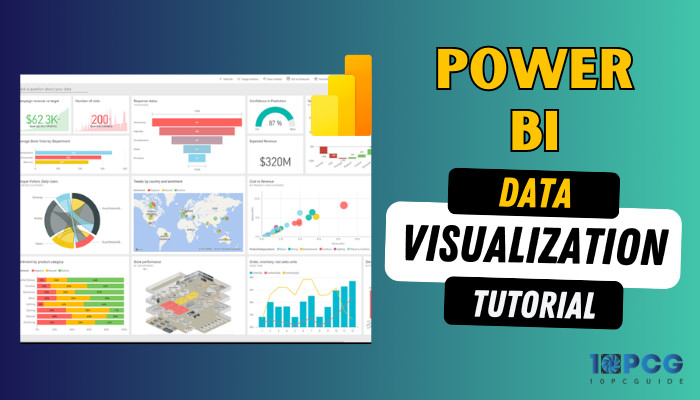
Therefore, let’s begin.
What is Power BI?
Microsoft Power BI is a business intelligence (BI) platform that helps businesses turn their information into actionable insights. It is a suite of tools and services that enable you to review, visualize, and share data. You can create interactive dashboards and reports and share them with others.
Moreover, Power BI can connect and analyze information from various sources, including Excel, SQL Server, and Azure.
That said, power BI has different components accessible in the marketplace.
Here are the components of Power BI:
- Power BI Desktop
- Power BI Service
- Power BI Gateway
- Power BI Embedded
- Power BI Dataflows
- Power BI Mobile Apps
You can get these tools in the marketplace. Also, there is a visual marketplace for you to grasp custom visuals created by Microsoft developers.
What is Data Visualization in Power BI?
Data visualization in Power BI is a powerful way to turn your information into insights to help you make better decisions and achieve your goals. Moreover, it’s a process of transforming info into graphical or pictorial forms that can reveal patterns, trends, and insights.
For data visualization, Power BI is a complete solution for self-service and enterprise business intelligence (BI) that can handle any information scenario, from simple to complex.
You can visualize your information in Power BI in various ways, including the built-in options and the extensive custom visuals marketplace full of free and paid visuals.
Whether you are a beginner or an expert, Power BI can help you create and share fantastic data visualizations that will impress your audience and inspire action.
Let’s now see the visualization options Power BI offers.
Why and When Do You Use Data Visualization in Power BI?
Simply put, you need data visuals to make the data easier to understand. Microsoft’s Power BI is a valuable tool that helps to create visualizations. The app also lets you use a huge number of pre-made and custom graphics.
So, why use data visualization in Power BI?
- Create Engaging Visuals from Difficult Data: Visualize complex data with Power BI to understand essential ideas better, detect trends, and discover hidden insights.
Making information formats that look good helps people understand what they mean and see how company trends and links work. - Effectively Share Insights with Many: Share insights clearly and concisely with stakeholders, colleagues, and decision-makers via data visualizations.
Visual reports can enhance comprehension and foster a shared perspective among diverse spectators, unlike reports based only on text. - Help Identify Patterns and Trends: Power BI’s data visualization features enable users to identify patterns, trends, and outliers. Displaying info visually helps people find trends that might be tough to see in text-based summaries.
Moreover, pattern recognition helps businesses anticipate trends and outcomes and make choices based on data. - Discover and Explore Data: With interactive visualizations, data exploration in Power BI seems more natural and engaging.
Also, visual representation promotes exploration and discovery by allowing user interaction with the data. Curiosity, new insights, and data-driven decision-making are all encouraged by interactive experiences. - Boost User Engagement and Data-driven Adoption: Power BI visualizations can make data visualization more engaging and encourage users to explore the data. Adopting a data-driven culture in business leads to better decision-making at all levels.
- Enable Effective Performance Monitoring: Data visualizations in Power BI dashboards and reports help businesses monitor performance, identify areas for improvement, and make timely adjustments.
The efficacy of visual representation in Power BI is in its capacity to provide information and its capability to clarify the pathway to enhanced decision-making.
With that being said, let’s explore the circumstances in which you may require utilizing Power BI’s data display alternatives.
When should you use data visualization in Power BI?
- Dealing with Large Datasets: Data visualization is beneficial when working with extensive datasets. Visualization allows you to gain a holistic perspective, identify patterns, and extract meaningful insights, saving a lot of time.
- Communicating Insights: Visualization is an effective means of presenting insights to others. Its visual nature simplifies complex concepts, making it easier for stakeholders to understand and act upon the information.
- Explore Data and Plan: As visualization provides a fresh perspective, this helps you to find the weak point of your business and take the necessary steps.
Power BI’s visual analytics enable you to easily present your data, engage your audience, and gain actionable insights. Using Power BI’s various presentation formats, you can quickly and correctly share your data.
Types of Data Visualization in Power BI
Power BI is a unified, scalable platform for self-service and enterprise business intelligence (BI) that can connect to and visualize any data source.
Power BI provides an array of graphical presentation choices, such as charts, tables, maps, shapes, etc. Power BI has numerous data visualization types, but you can categorize these into eight types.
You can choose from these categories of Power BI visuals depending on your data type, analysis goal, and audience preference.
Here are the types of data visualization categories in Power BI:
Charts
There are a couple of types of chart visualization in Power BI, and these are the most regular ways to visualize data.
Charts can display comparison, distribution, trends, or relationships of data using different visual elements, such as bars, columns, lines, pies, donuts, etc. 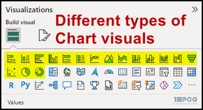
For example, apply a column chart to contrast the sales of different products or a line chart to show the revenue change over time.
Tables and Matrices
Tables and matrices are potent tools for visualizing data representation. In this format, you visualize the info with a rows and columns structure. While tables display the data values as they are, matrices present the aggregated information values based on row and column headers.
For instance, you can utilize a table to provide detailed information about each customer or matrix to showcase the total sales across different product categories and regions. 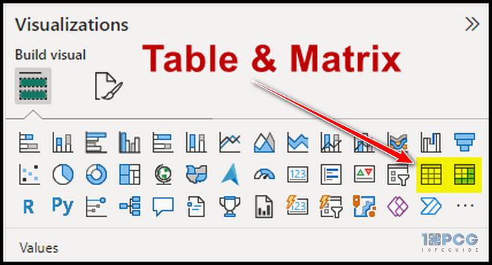
Moreover, Power BI offers the flexibility to customize the appearance and interactivity of tables and matrices.
Maps
Maps serve as effective graphical presentation options that depict the geographical location of data using various visual elements such as bubbles, shapes, and colors.
Maps facilitate the exploration of spatial patterns and relationships within the data, such as population distribution.
Power BI provides different map types, including Basic, Filled, and ArcGIS maps. 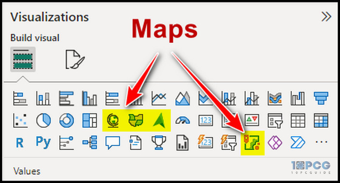
Additionally, you can leverage the Bing Maps service to geocode your data and display it on a map.
Gauges, Cards, and KPIs
To effectively communicate the performance of a single measure or value, Power BI offers visualization options such as gauges, cards, and KPIs (Key Performance Indicators).
Gauges visually represent the current value and its progress towards a goal, similar to a speedometer or a thermometer. Cards display the current value in a large and clear format, focusing on presenting a single fact or number.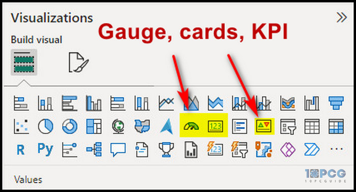
Conversely, KPIs showcase the current value, trend, and status, often using visual cues like a green arrow pointing up or a red circle indicating a decline.
Slicers and Filters
To refine and control the data displayed in your Power BI reports, and dashboards, slicers, & filters offer valuable options. Slicers are visual elements that enable you to select one or more values from a list, utilizing features like drop-down menus, sliders, or checkboxes.
On the other hand, Filters allow you to specify criteria for displaying or hiding data. Power BI allows you to add and configure slicers and filters from the Visualizations or Filter pane.
These are some of the primary and most used visualizations in Power BI. There are also some advanced visuals.
Treemaps
This represents hierarchical information using nested rectangles, with size and color representing data values. They help visualize info hierarchies and relationships.
With Treemaps, you can analyze organizational structure and employee distribution across departments. Also, this helps you visualize product categories and subcategories, representing the website’s hierarchy.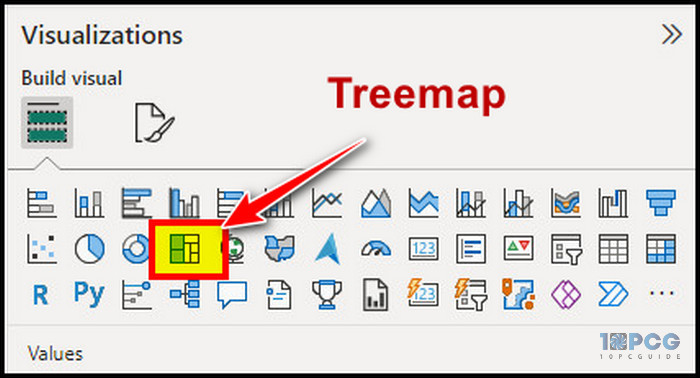
Custom Visualizations
Power BI allows the integration of custom visualizations from third-party developers, providing additional functionality and visual styles beyond the built-in visualizations.
R Script Visuals & Python Visuals
R script visuals and Python visuals are extensions to Power BI that allow you to create custom visualizations using R and Python scripting languages, respectively.
These extensions provide a powerful way to extend the capabilities of Power BI and create visualizations that are not possible with the built-in visualization types. 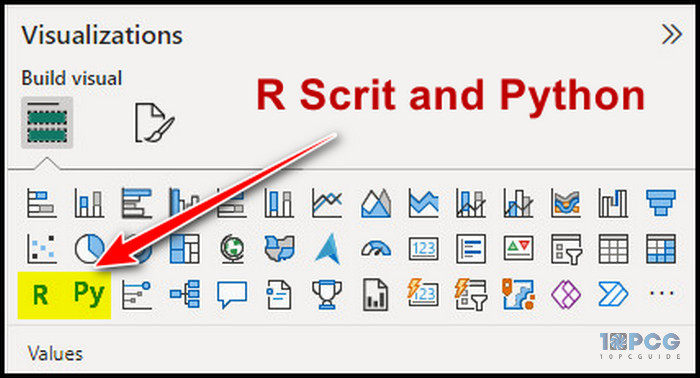
Power BI offers various information graphics options, including tables, matrices, maps, shapes, text boxes, etc. By harnessing these tools, you can effectively present and analyze your data, making it more engaging and meaningful to your audience.
How to Create Power BI Data Visualizations
Microsoft made it easy to create data visualization in Power BI. Just get your information file and import it to Power BI. Pick a visual type from the Visualization section and provide correct information in the visualization type placeholder. You will find your visuals taking shape.
That’s pretty simple, right? However, I will go with the details of how you can create and share one with others. So, let’s begin.
Here is the detailed process of creating a data visualization in Power BI:
1. Add Data in Power BI
Before you jump into visualization, you need some data to create that visualization. Power BI supports many types of information files, such as Excel, PBIX, CSV, Text files, SQL, Dataflow, and Dataverse.
That said, let’s now import your information file into Power BI. For the purpose of this article, I am working with an Excel file.
Follow the below steps to import the data file:
- Click on the Get data from the Home tab.
- Select Excel Workbook and click on Connect. Also, you will find different options in this window.
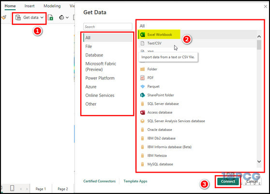
- Choose your file from the directory and click Open.
- On the next window, mark the data and click on Load.
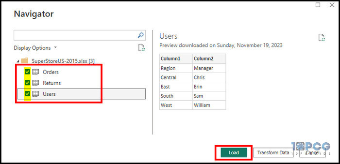
After you’ve loaded the data into Power BI, let’s format it to remove any obvious errors.
2. Format Dataset
After the information loads, click on the Table view from the left pane. You can correct the information formatting in this section.
To correct or change the information, click on the data column and choose the correct formatting from the Data Type section.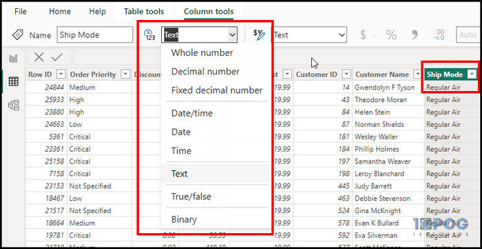
Now that you’ve formatted the information to your liking, let’s add some visuals.
3. Create Data Visualization
As our dataset is ready, let’s start making visuals. I will review and create several different visuals in Power BI for your convenience.
Before you start, let’s understand how you insert information in the visual.
Normally, when you click on the visuals, a visualization window will take place on the report page, and some placeholders will appear under the Visualization section.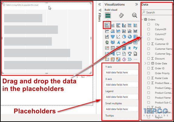
To get the data in the placeholder, select it and drag it to the placeholder section. The placeholder name might change depending on the visual you pick, and I will discuss that while creating different visuals.
Stacked Bar Chart
Stacked bar charts are used to compare categorical data, with the height of the bars representing the magnitude of the values for each category.
So, let’s start with a basic stacked bar chart. Here is how you can make one:
- Select the Stacked Bar chart From the visualization and expand the Order from the data.
- Click on the Product name, drag it to the X-axis, select the Profit, and bring it to Y-axis.
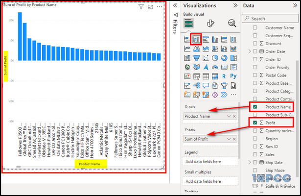
As you see the chart, start to visualize your data. You can compile more info in the chart.
For example, select and drag the Quantity of order in the Legend placeholder.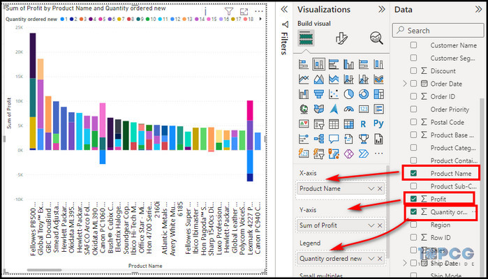
Also, let’s break some rules for the chart visualizations. Most chart visualizations have an X-axis and a Y-axis. The X-axis distributes the data horizontally, and the Y–axis does the opposite.
After you create the visualization, click on the Format your Visual option in the Visualization section to tweak the options. You can change the color, font size, and other behaviors.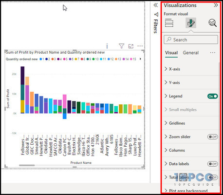
The options slightly change depending on the visualization you pick. I recommend you play with the customization, and you will understand how it works.
Area charts
These visualize trends and relationships over time across continuous variables. Here is how to create one:
- Click on New Visuals from the ribbon, and choose the Area Chart from your Visualization section.
- Select City and drag it to the X-axis, Profit in the Y-axis, and Quantity of the order in the Secondary Y-axis.
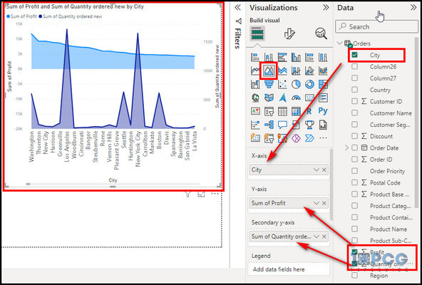
The chart provides a visual representation of profit and orders by country. A glance at the chart will give you an understanding of your profit and order volume.
Waterfall Chart
Waterfall charts illustrate the process or sequence of events that affect a cumulative total. They are beneficial for visually representing value changes over time, such as financial statements or sales pipelines.
- Click on the Waterfall Chart in the visualization.
- Put Profit in the category placeholder, Region in the Breakdown, and Sales in the Y-axis.
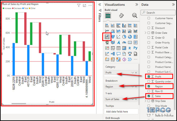
As we choose regions in the breakdown placeholder, the information shows data for each region in the section.
Scatter Chart
Scatter charts display individual data points and reveal correlations or patterns between two variables. They help explore relationships between different data points and identify outliers. Here is how to make one:
- Select New Visual from the ribbon and pick the Scatter chart.
- Choose City for the X-axis, Shipping cost for the Y-axis, and Sales for the Legend placeholder.
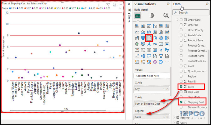
Depending on the data points, you can efficiently understand the shipping cost and sales.
Pie Chart
As the name suggests, the chart represents data as circular slices, with slice sizes proportional to corresponding values. They effectively visualize the proportions and relative contributions of different categories.
- Click on the New visual and select Pie Chart.
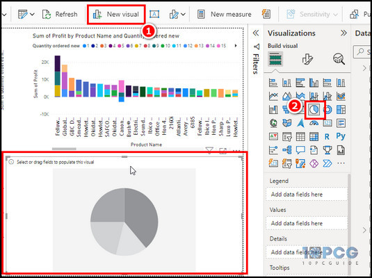
- Drag Region on the Legend and Sales on the Values placeholder.
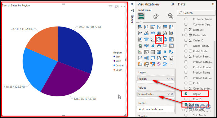
As you notice, it’s a compelling visual showing the sales results depending on the region.
For instance, changing the Legend placeholder from region to city will show the sales information depending on the city. 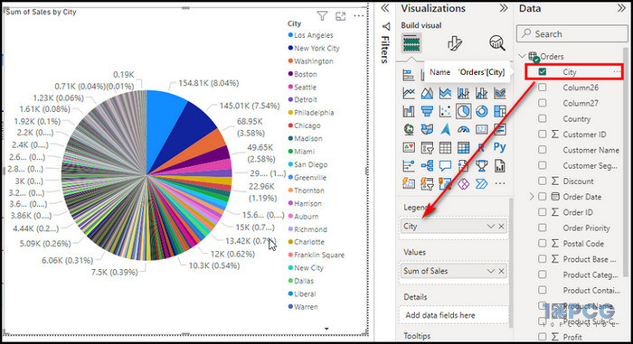
The Pie chart and Donut chart work similarly. If you have already made the pie chart, select the donut chart, and your visualization will take the donut shape. Donut charts are similar to pie charts but with a hole in the center. 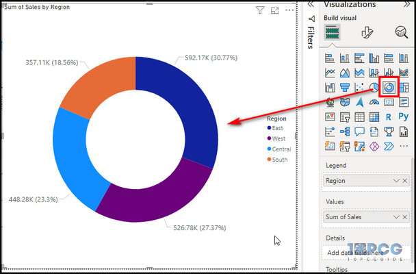
Table & Matrix Table
Now, let’s start working with the tables in Power BI. Tables and matrix tables display information in a tabular format, providing a structured view of detailed info. They are practical for organizing and presenting numerical or categorical data clearly and concisely.
Power BI has two built-in table types: a standard Table and a Matrix table. Let’s now create table visuals in Power BI.
Moreover, we have created some charts on the first report page and now create a new report page to work with. To create a new report page, click on the + icon at the bottom, and a new page will start. 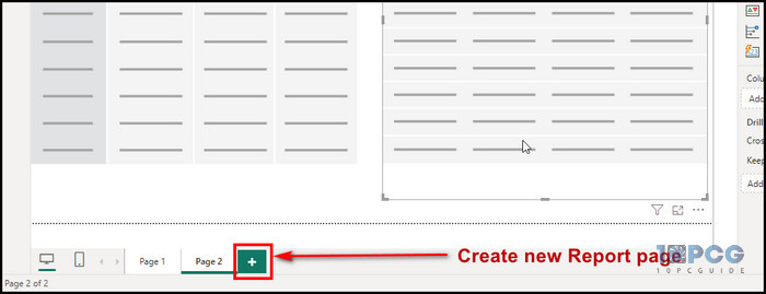
Regular tables display simple data sets with only one hierarchy level. They are simple to design and edit, and they convey information clearly and concisely.
Matrix tables, on the other hand, are intended to handle larger data sets with numerous levels of hierarchy. They let users aggregate and summarize information, giving a more flexible means of visualizing relationships between different data pieces.
Here are the steps to create table visuals:
- Select Table from the Visualization section.
- Pick City, Sales, and Profit from the data measures.
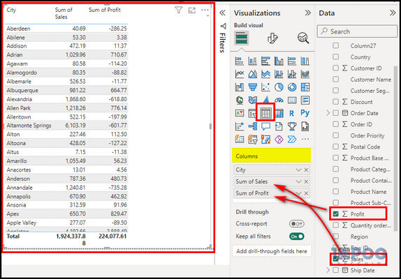
As you can see, a regular table just has the column placeholder, and you can stack many measures in the placeholder.
Let’s now create a Matrix table.
- Click on New visual and choose Matrix.
- Choose City for Rows, Region for Columns, and Sales for Values placeholder.
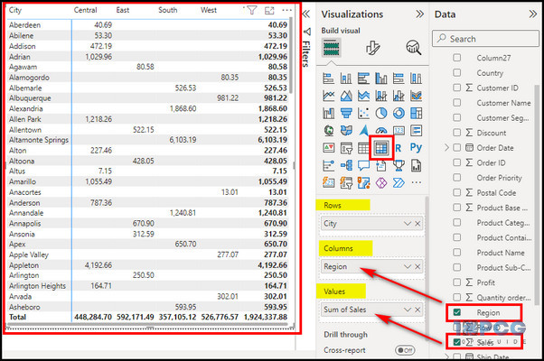
As illustrated, a matrix table can handle lots of information. I choose the City names for the table rows and the Region for the column. Finally, I pick the sales for the dataset depending on the rows and columns.
Treemap
Treemaps use nested rectangles to display hierarchical data, with size and color signifying information values. You can use Treemap to visualize complex data structures and relationships.
Here is how you can create one:
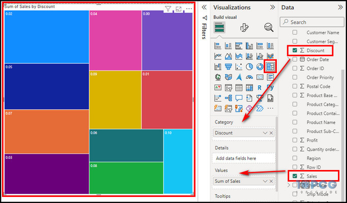
- Click on New visual and pick Treemap.
- Select Discount for the Category and Sales for the Values placeholder.
You can even go further and show more information in the treemap visual. For example, if you pick the Region and put it into the Details placeholder, it will divide each databox into four sections.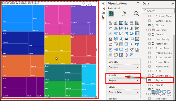
Basic Map
Basic maps display data points on a geographical map, allowing spatial patterns and trends to be visualized.
This helps analyze consumer dispersion across multiple regions, sales performance by country or city, and visualize website traffic patterns depending on geographical location. These are all examples of data analytics.
Power BI has two built-in maps: Basic and Field Map.
Follow the below steps to create a Map visual in Power BI:
- Click on the Basic Map from the Visualization.
- Bring City in Location and Order Priority in the Legend placeholder.
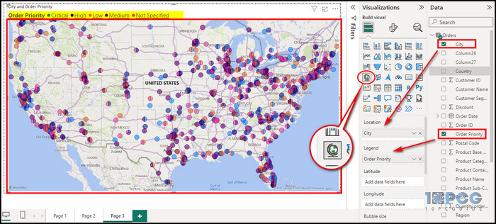
As demonstrated, the map shows order priority across all the cities. You can see the order priority fill color indication at the top.
Heatmap
Along with the built-in visuals, Power BI offers many custom visuals. You can access these custom visuals that Microsoft developers or third-party developers create from the Get more visual option.
HeatMap is a custom visual in Power BI, and you can easily create a Heatmap in Power BI.
Heatmaps use color intensity to represent data density or intensity over a geographical area. They are effective for visualizing patterns and trends in spatial info.
Follow the below steps to create a heatmap in Power BI:
- Click on the Get more visual option and choose Get more visual.
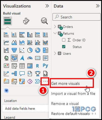
- Search for heatmap and select Heatmap.
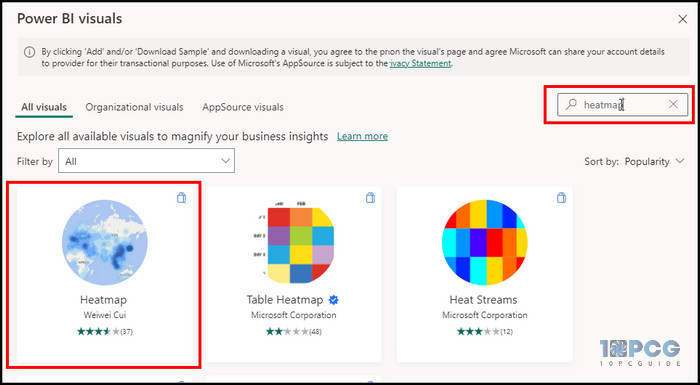
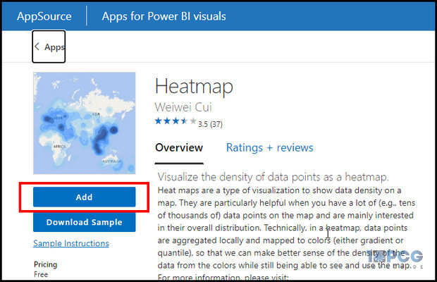
- Click on Add to import the heatmap in Power BI visual.
- Click on the HeatMap from the visualization section.
- Select the City for the Location and Profit measure for the Value placeholder.
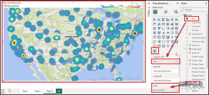
To provide a better heat map look, click on the Format your visual option, click Render, make Type to Heat, Radius – 30, and Opacity –1.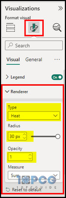
Your visual will take a proper heatmap view and show its data. HeatMap is also helpful in showcasing geographical information.
Gauge
Gauge charts show progress toward a target or objective and provide a fast picture of performance measures. They help track key performance indicators (KPIs) and detect deviations from goals.
- Click on Gauge from the visualization section.
- Drag Unit price on the Value, Profit on the Maximum value, and sales on the Targeted value placeholder.
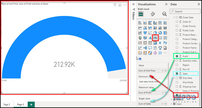
That’s how you showcase your data in gauge visualization.
As you see, there are several visualization options in Power BI, and I just covered some of the popular ones.
Power BI Reports and Dashboard
In Power BI, you can generate and configure Power BI reports, which are dynamic and interactive data visualization pages. Previously, I showed you how to create a new report page in Power BI.
That said, your information may be explored, analyzed, and presented using Power BI reports, including tables, charts, maps, and more.
Simply put, reports are the number of pages or workspaces in Power BI.
On the other hand, dashboards are groupings of tiles on a single page that show your data summarized from one or more reports. Dashboards can be made by creating new tiles from scratch or pinning tiles from pre-existing reports.
For instance, you could create various visuals on different report pages. However, you should show specific visuals from various reports in a single window. That is why you must use the dashboard in Power BI.
Power BI Reports and Dashboards aspects sound the same but offer different purposes to showcase your data. To know details about Power BI Reports vs Dashboards, read the article.
Integration of Power BI with R Script and Python
Beyond the built-in visualization types and data analysis, Power BI’s capabilities are extended via its interface with R and Python.
Combining these two widely used programming languages allows you to create innovative visualizations, conduct significant data analysis, and interact with various data sources.
Individuals using R script visuals can make complex graphics that fit their needs. This integration enables the creation of custom heatmaps, scatter plots, and other visualizations that go beyond the standard options available in Power BI.
With Python’s integration, you can run Python script in Power BI and do more complex data analysis jobs inside the program. This feature makes machine learning, statistical modeling, and other complicated data analysis methods easier to use, which improves the platform’s analytical power.
You can use these languages to connect to databases and APIs. This feature increases the amount of data that can be analyzed, which leads to more useful insights.
How to Publish Your Visuals in Power BI
So, we created the visuals; now, let’s save them and publish them on the web so you can share them with others. You can easily save your file.
Also, you may share your data analysis and insights with people online or on mobile devices by publishing your Power BI visuals.
Here are the steps to save and publish your visual:
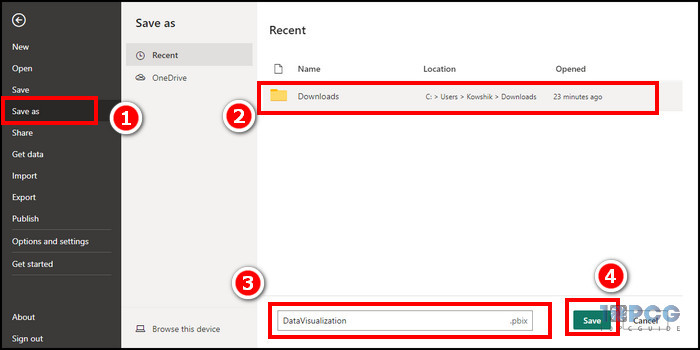
Save
- Click on File from the ribbon.
- Choose Save as, give the name of your visualization, and click Save.
Publish
- Click on the Publish option from the ribbon.
- Select the designated workspace from the prompt window.
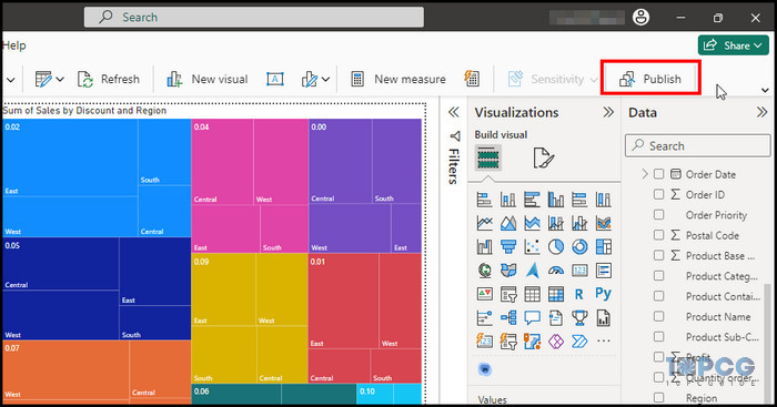
Follow the on-screen process to complete publishing. After publishing, you will receive a link to your report.
Benefits of Using Data Visualization in Power BI
Data visualization with Power BI offers numerous benefits that aid businesses in making brief decisions and accomplishing their goals.
Here are some of the key advantages of utilizing data visualization in Power BI:
- Data visualization in Power BI helps you understand massive amounts of information with a glance.
- Power BI is a cloud-based system, so your visualization updates in real time.
- Visualizing data can help us to understand it better and make better decisions.
- Graphical presentations facilitate collaboration and knowledge sharing among team members.
- Graphic data are practical tools for monitoring performance and identifying areas for improvement.
These are just some of the expected benefits. The benefits can vary depending on your situation.
Wrap-Ups
Power BI is an adaptable and powerful data visualization tool that can assist you in analyzing data and presenting it engagingly and practically. It offers numerous features and functions for customized information presentation and sharing.
With so many visualization options, you can also use other languages and tools, like R, Python, and Azure, to improve how you visualize information.
Power BI is one of the best graphical presentation tools since it keeps improving and adding capabilities. This session should have shown you how to utilize Power BI to create valuable and beautiful data visualizations.