Power BI is a business intelligence tool that helps you turn your data into visualization. It offers many intuitive ways to visualize your data.
Among them, the heatmap is a great way to visualize your data and reveal patterns, trends, and outliers. Heatmaps use colors to represent different values or categories throughout the map.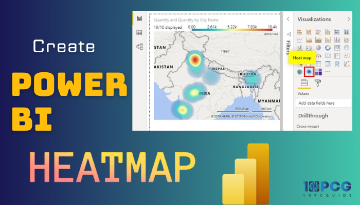
In the following article, I will show you how easily you can make a Heatmap in Power BI.
Therefore, without wasting any more words, let’s begin.
What are Heatmaps in Power BI?
Power BI heatmaps are a type of data visualization that utilizes color intensity to represent the distribution of data points across two dimensions. They are particularly helpful in identifying patterns and trends in large datasets and provide a quick visual overview of the data.
But how do Power BI heatmaps work?
Heatmaps work by assigning a color value to each of your data points based on its measure value. The color intensity typically ranges from light to dark, representing low to high values, respectively.
This gradient of colors forms a heatmap, where areas with higher concentrations of data points appear darker and areas with lower concentrations appear lighter.
Applications of Heatmaps in Organizations
Heatmaps are a versatile data visualization tool for complex data patterns and trends. They help you with decision-making, problem-solving, and strategic planning.
Here are the methods you or your organization can take advantage of heatmap in Power BI:
Sales Analysis and Optimization
You can use heatmaps to analyze sales data by product, region, or time to identify areas of high and low sales performance. This aids your sales teams to concentrate on the most profitable products and regions, optimize pricing, and target marketing.
Customer Behavior Analysis, Engagement
With a heatmap, you can visualize customer behavior patterns for different locations.
For example, you can monitor traffic, product interactions, and satisfaction rates with a heatmap, which helps your business understand customer preferences.
Marketing Campaign Evaluation and Optimization
Heatmaps can be utilized to compare engagement metrics across various marketing campaigns and target audiences.
Comparing engagement metrics across marketing campaigns guides businesses in evaluating effectiveness. This helps identify successful strategies and optimize resource allocation for future campaigns.
Supply Chain Management and Optimization
Heatmaps visualize supply chain data, offering insights into inventory levels, shipping routes, and delivery times. This aids in identifying disruptions, optimizing logistics, and enhancing overall supply chain efficiency.
Geographical Data Analysis and Planning
You can use a heatmap to visualize geographical data, such as sales distribution, population density, and environmental factors.
Moreover, Heatmaps bring geographical data to life, guiding decisions on location planning, resource allocation, and marketing strategies.
Financial Analysis and Risk Assessment
Visualizing financial data helps you identify trends, patterns, and potential risks or opportunities, enabling informed financial decision-making.
Productivity Analysis and Employee Engagement
You can make a heatmap to visualize the employee activity patterns depending on a specific time period. This can help businesses optimize website design, improve user experience, and increase conversion rates.
Heatmaps are visualizations of data density, which means they can be utilized to evaluate a variety of information. Any organization or individual can benefit from this type of data visualization.
How to Create a Power BI Heatmap
To create a heatmap in Power BI, you must have a data file with at least two variables and load it to your Power BI desktop. You can get your data from numerous sources, such as Excel, CSV, or SQL. Then choose Heat Map from the visuals marketplace/more Visuals.
That’s the summary of the process, and let’s now get into step by step procedure to create and customize a heatmap in Power BI.
Before you jump into creating a heatmap, remember Power BI does not offer any built-in Heat Map. So, you have to add from custom visualization.
Here are the steps to create a heatmap data visualization in Power BI:
1. Get the Data in Power BI
First, pick the data. As you are reading this article, I believe you already have that. For today’s example, I got a data file with the country name and population—an elementary set of datasets.
If you don’t have the data, you can create an Excel file with the country name and population.
Here are the steps to add a data file in Power BI:
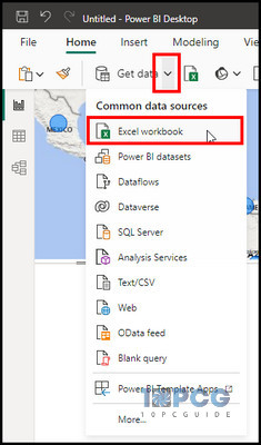
- Launch Power BI Desktop, click the arrow beside Get data, and choose Excel workbook.
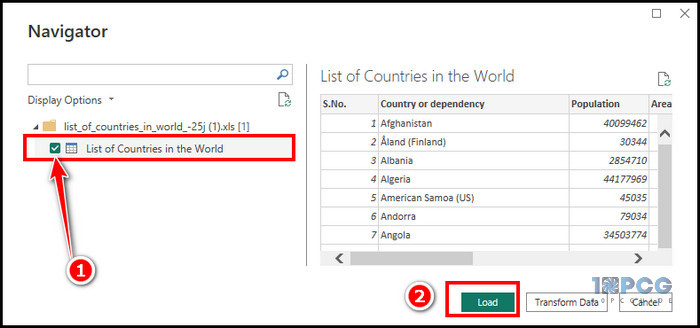
- Pick your Excel file and click Open.
- Mark the data File and click Load.
After you get the data, let’s bring the Heat map to your Power BI.
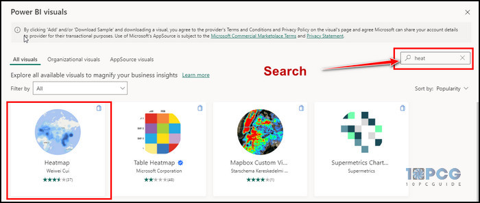
2. Import Heat Map
As I already mentioned, Power BI has no built-in heat map. But you can easily import the heat map from the store.
Here is the method to import Heat Map:
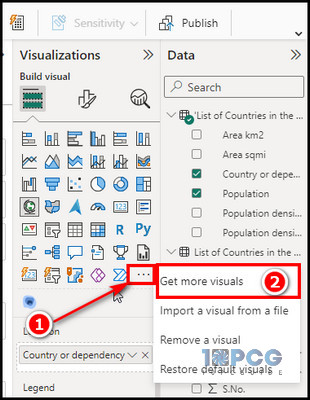
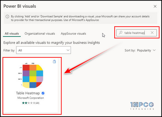
- Click on the three horizontal dots (Get more visuals) in the Visualization section.
- Choose Get more visuals.
- Click on the search bar on the custom visuals window, search for Heatmap, and select Heat Map.
- Select Add to import Heat Map to Power BI.
After you complete the process, you will find the Heat Map under your visualization options. Select Heat Map, and let’s provide some data for a proper visualization.
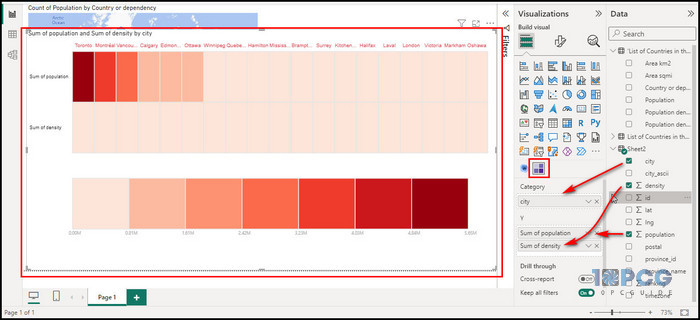
3. Create Heatmap
Let’s create a proper-looking heatmap by implementing data with the following steps.
- Select the Heat Map.
- Click on the Country, drag it to the location (ID) placeholder, and choose Population, drag it to the Value.
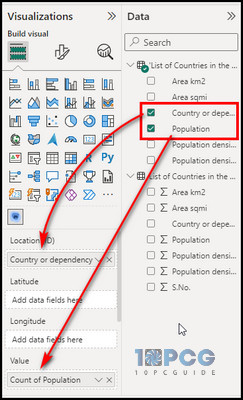
You will find your Heat map showing the information. But let’s customize it a little to give it a heatmap look.
- Click on the Formate your visuals tab in the Visualization.
- Expand Renderer, and make the type Heat and Radius 30px.
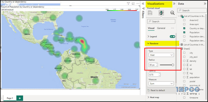
- Expand the Heat map and change the color from red to green.
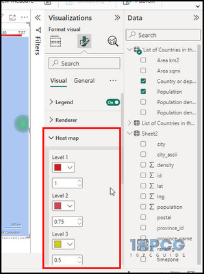
As you can see, it’s now taking a proper look at a heatmap. Though creating a heatmap in Power BI is straightforward, you must maintain some preventive measures when creating a density map.
That said, you can also make a heatmap table in Power BI. Let’s now see how to create one.
How to Create a Heatmap Table in Power BI
A table heatmap is a form of data visualization that employs colors to represent variations in data values inside a table or matrix or heatmap matrix. It facilitates the effortless and instinctive comparison of data values, as well as the identification of patterns, trends, and outliers.
In Power BI, you may make a table heatmap by utilizing conditional formatting on the matrix visual.
Otherwise, you can get the Table Heatmap just like we get the Heat Map from the custom visuals. Next, I will show both methods to create the heatmap table.
Here are the steps to create a heatmap table in Power BI:
Custom Heatmap Table
- Click on the Get more visuals option.
- Search for the table heatmap and choose the result.
- Click on Add to import Heatmap Table to Power BI.
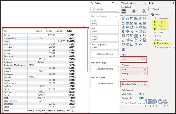
- Click on the Heatmap Table from the visuals and provide data to the placeholders.
You will find your heatmap table taking its shape and providing you with data density. Click on the Formate section in the Visualization and tweak with the options to change color, etc.
Heatmap Matrix Table with Conditional Formatting
- Select the Matrix table from the visualization.
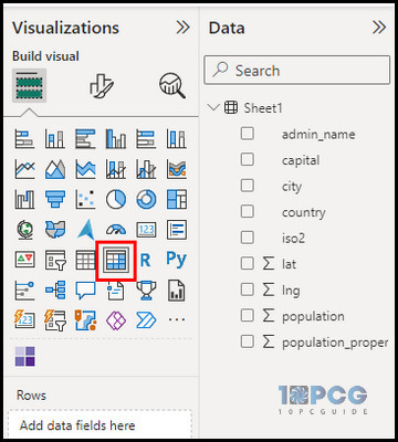
- Provide data for the Matrix Table.
- Right-click on the Value placeholder, choose Conditional Formatting and pick Background color.
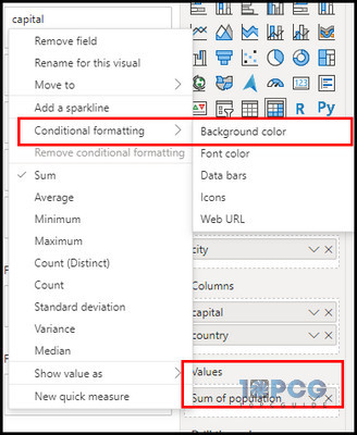
- Provide color choices and click OK.
That’s how you turn a Matrix table into a heatmap table using conditional formatting. Again, go to the Format tab and tweak the colors and other options.
Precautions While Using Power BI Heatmap
Although Power BI heatmaps are a valuable tool for data visualization, it is essential to use them carefully to avoid misinterpretations and ensure that the data is presented clearly and concisely.
Here are the things you need to remember while working with Power BI Heatmaps:
- Power BI doesn’t have any built-in visualization to create heat maps. You need to rely on the custom visuals which you can add.
- Heatmaps show heat or density. Darker colors represent higher values, and lighter colors represent lower values. Choose a color palette that matches the data and report design.
- Heatmaps can visualize numerical data, and the heat map in Power BI only visualizes numerical values.
Also, choose appropriate data for the placeholders of the x-axis and y-axis. Use proper contextualized color gradients and avoid overcrowding.
By carefully monitoring these, you can create a proper heatmap in Power BI.
Benefits of Using Power BI Heatmap
Heatmaps in Power BI are a robust method for visually representing data on a geographical map or a matrix. Colors are employed as a visual representation to effectively illustrate variations in data values, hence facilitating the acquisition of valuable insights and informed decision-making.
Here are some of the benefits of Power BI heatmaps:
- You can get an overall view of how your customers act by focusing on the main pages and areas that get more clicks or attention with the heatmap.
- Based on what users say, you can make your business run better by changing the style and layout of your tools. For example, using a heatmap on a matrix, you can identify which buttons or links are more visible or accessible.
- The heatmap allows you to visualize regional data variations that let you examine geographical patterns and trends.
- You can highlight outliers and anomalies using contrasting colors to emphasize their deviation from the norm. For example, you can use a heatmap on a matrix to see which data points are exceptionally high or low.
These are some of the remarkable benefits of heatmap. Heatmaps are not just for displaying geographical data. They can be used for many other purposes.
For instance, you can view information about your website, such as which state or country it receives the most attention from. Also, you can obtain sales information in the same way.
Wrap-Ups
Heatmap is a great way to emphasize information, making it easier to understand as well as monitor. Also, you can visualize complex data in a simple and intuitive way.
Following the heatmap building process, you can create your own heatmaps in Power BI and enhance your data analysis and storytelling skills.