A scatter plot is a valuable type of data visualization in Excel. You can use it to determine if there is any relationship between any two quantitative variables. It is one of the most basic data visualizations you need to learn.
If you have not done much data visualization with Microsoft Excel before, then you may not know how to make a scatter plot in Excel.
Do not worry, though. I have worked with Excel for years and had to make plenty of scatter plots while working with this application. I am here to teach you the basics of what I know about scatter plots in Microsoft Excel.
So keep reading this article till the end to learn how to make a scatter plot in Excel.
What is a Scatter Plot in Microsoft Excel?
A scatter plot in Excel is a type of plot or visualization that uses cartesian coordinates to display the values of any two quantitative variables for a data set. It is also known as a scatter graph, scatter chart, scatter diagram or scattergram.
A scatterplot’s horizontal and vertical axes are value axes used to plot numerical data. The dependent variable is typically on the y-axis, whereas the independent variable is on the x-axis.
Values at the point where an x and y axis meet are shown as single data points on the graph.
The primary purposes of scatter plots are to examine and display correlations between two numerical variables. The correlation is more significant when the data points fall more closely along a straight line.
The two variables are said to have a positive correlation if the resulting line slopes from lower left to upper right. The correlation between the two variables is considered negative if the line that is drawn slopes downward from the higher left to the lower right.
If the points in the scatter plot are widely scattered, we call this type of correlation weak correlation. If the points in the scatter plot seem randomly spread out, then we can judge that the two variables do not correlate.
The dots in a scatter plot not only represent the values of individual data points but reveal patterns when the data is seen as a whole.
A scatter plot might help spot other data patterns. Based on how tightly sets of data points cluster together, we can categorize the data points into groups.
Additionally, scatter plots can reveal any unexpected gaps in the data as well as any outlier locations. This can be helpful if we wish to divide the data into distinct categories.
Some more guide on how to group rows in Microsoft Excel.
How to Organize Data to Make a Scatter Plot in Excel?
If you have any prior experience with data visualization, you will know that data cleaning is an integral part of the process. In Excel, making a scatter plot is very easy. It is only a matter of a few clicks.
You need to focus on getting the data in your spreadsheet in the correct format. A scatter graph shows two quantitative variables that are related to one another. You then input two sets of numerical information into two different columns.
For convenience, the independent variable should be in the left column since Excel will plot this column on the x-axis. The right column should contain the dependent variable, which will be plotted on the y-axis and is the variable that is impacted by the independent variable.
If your spreadsheet data is not organized that way, there is no need to worry. You can swap the axes in the visualization.
You may also like to read how to combine first and last name in Excel?
How to Make a Scatter Plot in Excel?
Excel gives you options when it comes to making a scatter plot. There are a variety of templates to choose from. The best thing about Excel scatter plots is that they are straightforward.
Follow these steps to make a scatter plot in Excel:
- Select two columns that contain quantitative data along with the column headers.
- Click the Insert tab and select Insert Scatter (X, Y) or Bubble Chart.
- Select one of the scatter plot templates. You can choose the first thumbnail to pick the classic scatterplot template.
There are a few types of scatterplot templates we can choose from. They are:
- Scatter with straight lines.
- Scatter with straight lines and markers.
- Scatter with smooth lines.
- Scatter with smooth lines and features.
The optimal time to utilize scatter charts with lines is when there are few data points. Otherwise, the plot area could start to appear highly disorganized.
I will use an example to help you understand all the steps. 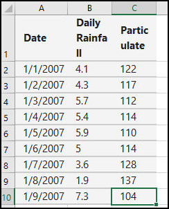
The data in the spreadsheet above is also used as an example on the Microsoft official website. I will use the same example to show you how to make a scatter plot in Excel, so it could be more convenient for you if you first tried that one.
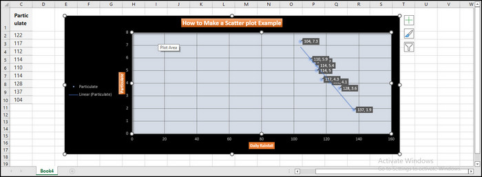
Here, the two columns containing quantitative data are Daily Rainfall and Particulate. Select the two columns to get started.
Click the Insert tab and select Insert Scatter (X, Y) or Bubble Chart. 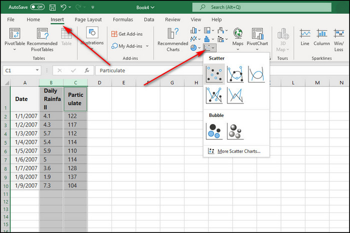
Select any of the five scatter plot templates. I’ll use the classic scatterplot template, which only plots the data points in a cartesian coordinate system.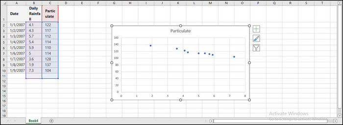
Check out our separate post on how to remove password from Excel file.
How to Customize a Scatter Plot?
Once you have inserted a scatter plot, you can customize it in many ways. A scatter plot made from a built-in template may not satisfy your needs. You may want to add legends, edit titles, and edit the horizontal and vertical axes.
You can do all that and customize gridlines, trendlines, and data labels. I should not forget to mention how you can customize colors as well.
1. Customize Plot Style
Excel has a few built-in plot styles for scatter plots. You can select one of them to customize your scatter plot to your liking.
Follow these steps to customize a scatter plot style:
- Make a scatter plot using the steps mentioned in the above section.
- Access the Chart Design tab on the top of your screen.
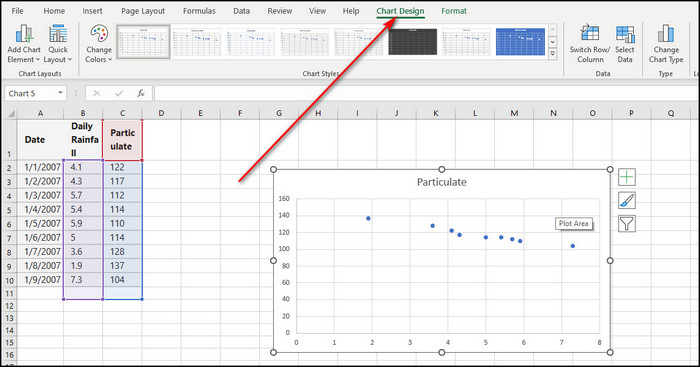
- Select the desired chart style under the Chart Styles section.
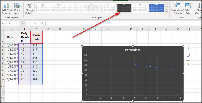
If you are done deciding on a built-in style, you can move on to the following customization.
Related guide on how to delete a sheet in Excel.
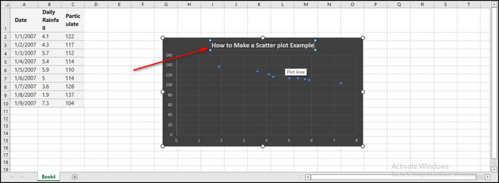
2. Customize Plot Title
You need to give your plot an appropriate title to send a clear message about what the plot is about. You can also customize it to your liking to enhance its visual appeal.
Follow these steps to customize a scatter plot title:
- Make a scatter plot using the steps mentioned in the above section.
- Type the desired text by clicking on the chart’s title.
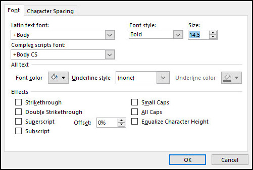
- Right-click on the chart’s title, select Font and then type the desired size into the Size box to adjust the font size. Select OK.
- Right-click the chart’s title, select Style and choose a style to make your title look more appealing.
- Right-click the title of the chart. Fill the title background with color if your style is not already doing so. You can also color the outlines.
If you are done customizing the title, move on to the following customization.
3. Customize by Adding/Removing Chart Elements
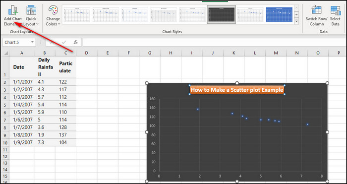
The Add Chart Element option on the Chart Design tab is handy when customizing a scatter plot.
You can remove/add any axis, add axis titles, change plot title location, add data labels, add plot legends, add error bars, add trendlines, and add gridlines.
Follow these steps to customize a scatter plot by adding/removing chart elements:
- Click Add Chart Element > Axis Titles on the Design tab.
- Click Primary Horizontal under the Axis Titles submenu to add a horizontal axis title.
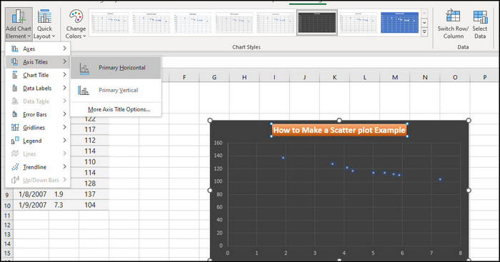
- Click Primary Vertical under the Axis Titles submenu to add a vertical axis title.
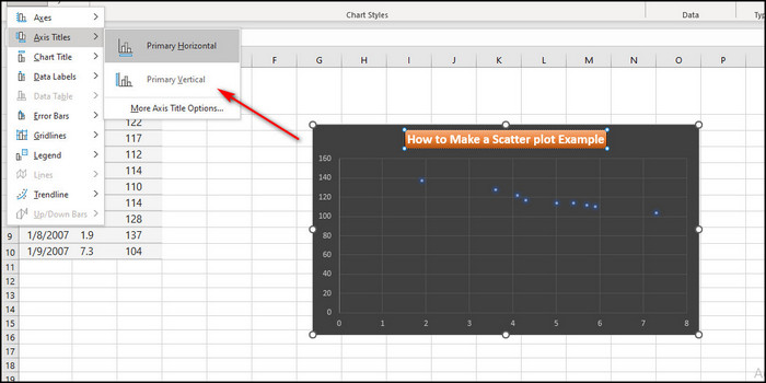
- Click on each title, enter the desired text, and click the title again. You can customize the axis titles, similar to how you customize the plot title. This will wrap up Axis title customization.
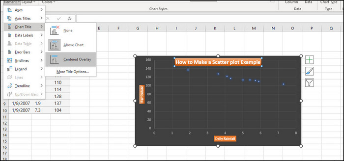
- Click Add Chart Element > Chart Titles on the Design tab. You can either remove the title or change its current position based on your choice. The options are pretty self-explanatory.
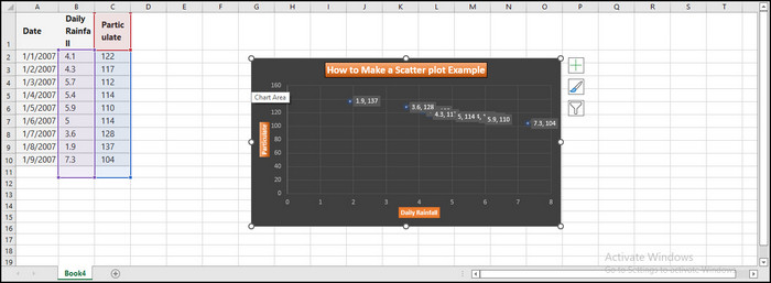
- Click Add Chart Element > Data Labels on the Design tab. You can choose the position of the data labels from the resulting sub-menu. You can turn on Data Callout to show the x-axis data besides the data labels.
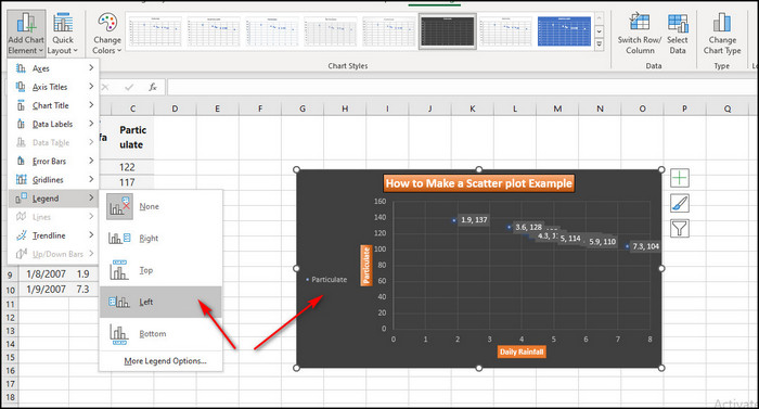
- Click Add Chart Element > Legend on the Design tab. Select the location of the plot legend.
- Click Add Chart Element > Trendline on the Design tab. You can select a variety of trendlines to understand the correlations between the two variables. You can choose linear when the number of data points is low.
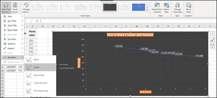
Similarly, add gridlines and error bars from the Add Chart Element option.
Check out the easiest way on how to randomize a list in Excel.
4. Customize by Using the Format Tab
You can find some other excellent options by using the Format tab. Another tab appears on the top of your screen if you click on the scatter plot area.
Follow these steps to customize a scatter plot using the Format tab:
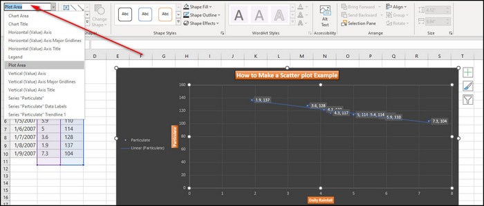
- Select the location of the plot you want to edit on the Format tab. You can select it at the top left corner of your screen. I will show you how to customize the plot area and chart area.
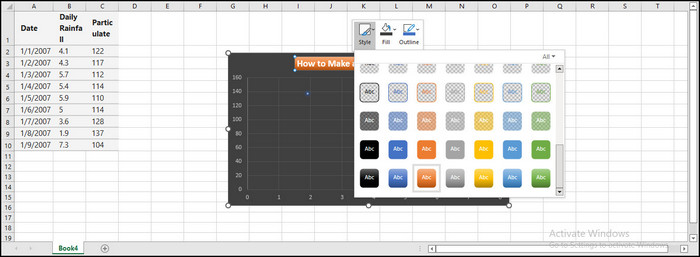
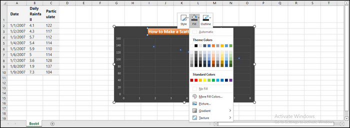
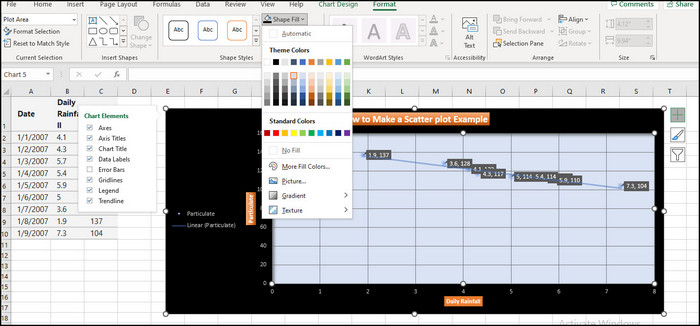
- Click the More button on the Format tab, then select the desired effect from the Shape Styles group by selecting the More button.
- Click on shape fill to color the chosen location.
There are many more customization options you will find in Excel. If you have had no problem catching everything thus far, you should browse some options on your own to learn more.
How to Swap X and Y Axes on a Scatter Plot in Excel?
Remember that Excel will plot the left column on the x-axis, and Excel will plot the right column on the y-axis. If the order of the columns is wrong in your spreadsheet, do not worry. You can insert the scatterplot and change the variables in the x and y axes.
Follow these steps to swap the x and y axes on a scatter plot in Excel:
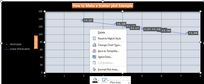
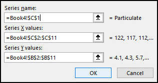
- Right-Click on any of the axes and click on Select data.
- Click on the Edit section in the dialog window.
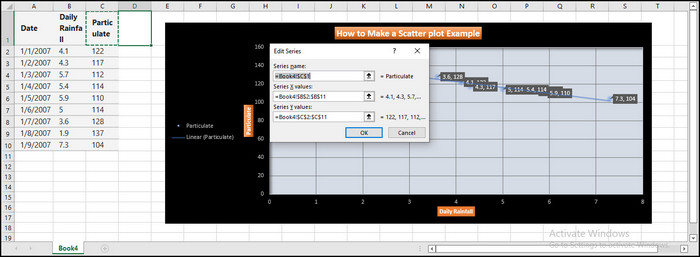
- Swap the values for the series x values and the series y values.
- Click OK twice.
The process will be complete, and you will have your desired result.
Conclusion
You can create a scatter plot in Excel using the numerical data stored in at least 2 columns. You have a lot of flexibility in how you can customize it. How you should arrange data is not complicated. You can swap out the x and y axes if you need to.
If you have any queries, please comment below! I will try my best to assist you.
you can add an image of scatter plot (how it looks on Excel). That will improve the authenticity of this article.