Even though Power BI is known for its intuitive interface and robust reporting capabilities, its true potential lies in advanced analytics.
From predictive analytics to machine learning integration, Power BI’s advanced features are designed for businesses seeking to extract maximum value from their data.
That’s why, in this article, I’ll describe the tutorials for the advanced analytical options available in Microsoft Power BI, with easy-to-understand examples for each technique.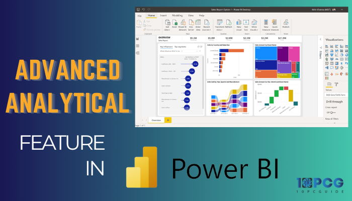
Let’s begin!
What is Advanced Analytics in Power BI?
Power BI has a set of powerful analytical functions that go beyond basic reporting and visualization. It includes features and tools that help you to get more information, make data-driven decisions, and discover patterns & trends in the data.
Advanced analytics in Power BI surpasses basic analytics by incorporating sophisticated statistical and machine learning techniques.
For instance, organizations can create and deploy predictive models based on historical data to anticipate future trends or outcomes.
Key components of advanced analytics include machine learning algorithms, statistical functions, and predictive modeling tools. You can use these features to uncover hidden insights, forecast future trends, and perform complex data analyses.
Also, Power BI’s integration with Azure Machine Learning lets you seamlessly incorporate ML models into reports and dashboards.
Furthermore, with Power BI’s advanced features, conduct what-if analyses, scenario planning, and statistical hypothesis testing. It allows organizations to make informed decisions based on a more comprehensive understanding.
How to Perform Advanced Analytics in Power BI
Advanced Power BI analytics encompasses multiple techniques beyond primary data exploration and visualization to uncover deeper insights and patterns from data. These techniques include statistical analysis, machine learning, and artificial intelligence.
Use ML algorithms to forecast future trends and patterns. Power BI provides built-in forecasting capabilities and integration with Azure Machine Learning services.
Additionally, uncover hidden patterns and relationships in your data using clustering and anomaly detection techniques. Power BI’s DAX language and advanced data modeling capabilities support these techniques.
Now, follow the instructions below to perform advanced analytics in Power BI:
Set Targets
Define the objectives of your analysis clearly. Understand the key questions you want to answer and the insights you want to extract from the data.
Utilize Power Query
Import your data in Power BI through Excel, SQL Server, or other data sources. Then, use Power Query to clean the data. It includes handling missing values, removing duplicates, and other data-cleaning tasks.
Now, apply transformations such as merge tables, split columns, or create calculated columns to shape your data as needed.
Apply Advanced Analytics Techniques
Integrate machine learning models directly into Power BI using Azure Machine Learning or other services. Also, use different advanced analytics features such as forecasting, clustering, and key influencers.
Create visually appealing dashboards by arranging visualizations on report pages. Choose the visualizations that effectively display your insights. For more unique visuals, explore and use custom visuals available in the Power BI marketplace.
Automate Data Refresh
Configure scheduled data refresh in Power BI Service to keep your reports up to date. It is crucial for maintaining accuracy. Additionally, link your data to sources that are constantly updating for live analysis.
Iterate and Refine Analysis
Share your Power BI reports and dashboards with stakeholders to gather feedback. Then, based on feedback and new data, iterate on your analysis. You’ll need to re-adjust visualizations and refine calculations.
Advanced Analytical Features in Power BI?
Advanced analytics lets you go beyond traditional business intelligence by incorporating sophisticated statistical and machine-learning techniques into the data analysis. Power BI offers robust tools and features for analytics to build predictive models and uncover hidden patterns.
With integrated capabilities such as R and Python scripting, you can write custom codes to perform complex analyses and create advanced visualizations.
Additionally, Power BI’s AI-powered capabilities, such as natural language processing and automated machine learning, make it accessible for advanced analysis.
These features allow organizations to make data-driven decisions, predict future trends & gain a competitive edge, and below, I’ve explained how to use them.
Here are the advanced features that are available in Power BI:
1. Use Statistical Functions
Power BI offers statistical functions to analyze and derive information from data effectively. These include descriptive statistics, correlation analysis, regression analysis, and more.
Descriptive statistics functions, such as AVERAGE, MEDIAN, and MODE, allow you to understand the central tendency of the data. Correlation functions, such as CORREL, quantify the relationship between two variables.
Power BI also supports regression analysis through functions like SLOPE and INTERCEPT, which are crucial for predicting values based on existing data patterns.
Additionally, use statistical functions to handle data distributions, perform hypothesis testing, and calculate probabilities.
Here are the examples of using statistical functions in Power BI:
Add an Average Line to Charts
- Load your dataset into Power BI. In this example, I’ll import a dataset with a column for the dates and a column for the price.
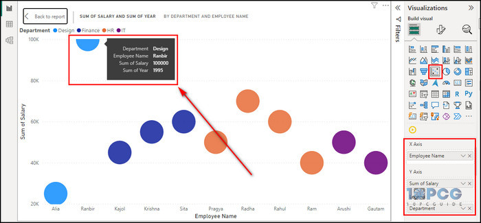
- Select the Line chart visualization onto your report canvas.
- Assign the Date column to the x-axis and the Price column to the y-axis.
- Expand the Y-axis field and choose Average.
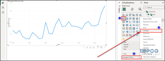
Now, you’ll see a line chart with the average line plotted.
Add a Trend Line to Charts
- Click on the Analytics icon in the Visualizations field.
- Toggle on Trend line.
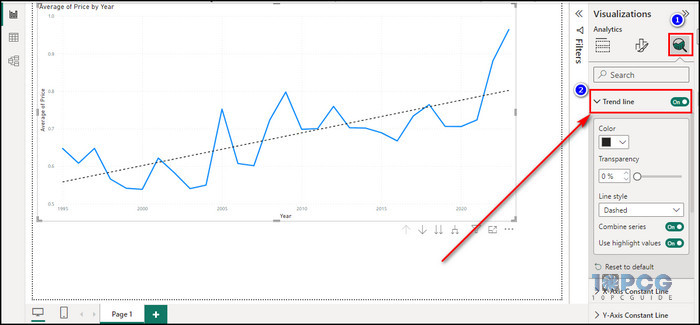
Now that you have added the trend line, you can analyze the overall trend in your data more effectively. The trend line helps to identify whether your data is increasing, decreasing, or remaining relatively stable over time.
2. Create Histogram
In Power BI, a histogram is a powerful visual representation of data distribution within a dataset. It provides insights into the frequency and patterns of values.
This graphical tool organizes data into discrete bins or intervals along the x-axis, with the height of each bar on the y-axis corresponding to the frequency of occurrences within that specific range.
Utilizing the histogram allows you to quickly grasp the central tendency, spread, and skewness of the data.
Follow the steps below to create a histogram in Power BI:
- Import your data in Power BI.
- Go to Report view.
- Select the Clustered column chart from the Visualization field.
- Set the Date column to the x-axis and the Price column to the y-axis.
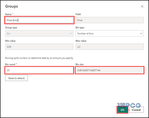
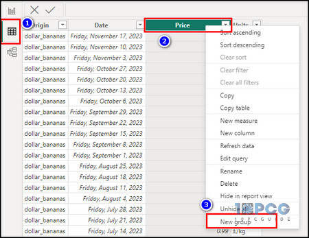
- Right-click on Price from the Data pane and choose New group.
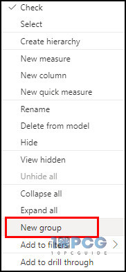
- Provide a name for the group, enter the Bin count, and click OK.
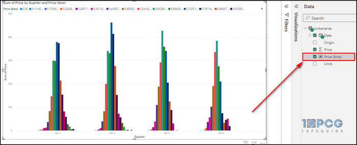
- Check the newly added group from the Data panel.
Depending on your dataset and analysis requirements, you’ll need to adjust the configuration and statistical functions accordingly.
3. Apply Top N Analysis
Top N analysis in Power BI lets you focus on the most significant data points within a dataset. Whether exploring sales performance, customer behavior, or something else, Top N analysis enables you to easily identify and analyze top performers or contributors.
Gain insights into the highest values, such as top-selling products, top-performing regions, or top customers, by specifying the desired number of items to display.
Here’s the process for applying Top N analysis:
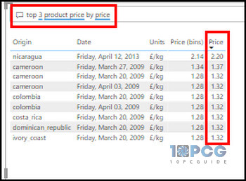
Use the Q&A Visual to Find the Top N
- Import your data into Power BI Desktop.
- Go to the Visualization pane.
- Click on the Q&A icon to add a Q&A visual to your report.
- Type natural language questions in the Q&A box, and Power BI will generate visuals based on your queries.
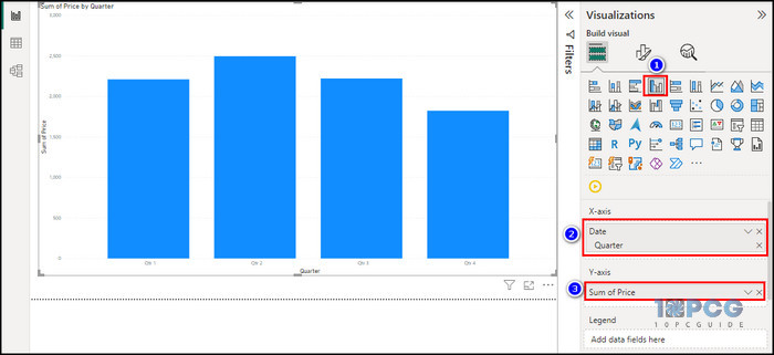
Use a Top N Filter Type
- Click on the visual to which you want to apply the Top N filter. In this example, I am using the Stacked column chart.
- Set the Date column to the x-axis and the Price column to the y-axis.
- Expand the Date – Year field from the filter pane.
- Select Top N in the Filter type.
- Set Show items to Top and 5.
- Drag the Price field into the By value field and choose Maximum.
- Click on Apply filter.
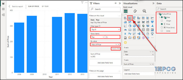
Now, you’ll see the top 5 years with the maximum price in your dataset.
Use a TOPN DAX Function
- Import your data in Power BI.
- Right-click on the data and choose New measure.
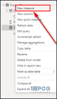
- Enter the DAX code as the new measure. In this example, I’m using the following expression:
Top 5 Products = SUMX ( TOPN ( 5, ProductPrice, ProductPrice[Origin]), [Price] )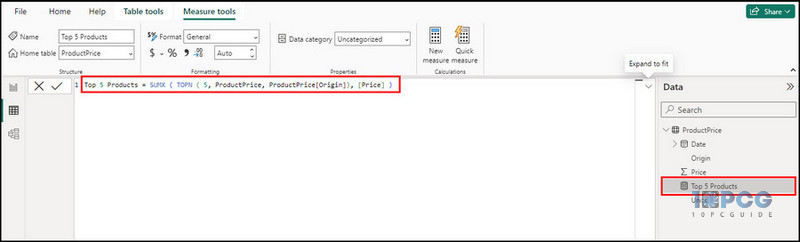
Now, you can effectively use the TOPN function for Top N analysis in Power BI. Adjust the measure, table, and criteria based on your specific requirements.
4. Find Outliers in Power BI
In Power BI, identifying outliers is a straightforward process thanks to its vast visualization tools.
Utilizing visuals such as scatter plots and DAX functions, you can quickly pinpoint data points that deviate from the usual.
Scatter plots visually represent individual data points, allowing for a clear observation of outliers based on their position relative to the overall data distribution. The DAX formula can do the same by writing just a few lines of code.
Power BI’s interactive features enhance outlier detection even more by allowing you to explore and filter data dynamically.
Here are the steps to find outliers in Power BI:
- Open Power BI Desktop.
- Load your dataset into the app.
- Select the Scatter chart icon to create a new plot in the Visualizations pane.
- Drag the relevant fields to the X-Axis and Y-Axis fields. Put the variable you suspect contains outliers on one axis and the dependent variable on the other.
- Drag the column that contains the data points you want to analyze into the Values field. It will create individual data points on the scatter chart.
Now, simply examine the scatter chart visually for outliers. Look for points that are far away from the general pattern or trend of the data.
5. Group and Bin Data for Advanced Analysis
In Power BI, grouping means categorizing data points based on common attributes. It allows you to aggregate and summarize information for a more comprehensive understanding.
Meanwhile, binning refers to creating discrete ranges or bins to organize numerical data. It lets you explore patterns and trends within specified intervals quickly.
Grouping and binning allow users to manage and analyze large datasets efficiently. They provide insights into the distribution and relationships of data points.
Here’s how to group and bin data for advanced Power BI analysis:
Create a Group
- Open Power BI Desktop and load your data source.
- Go to the Table view.
- Select the column you want to group, right-click on it, and choose New group.
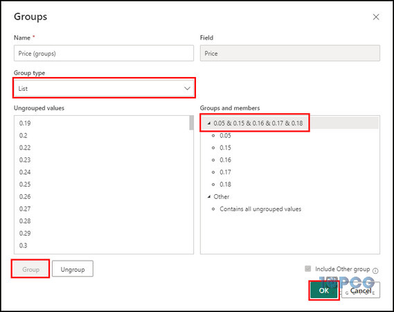
- Set the Group type to List.
- Select the values you want to group and click the Group button.
- Click OK.
Edit a Group
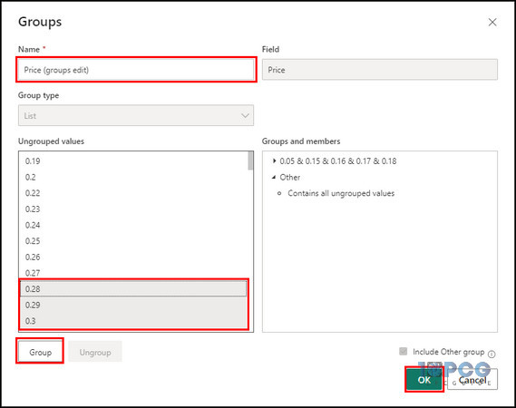
- Select the group you want to edit.
- Right-click on the group and select Edit group.
- Make necessary changes to the group, such as adding or removing values or updating the group name.
- Click OK to save changes.
Create Bin Groups
- Proceed to the Table view.
- Select the column you want to bin, right-click on it, and choose New group.
- Set the Group type to Bin.
- Specify the Bin size and click OK.
6. Perform Time Series Analysis
To conduct time series analysis in Power BI, simply use the built-in functionalities and predictive forecasting models to extract meaningful insights from data with a time scale.
For this process, you need to prepare the data, identify trends & patterns, and generate forecasts for future developments.
Power BI simplifies time series analysis by providing automated trend detection and forecast visualizations. So you can make informed decisions based on data-driven insights.
Follow the steps below to perform a time series analysis:
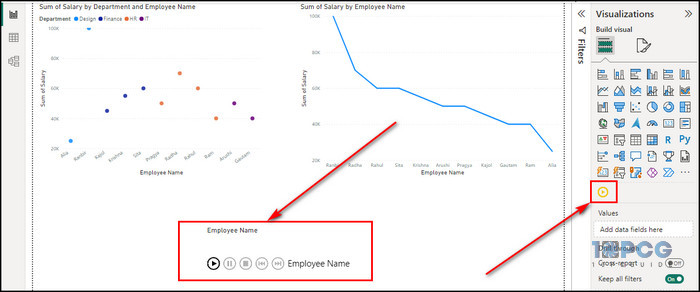
- Import a dataset in Power BI that has a column with date or time values for your time series.
- Create a Scatter chart and a Line chart with your time series data in the Report view tab.
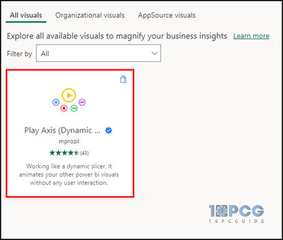
- Select Get more visuals from the Visualizations pane.
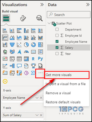
- Search for Play Axis and add it to your report.
- Configure the Play Axis visual settings, such as the animation speed and direction.
- Click the Play button to start the animation.
7. Use the Analyze Feature
Power BI’s Analyze feature is valuable for uncovering hidden information and patterns within your data. It automatically identifies trends, anomalies, and contributing factors with a comprehensive understanding of your business metrics.
Here’s the process to use the Analyze option in Power BI:
- Right-click on any data point in a Bar or Line chart.
- Select the Analyze option.
- Choose Explain the increase, Explain the decrease, or Find where this distribution is different based on your query.
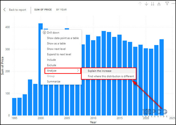
Now, Power BI’s machine learning algorithms will analyze your data and give meaningful explanations with visualizations to help you grasp the factors for the observed trends.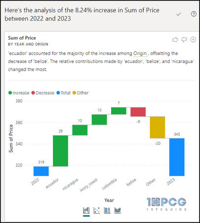
8. Utilize What-If Parameters
What-if parameters are powerful tools for performing scenario analysis and exploring different possibilities within your data. They can create dynamic variables that you can adjust to see how different values affect your data and visualizations.
So you can quickly assess the potential impact of various factors on your business or organization.
Here are the steps to utilize the What-if parameters:
Create a What-if Parameter
- Navigate to the Modeling tab from the top ribbon bar.
- Select the New Parameter option.
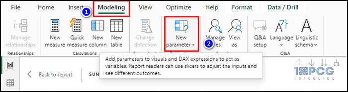
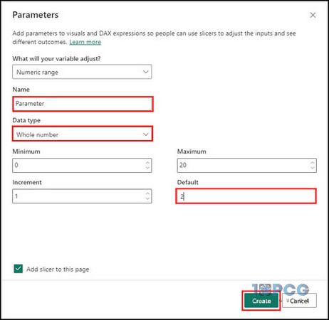
- Provide a name and select the Data type for the parameter.
- Assign a Default value to the parameter.
- Set restrictions on the data type to ensure that users enter valid values. For instance, you can define a Minimum and Maximum value for a numerical parameter.
- Check the Add to slicer box to create a slicer control for the parameter. It allows you to select different values from a visual representation interactively.
- Click the Create button.
Use a What-if Parameter
- Determine which parameters are most relevant to the scenario analysis you want to perform.
- Utilize the created parameters within DAX measures or calculations.
- Add the measures or calculations containing parameters to your visualizations.
- Place slicers on the Report canvas so you can interact with the slicers to dynamically explore different scenarios.
Now, carefully analyze the visualizations and identify patterns or trends as you modify the parameter values. Use these insights to make informed decisions and understand the impact of different factors.
How to Leverage AI and Machine Learning in Power BI for Advanced Analysis
Using AI and ML for enhanced analysis involves integrating pre-built AI capabilities and custom machine learning models into your data visualizations. Import AI-powered visuals or incorporate Power BI’s built-in AI features, such as anomaly detection and forecasting.
These features empower users to uncover deeper insights, make data-driven decisions, and gain a competitive edge by directly employing AI’s and machine learning’s predictive and prescriptive power within the Power BI environment.
Here’s how to leverage AI and machine learning for advanced analysis:
1. Detect Anomalies
Detecting anomalies has a profound impact on Power BI advanced analytics by identifying irregular patterns, outliers, or unexpected behaviors within the data.
When you find anomalies, it allows analysts and decision-makers to gain deeper insights into issues, trends, or opportunities that may otherwise go unnoticed.
By leveraging anomaly detection techniques, Power BI users can improve data quality, identify data entry errors, detect irregular activities, and uncover hidden patterns that may impact business performance.
Follow the steps below to detect anomalies in your Power BI report:
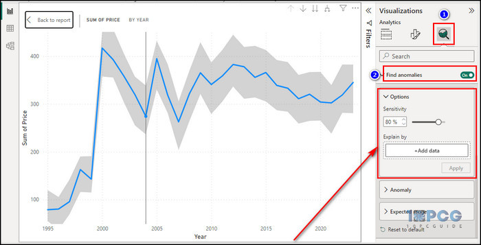
- Import your data into Power BI Desktop. Ensure your data has a date or time field representing the time series.
- Create a Line chart.
- Drag the date or time field onto the X-axis and the measure you want to analyze onto the Y-axis.
- Select the Analytics icon and toggle on the Find anomalies option.
- Adjust the Sensitivity slider to control how strict anomaly detection should be.
Remember, anomaly detection works best with clean and consistent data. Ensure your data is free from errors and outliers before applying anomaly detection.
2. Use Key Influencers
Observing key influencers enhances your analytical capability in Power BI by identifying and highlighting the most impactful factors that drive specific outcomes within a dataset.
This feature employs machine learning algorithms to detect patterns and relationships in the data automatically. It shows the key drivers influencing a particular metric or result.
By visually presenting these influencers, such as specific data points, categories, or variables, you can gain valuable insights into the factors responsible for the observed trends.
Here’s the process for using Key influencers:
- Load your dataset into Power BI.
- Click on the Key influencers visualization icon.
- Drag and drop the metric you want to analyze into the Analyze field.
- Drag and drop influencing factors into the Explain by field.
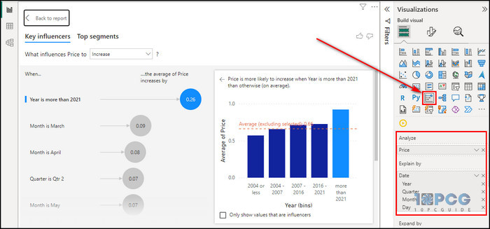
Now, Power BI will generate the key Influencers that have impacted the selected metric.
Analyze the results to understand which factors have the most significant impact on the outcome variable. Pay attention to the contribution percentage and the direction of influence (Increase or Decrease).
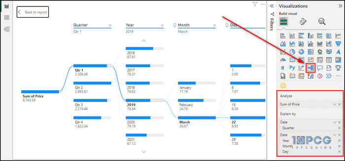
3. Create Decomposition Trees
Decomposition trees in Power BI enhance advanced analysis by providing a dynamic and visually intuitive way to break down complex data hierarchies. These trees break down a particular metric or KPI into different parts to let you explore and understand the contributing factors.
This capability is compelling for identifying patterns, trends, and outliers in large datasets. It enables users to perform root cause analysis.
The interactive nature of decomposition trees facilitates drill-downs into specific dimensions, such as time, geography, or product categories.
Here’s how to create a decomposition tree:
- Load the data you want to analyze into Power BI.
- Click the Decomposition tree icon to add it to your report canvas.
- Drag the measure you want to analyze from the Data pane to the Analyze field in the Decomposition tree visualization.
- Drag and drop the hierarchy field, in this case, Date, into the Explain by field.
- Expand and collapse nodes on the Decomposition tree to explore the relationships between different hierarchy levels.
- Hover over a specific node to see detailed information and visualizations related to that level.
4. Construct Smart Narratives
Smart Narratives in Power BI have a transformative impact on advanced analysis by providing a dynamic and insightful explanation of data visualizations.
This feature utilizes natural language generation to automatically generate coherent and relevant narratives to describe charts and graphs, offering a clear and concise interpretation of the underlying data.
It not only enhances the accessibility of complex analyses for a broader audience but also facilitates a deeper understanding of essential information.
Integrating narrative explanations within Power BI dashboards simplifies the analytical work, making it easier for both technical and non-technical users to gain data.
Here are the steps to construct a Smart narrative:
- Import your data into Power BI.
- Use the Power BI interface to create visualizations based on your data.
- Drag and drop fields onto the canvas to create charts, tables, and other visual elements.
- Select the visualization for which you want to generate a Smart narrative.
- Click on the Smart narrative option from the Visualization pane.
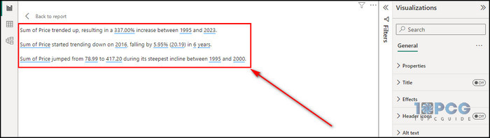
Now, Smart narrative will automatically generate information based on the data in your visualization. Review it to gain a deeper understanding of your data.
How can Power BI Advanced Analytics Help Businesses?
Performing advanced analytics in Power BI benefits businesses by providing powerful tools and features that enhance data analysis and decision-making processes. It unlocks the ability to leverage predictive analytics. So businesses can forecast trends and identify patterns based on future predictions.
This predictive capability can be particularly valuable for finance, sales, and marketing industries, where expecting market changes and customer behavior is critical.
Moreover, Power BI’s integration with machine learning models lets businesses use sophisticated algorithms for their data. They can uncover more profound information and automate complex analyses.
Additionally, the platform’s support for data visualization facilitates the communication of insights to stakeholders.
So, it’s safe to say Power BI’s advanced analysis topics empower businesses to transform raw data into valuable insights.
Final Thoughts
As you can see, integrating machine learning, artificial intelligence, and sophisticated visualization tools within Power BI enhances data analysis capabilities. It ensures that businesses can unlock the full potential of their data.
Comment below if you have further questions, and we’ll get back to you.