Do you need to compare variables across categories? If so, the ultimate solution for you is the clustered column pivot chart of Microsoft Excel.
Using PivotTables in Excel, you can efficiently summarize large data sets, create interactive dashboards, and analyze numerical data in detail.
Here, I will demonstrate how to build a data set, convert it to a Pivot Table, and make it a clustered column pivot chart.
Without further ado, let’s begin!
How to Insert a Clustered Column Pivot Chart in the Current Worksheet
To insert the clustered column pivot chart under the same Excel Sheet, create a dataset, and make the dataset a Pivot Table using the PivotTable feature. Once the Pivot Table is ready, add a clustered column chart using the Pivot Chart under the Insert tab of Microsoft Excel.
The process of building a complete pivot chart is straightforward. You can build a pivot chart within three steps.
I will describe the steps with real-life examples so you can relate and efficiently apply the steps to your project.
Here are the steps to insert a clustered column pivot chart in Excel:
1. Create a Dataset for a Pivot Table
Let’s start the journey by building a new table with your data. Simply launch the Microsoft Excel desktop application and create a new Workbook.
Now add your data to the newly created Workbook. For instance, I have added a company dataset in the following table. This table contains information about the selling year, states, predicted sales, and real sales.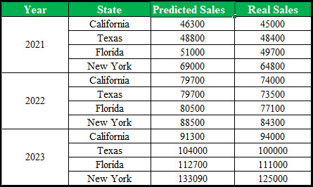
Using this dataset, I will create a pivot chart. Move down to the next part to build a pivot table for the chart.
2. Build a Pivot Table from Dataset
Once the data table is ready, you can create a pivot table using the dataset. To do so, consider the subsequent instructions.
Here’s how to build a pivot table from an Excel dataset:
- Select and highlight the dataset.
- Navigate to the Insert tab and select PivotTable.
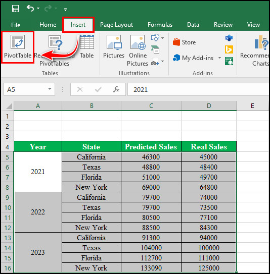
- Check the Existing Worksheet checkbox from the Create PivotTable window.
- Click on the Location icon, choose a cell, and click on the icon again.
- Select OK.
- Locate PivotTable Fields on the right-hand side of the screen.
- Select and drag the State and Year to the Rows field.
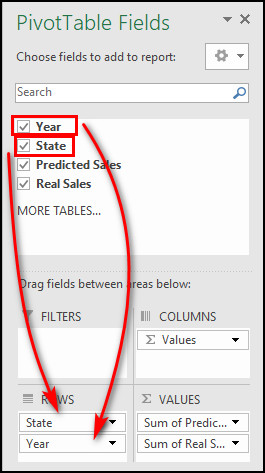
- Repeat the process for predicted and real sales, but drop them to the Values field.
Voila! You’ve successfully created a pivot table from your dataset. You can sort and filter the labels & values using the Row Labels dropdown menu.
3. Insert Clustered Column Chart
Once your Pivot Table is ready, insert a clustered column chart to bring life to the table. Though there is no direct method to make an Excel clustered stacked column pivot chart, you can use the clustered column chart instead.
Perform the following process to insert a clustered column chart:
- Select your PivotTable.
- Switch to the Insert tab.
- Navigate to Pivot Chart >> Pivot Chart.
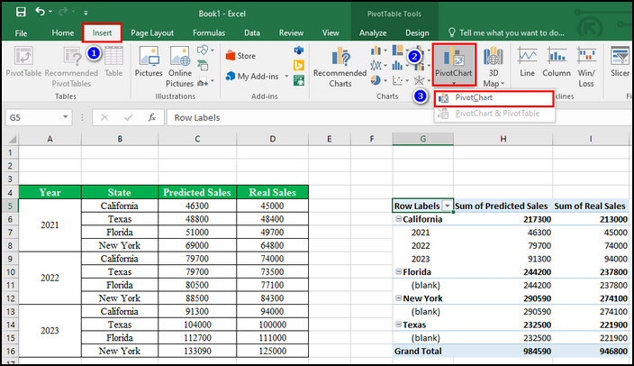
- Choose a column style from the Insert Chart window.
- Click OK.
Bingo! You have just created a clustered column pivot chart in the Excel desktop application (2013, 2016, 2019, and 2021 versions).
The aforementioned method will instantly create a clustered column chart using the data of the selected Pivot Table. In case you’re not satisfied with the output, you can edit the clustered column chart by following the instructions in the next section.
How to Edit the Clustered Column Chart in Microsoft Excel
You can efficiently modify the clustered column chart in Excel using the Format Gridlines and Format Data Series options. Moreover, you can make the bars three-dimensional and add Shadow, Glow, or Soft Edge for further enhancement.
Here’s how to edit the clustered column chart:
- Right-click on the chart and select Format Gridlines.
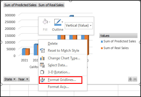
- Expand the Line option and choose Automatic. Here, you can adjust the Color and Width to beautify the chart.
- Right-click on a bar and choose Format Data Series.
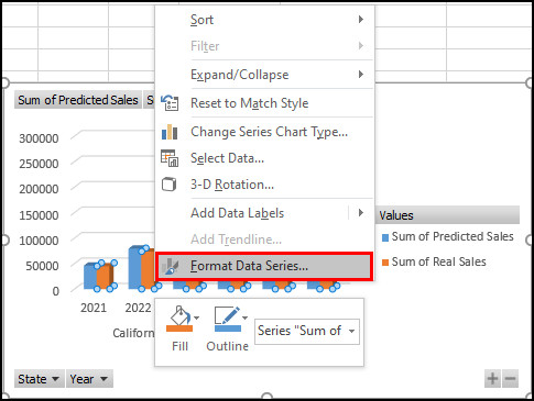
- Adjust the Gap Width to make it more appealing.
- Choose a Column shape that represents the dataset.
- Click on the brush icon (Effects) and alter the options of Shadow, Glow, Soft Edge, and 3-D format according to your needs.
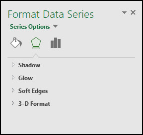
Don’t hesitate to alter the settings until you get the desired result. Once you’re satisfied with the output, you can close the Format pane.
Wrap Up
Inserting a clustered column pivot chart in MS Excel is not rocket science. If you cautiously go through the process above, undoubtedly, you will be able to craft a unique and helpful chart.
However, if something goes wrong, don’t panic. Simply start over and perform each step more carefully.
For further assistance, leave a comment below.