Pie charts are excellent for making complex information understandable at a glance. These are powerful graphs that can present your data with great aesthetics, and in MS Word, you can easily use them in your document.
In this article, I’ll provide the step-by-step process of creating pie charts in Microsoft Word.
Let’s begin!
How to Create a Pie Chart in Word
To make pie charts in Word, open your document and click on the Insert tab. Then, select Chart and choose Pie from the chart options. A default pie chart will be inserted into your document. Select the chart and choose the Chart Elements option on the right to customize it.
To input your data, right-click on the chart, select Edit Data, and an Excel spreadsheet will appear. Enter your data into the spreadsheet, and the pie chart will automatically update.
Check out the steps to create a pie chart in MS Word:
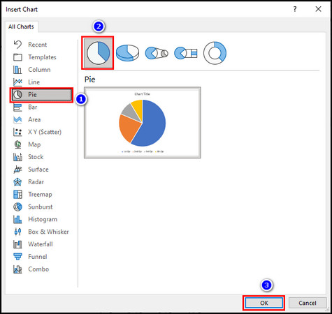
1. Add a Pie Chart
When you insert a pie chart in Microsoft Word, you tell the software to create a graphical representation of your data. This representation is based on the data you provide.
Follow the steps below to add a pie chart:
- Open your Word document and place your cursor where you want to insert the chart.
- Go to the Insert tab in the Word ribbon at the top.
- Click on Chart in the Illustrations group.
- Select Pie from the list of chart types on the left in the Insert Chart dialog box.
- Choose a sub-type for your pie graph, for example, Pie, 3-D Pie, or Pie of Pie.
- Click the OK button to insert the pie chart into your document.
After these steps, an Excel spreadsheet will open automatically with a simple title and data already entered. Use this spreadsheet to add the data to your pie graph.
2. Input Data to the Pie Chart
After inserting the chart, you need to provide the data that will be used to make the pie graph. You enter this data into an Excel spreadsheet linked to the pie chart. The graph uses this data to calculate each slice of pie.
Here’s how to input data into the pie chart:
- Remove the example data from the Excel spreadsheet.
- Enter the title and data for your pie graph.
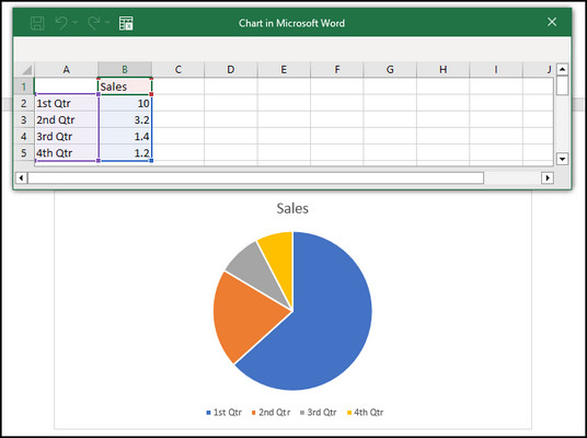
- Close the spreadsheet when you are done.
The pie chart is dynamic. It means as soon as you enter the data in the worksheet, the graph starts calculating it and adjusts its pie slice sizes.
When you need to edit or add more data to the pie chart, open the Excel spreadsheet again. For that, click on the chart, go to the Chart Design tab, and select the Edit Data option from the Quick Access toolbar at the top. 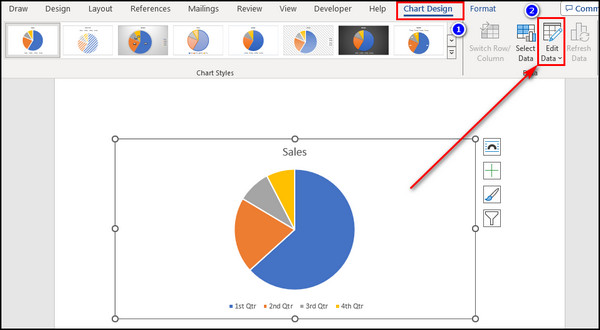
3. Format Your Pie Chart
Now, you can customize the appearance of the pie chart to make it more visually appealing, convey information more clearly, and match your document’s style. Formatting includes adding labels, changing colors, adjusting the size, and more.
Below, I’ve provided the options available in Word to format your pie chart:
Layout Options
This option lets you control how the pie graph interacts with the surrounding text. You can resize the chart by clicking and dragging its corners. 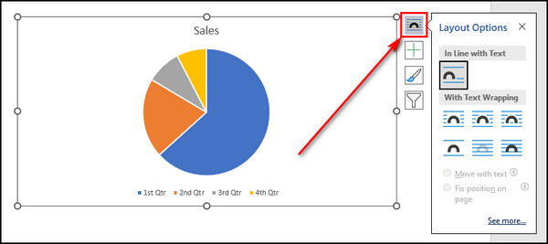
Chart Elements
To add or remove specific chart elements like data labels, legends, or titles, click on the graph, and you’ll see the Chart Elements button (plus icon) in the upper-right corner of the pie chart. Click this button to choose which elements to display. 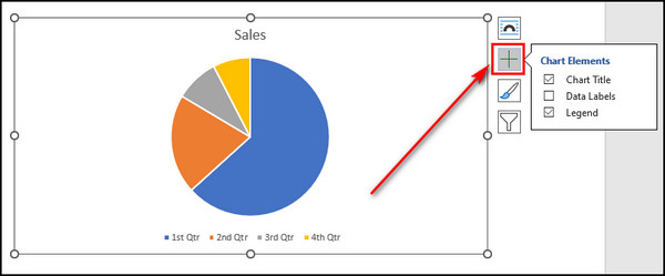
Chart Styles
This option lets you change the style and color of your pie chart. To change the chart style, click on the chart, and you’ll see the Chart Styles button (paintbrush icon) on the top-right of the chart. Click this button to choose a style that suits your document’s design, and go to the Color tab to modify its colors.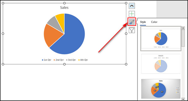
Chart Filters
It allows you to focus on specific data series in your pie chart. To access Chart Filters, click on the chart, and you’ll see a Filter icon (funnel-shaped) beside the chart. Click this button to filter the data series you want to display. 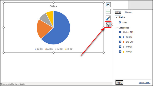
What are the Different Types of Pie Charts Available in Microsoft Word?
Microsoft Word offers five types of pie charts. All of them allow you to represent data as segments of a circle, with each segment’s size proportional to the value it represents. Choose different pie graphs to suit your visual preferences and the data type the chart presents.
Below, I’ve explained the types of pie charts available in MS Word:
Pie
This graph is the basic pie chart in Word. It represents data in a circular graph where each data category is shown as a slice of the pie. The size of each slice is proportional to the value you’ve provided in the dataset. The entire pie is considered 100%. 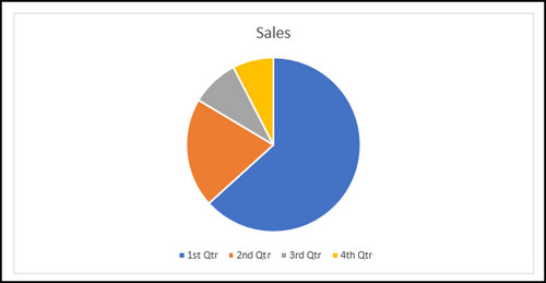
3-D Pie
A 3-D pie chart is similar to a standard pie chart but with a three-dimensional effect. It can be more visually appealing and gives your graph a dynamic look. It’s used for the same purposes as a regular pie chart but may be used to add more depth to your data representation. 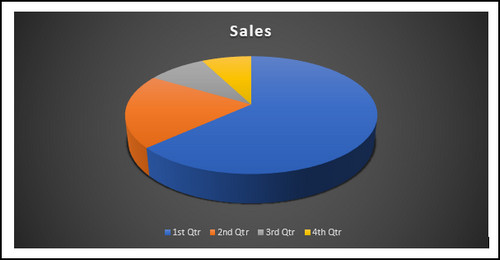
Pie of Pie
Use this type of pie graph when you have a lot of data points that make the main pie chart slices too small to see clearly. This chart creates a secondary pie chart to represent the smaller data points, and the main pie graph shows a summarized version of the data. 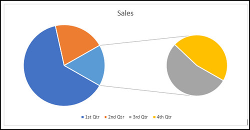
Bar of Pie
Like the Pie of Pie chart, use the Bar of Pie chart when you have numerous small data categories. Instead of a secondary pie chart, it uses a bar chart to represent the smaller data categories. So it becomes easier to compare those smaller categories.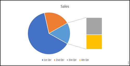
Doughnut
This unusual doughnut-shaped pie chart shows the relationship of different parts of the entirety. But it can represent multiple data series within the same chart. Doughnut charts are helpful when you want to highlight the proportion of individual parts relative to the whole. It also allows you to compare between multiple doughnut rings. 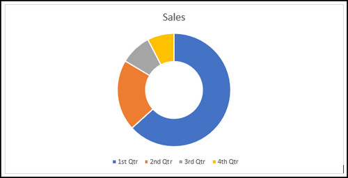
What are the Advantages and Disadvantages of Using Pie Graphs in MS Word?
Pie charts effectively show the parts of a whole. People can quickly grasp proportions and percentages at a glance. However, they are not suitable for displaying complex data with many categories, as it becomes challenging to distinguish small slices or compare multiple pies.
Here are the advantages and disadvantages of using pie charts in Word:
| Advantages of Pie Graphs | Disadvantages of Pie Charts |
|---|---|
| ● Pie charts are simple and intuitive. Anyone can easily understand them. ● They are excellent for showing the proportions or distribution. ● Pie graphs are visually appealing and can draw the viewer's attention. ● These are useful for comparative analysis. ● Pie charts are space-efficient and take up less space compared to other charts like bar charts. | ● The pie chart becomes messy and hard to read with too many categories. ● Pie graphs become challenging when comparing data values between slices, especially when the differences are small. ● Pie charts are not as numerically precise as other charts available in Word. |
When Do You Need a Pie Chart?
Pie charts effectively display data where each category’s contribution to the whole is large enough to be noticeable easily. They are most commonly used when you have a few categories, typically between 2 and 7, to ensure clarity and readability.
A pie chart in Microsoft Word is a valuable tool for visually representing data divided into distinct categories or parts, especially when you want to show the composition of a whole.
For instance, you might need a pie chart in Word to present the distribution of expenses in a budget, the market share of different products, or the composition of a survey’s responses based on various options.
A well-constructed pie chart can make it easier for your audience to grasp the relative proportions of each category.
Related Article: How to Make a Flowchart in Microsoft Word.
Final Thoughts
Making a pie chart in Microsoft Word is a straightforward process that can add clarity and visual appeal to your data presentations in documents. It allows you to present your information in a visually engaging manner.
Comment below if you have further questions, and we’ll get back to you.