The default SharePoint interface can be dull and uninspiring, making it difficult to engage users and encourage teamwork. Fear not, though, as there are many ways to make SharePoint look pretty and enhance the user experience.

In this article, I’ll explain the methods to make your SharePoint site sleek and modern, from customizing the layout and theme to adding eye-catching images.
So, let’s dive in and learn how to beautify SharePoint!
To give your SharePoint site a more professional and branded look, you can customize its appearance easily and quickly. The available options depend on the version of SharePoint you are using. However, you must be the site owner or have design permission to make changes.
You can alter the theme, header & navigation layout for Team sites, and for Communication sites, you also have the ability to add a footer to your site.
Follow the instructions below to change the look of your SharePoint site:
To change the colors of your site, use a theme. You can choose from the default SharePoint themes and customize them according to your needs, pick your company brand theme, or use one of the classic experience designs.
Here are the steps to use a theme to change the color of your SharePoint site:
- Open your SharePoint site.
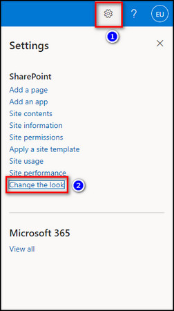
- Click on the Gear icon at the upper right corner and choose Change the look.
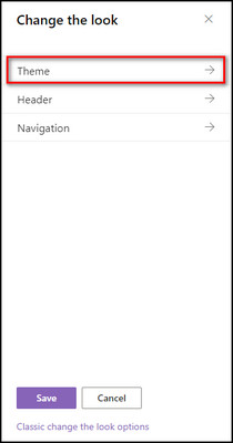
- Select Theme.
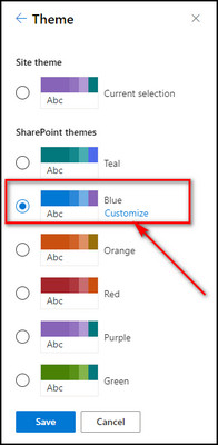
- Select the theme you like and click Customize to customize a default SharePoint theme’s colors.
- Choose the Main and Accent colors you want. You’ll see a preview of your site with the theme applied.
- Click Save to apply it. Otherwise, click Cancel to go back to the original theme.
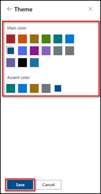
Note: Remember that you can’t change the background color for your site using this setting.
If your administrator has set site theming to Display only a list of company-approved themes, you won’t see any default SharePoint themes.
2. Modify Your Site Header
The site header contains the site’s title, logo, navigation menus, and other relevant information. By customizing your site header, you can personalize your SharePoint site and make it more visually appealing and user-friendly.
Customizing the site header means changing the logo, updating the site title and description, adding or removing navigation links, changing the header background color, and adjusting the layout of the header section.
Here’s how to modify your site header:
- Open your SharePoint site Settings.
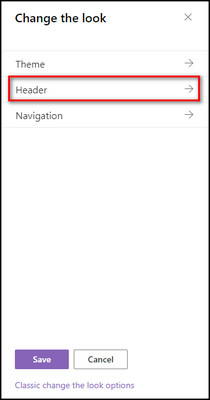
- Select Change the look > Header.
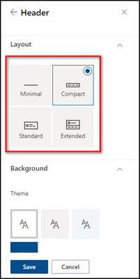
- Choose one of the following layouts:
- Minimal: The site title, site logo, site actions, site navigation, and labels are all fixed on a single bar at the top. The site logo size is small, and all the option heights are reduced.
- Compact: the menu bar height is slightly larger, which holds the full-size site logo, and all the options are kept on a single line.
- Standard: The menu bar is split between 2 lines. The top line has the site title, and other options are at the bottom. The site logo is large.
- Extended: With this layout, you can add a background image at the top of the menu bar, along with the full-size site logo and the title. Upload your desired image from the Background All the other options are set at the bottom area of the menu bar.
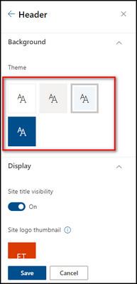
- Pick a Theme from the Background. It will update the background color of your site header.
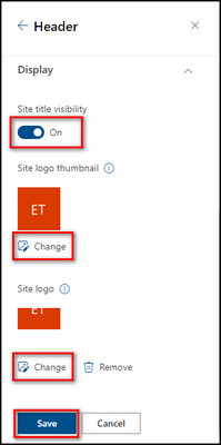
- Apply the following changes from the Display section:
- Use the toggle for Site title visibility to show/hide your SharePoint site title.
- Click the Change button to upload the Site logo thumbnail from your device.
- Select Change under the Site logo to add a new logo from your computer.
- Click Save to apply the changes.
SharePoint provides several options for changing the navigation style to make it more user-friendly and visually appealing.
For example, you can choose to use a horizontal or vertical navigation menu, change the font and color scheme of the menu, and add drop-down menus to display subpages.
Below I’ve provided the steps to customize the navigation style:
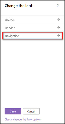
- Go to Settings from your SharePoint site and select Change the look.

- Choose Navigation.
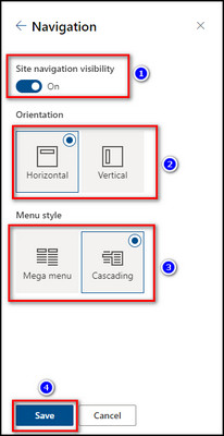
- Use the Site navigation visibility to toggle on/off the navigation menu.
- Select Horizontal or Vertical as the navigation menu orientation. You can further modify the Horizontal orientation by selecting Mega menu or Cascading.
- Click the Save button when you are done.
If you have a SharePoint Communication site, customize the footer by adding text, images, and links to the footer section. Also, you can modify the layout and design of the footer to match your site’s overall theme and style.
Here’s the process to add a site footer:
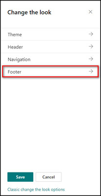
- Open your Communication site, click the Settings icon, and choose Change the look.

- Select Footer.
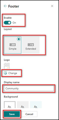
- Toggle on the Enable option to include a footer on your site.
- Choose the Simple layout if you want one level of labels & links or the Extended layout for two levels of labels & links.
- Click Change to upload your logo image to the footer.
- Provide a Display name and select a background color for the footer.
- Click Save to apply the modifications.
Now that you have added a footer to your site, click the Edit button on the top left corner of the footer to insert labels and links. You can attach up to 8 links or labels.
6. Change the Classic Experience Themes
SharePoint has different pre-built old classic themes for its sites which you can modify further. These themes provide different color schemes, fonts, and graphical elements to customize the site’s overall look and feel.
Here’s the process to change the classic experience themes:
- Open your SharePoint site, click the Gear icon, and choose Change the look.

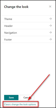
- Select Classic change the look options from the bottom.
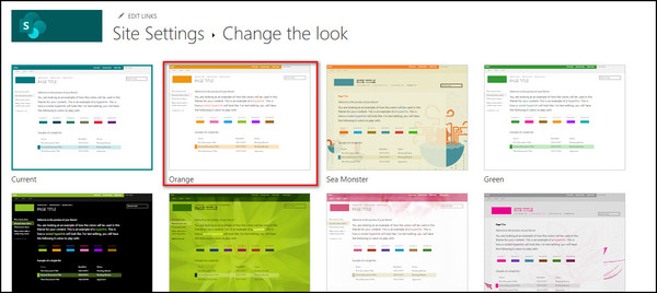
- Pick a look from the available choices and customize the background image, color scheme, layout, and fonts.
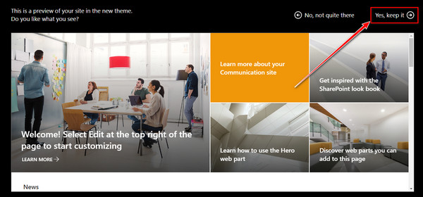
- Click Try it out to preview your changes, and Yes, keep it to save them. If you do not like the changes, you can click Start over and return to the homepage of your site.
In the following section, I’ve explained the factors to keep in mind when creating a new SharePoint site.
To design an effective SharePoint site, you should identify your audience, plan the structure, use consistent branding, add site navigation, and create a custom theme. Ensure that the site is responsive, and test and refine it with real users for feedback and improvements.
Below I’ve provided the tips to design an Effective SharePoint site:
Plan the Structure of Your Site
When creating content for your SharePoint Team Site, consider the top-level subsites and the second & third-level sites. Your homepage should feature a navigation panel containing all the primary options, with a straightforward and clear hierarchy that helps users locate information more quickly.
Customizing your site’s navigation can help users find their way around more easily. You can add, remove, or modify links on both the top navigation bar and the quick launch bar on the page’s left-hand side.
To begin customizing, click on one of the Edit options on your team site’s homepage.
If you cannot locate the Edit option, it may be due to a lack of permission to make changes, or your site admin may have customized the site to exclude this option. To customize your team site, you must have the appropriate permissions or be the site owner.
Optimize Your Site for Cross-Device Usability
When utilizing a SharePoint Team site, it’s essential to remember cross-device usability to maximize accessibility for your team. The Team site allows access to your content from any device with an internet connection.
However, to optimize your site for easy viewing on different devices, you must make it cross-device-friendly.
Ensure the top navigation bar and quick launch bar are not too lengthy, which may cause them to be cut off on smaller screens. Also, utilize device channels, a feature of the SharePoint publishing infrastructure, to style your content for various devices.
Feature the Most Recently Updated Pages on Your Homepage
To optimize your site, consider featuring pages you update frequently and appeal to a broad audience. Pages like the latest news, corporate events, announcements, and job opportunities are great examples.
Incorporating these pages into your site and utilizing web parts to display them on your homepage can provide easy access for users.
Use Visuals on Your Homepage
Images are a powerful tool for communication and can often carry information more effectively than text alone. By incorporating visuals on your SharePoint site’s homepage, you can create an exciting and engaging user experience to increase overall usage.
Try utilizing a simple slideshow featuring photos of your team to help boost user engagement. It adds a personal touch to your site and creates a sense of community.
Adding compelling images to your Team site can enhance its look and feel, making it more attractive and user-friendly.
It’s essential to warmly welcome users visiting your SharePoint Team Site for the first time. One way to do this is by writing a brief introduction at the top of the homepage that offers tips and guidance on using the site effectively.
Include tips on navigating the site, organizing libraries, and tagging content. Add a link to a detailed instruction manual that users can download to provide more in-depth training. You can help users feel more confident and comfortable using your SharePoint Team Site by including an introduction and valuable tips.
SharePoint arranges its content in a flat format based on its properties and features rather than in a folder structure.
Instead of grouping files and documents into folders and subfolders, they are marked with descriptive data identifying their content and characteristics. It can be the document type, the date of creation, the author, and other relevant information.
Using a flat structure for your SharePoint content eliminates the need to navigate through several layers of folders to find the required content. It removes the possibility of accidentally saving content to the wrong folder and shortens URLs.
Be Flexible and Adapt to Your Team’s Needs
SharePoint is a highly customizable platform that you can arrange to suit your specific needs. Take feedback from your end-users during the initial design phase and make the necessary adjustments to create a personalized site that meets your team’s needs.
While your team utilizes the SharePoint site, identify areas that require further customization.
SharePoint is a versatile tool you can customize extensively to create a unique place that fulfills your organization’s needs. With this flexibility, continue to modify and refine your SharePoint site to ensure it remains a valuable tool for your team.
FAQs
How do I customize SharePoint layout?
To customize the SharePoint layout, open your SharePoint site, and click the Edit option from the top left corner of the homepage. You need to be the site owner to be able to modify the layout.
How do I change SharePoint to a new look?
To change SharePoint to a new look, open your site, click the Gear icon from the upper right, select Change the look and choose the section you want to modify. You can also select Classic change the look options for a classic SharePoint layout.
What are SharePoint layouts?
SharePoint has four layouts — Minimal, where all the top bar options, site title & logo are small, and the menu bar height is reduced. Compact, where only the site logo is full-size, but the other menu options are mini. Standard, where the menu bar is split horizontally between the site title and other options. Extended, where you can upload a background image on the menu bar, and all options, site title & logo are large.
Final Thoughts
Transforming SharePoint from a boring, dull platform to a visually engaging workspace is a straightforward process.
Using the SharePoint customization tools, integrating images, and taking a user-centric approach to design, you can create a SharePoint site that inspires collaboration, creativity, and productivity.
Through the steps provided in this article, you can create a visually appealing and user-friendly site that your team will love to use.